Design submitted by Sam from Germany.
Sam says: I like the idea of letting something run around the wrist and adapt in the case region to tell the time.

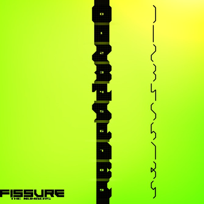
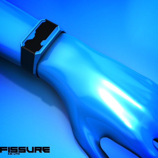
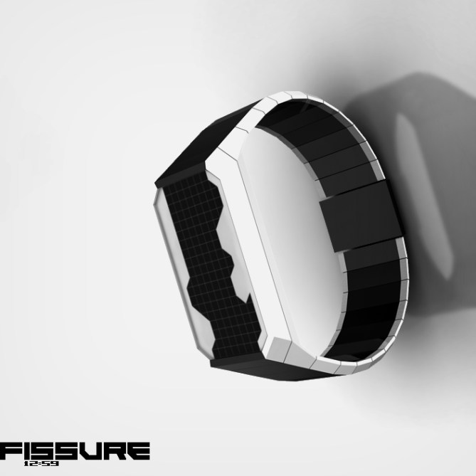
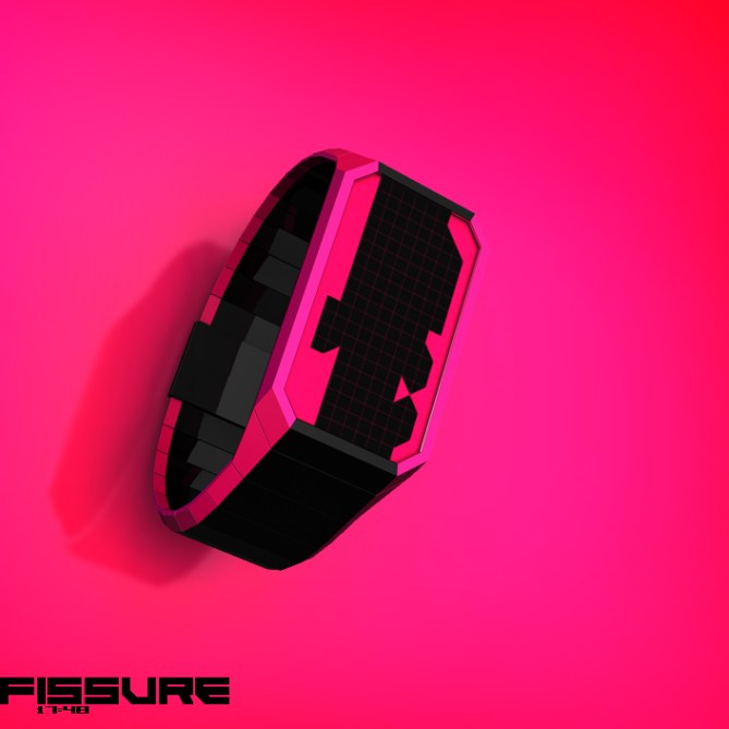
FISSURE is a watch with a distinctive cleft in the center that frazzles out like ripped paper or a rock spur forming numbers on the display. The gap is made by an LCD display while in the rest of the watch it’s just another material color. The four numbers can be found in the outline of the gap and have to be read top-left, top-right, bottom-left and bottom-right. Please check the number picture to learn the numbers 😉
I wanted some screaming colors this time, just to emphasize the fissure theme. More serious styles are always possible, but I think the crazy borders with it’s sharp edges go best with strong colors.
This is definitely not a watch for everyone. The difficulty is for people who like arts and have fun in deciphering symbols. The sharp style is for expressionists and outgoing people.


Thank you Toky for posting my screaming concept! ^^
LikeLike
Looks great and I really love the contrast betweeen LCD and base colour, the numbers are abstract but easy to read. My only gripe is it feels a little similar to a design that was on the blog some time ago. The numbers were negative and the sourrounding areas showed the edges/silloete of the numbers, so it wasnt exactly the same principle but gave a similar look. Either way very support worthy 5/Y best of luck! 😀
LikeLike
Yeah I remember exactly because this one was half ready when the other one came online. Good memory sir 😉 Thanks alot for the support Pete!!!
LikeLike
Ahhh the dreaded GMTA! hehehe we have all been victims of that at some point! hehe
LikeLike
I like the numbers, the case, the strap, the whole concept! Good of luck Sam!
LikeLike
Teh numbers man is at it again hehe, another awesome piece of work Sam 5/Y
LikeLike
Although it took time to learn and read the time, overall, it uniqueness and simplicity still the best attraction! 5 stars!
LikeLike
I like the concept. I wonder if the numbers could be stretched more horizontally. I think I’d like for the cleft to be more jagged, to stand up to the boldness of the color.
LikeLike
It’s quit difficult to read the 4 and the 6 for me, but I think this is training. Looks really nice!
LikeLike
Thank you guys for the comments!
Ah I see what you mean Logan, a less tame, more dominant cleft. Good idea.
Oh yes, not easy to read but I think I caught the essential characteristics of the numbers.
LikeLike
Love the design, Samu, but I don’t want to have to paint my arm blue to get this watch. 5*/ Y
LikeLike
Great idea and good presentation, although I agree with Logan and Trayo. The shape of the figures need some work to have enough indiviual caracteristic to be “easy”read… or perhaps a reveal mode would be an good option to solve it.
LikeLike
Thank you DZ and Jens!
Will think about the need to color the arms and the shape of the numbers 🙂
LikeLike
OMGGGGGG I WANT THISSSSSSSSSSSSSSSSSSSSSS WATCH!!!!!!!!!!!!!!!!!!!!!!!!!!!!!!!!!!!!!!!
LikeLike
Nice one SamA+ sama! (waiting something like look like this to arrive today). This one is super cryptic. Depends on how the LCD segment is cut, Bought!
LikeLike
Thank you JUUUUUUUUUUN and Sir Fir for your comments! Made me smile 😀
LikeLike
You’re one of my favorites! Stunning shapes and precise implementation. Pleasure for the eyes. Congratulations!
*****/Y
LikeLike
Thank you Julius! Nice to see that some people like this crazy concept 🙂
LikeLike
Sam I wonder when will you open your own watch factory.
I really like your style and I love every single watch you create.
This one in particular is something I will definitely buy.
Keep it up, you are going far and will go beyond.
LikeLike
Thanks alot Beto! Nice to come by 🙂 I wonder what the future brings…
LikeLike
Wow! Colour overload! Hands down the most vibrant watch design on the blog so far!
I could definitely see this design in a cool modern cyber punk boutique somewhere.
Some of the numbers are slightly hard to decipher….but they could work with a certain layout. I might get back to you on this as its given me an idea! 😉
LikeLike
Coolio Scott, thank you! Yah, agreed about the difficulty. I’m curious about the certain layout now 🙂
LikeLike
ok a clue……lightning might strike 2.0
I can see the idea in my head, but getting a chance to draw it up in the next couple of months is unlikely due to work! 😦
I really think you numbers could fit though.
LikeLike
Ummm sounds like a nice coop!
LikeLike
I hate the screaming colors options. I’m not sure about the overall look.
LikeLike
Okidoki 😉
LikeLike
But I love the single-line digits ( the one on the right of the 3rd pic )
LikeLike