Design submitted by Peter from the UK.
Peter says: This is “QuadOrbium” The watch is loosely inspired by the humble bicycle combination lock.
The gyneric format of the inspiration tends to consist of four discs with numbers printed on them that your scroll untill the correct combination of numbers are displayed and the lock can be disengaged.

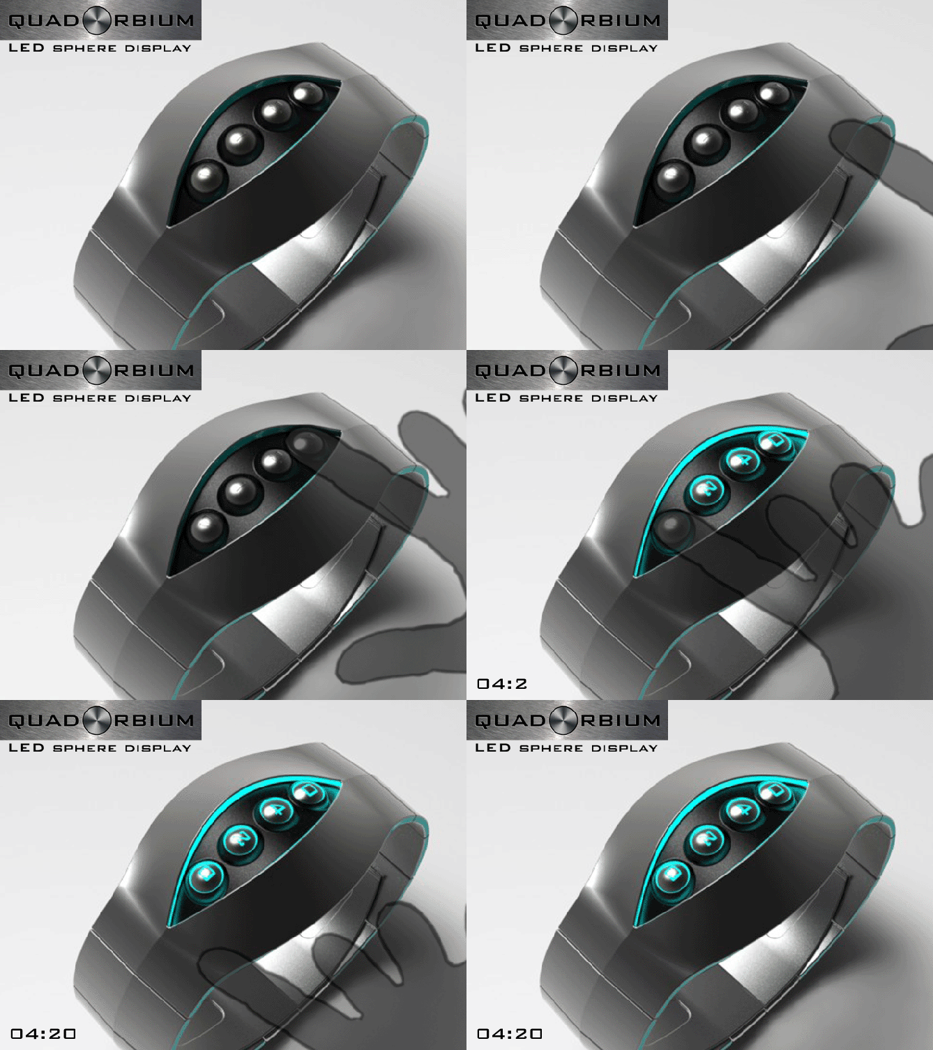
“QuadOrbium” works on a similar priciple, and consists of four (quad) spheres (orbs) with numbers inset into them (the “ium” make it sound like a chemical or element made up of the four orbs (molecules) The spheres are rotated/scrolled by the user until the correct numbers for the time are displayed, when a correct number is displayed it illuminates (LED backlit) along with the edge of the strap that surrounds the display. The lights would go off after a duration of time (this duration could be set by the wearer). If only a minute has passed since the last time display it would only be necesary to rotate the final sphere, as soon as this is done all the spheres would re-illuminate to describe the time.
(this time telling method would also work well with LCD touch screen/s but would be less tactile)

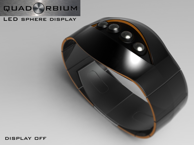
The unusual and tactile interaction with the display has a fun feel that might appeal to people who like playful unusual products. The elegent organic form of the strap has an adult appearance that may appeal to the more sofisticated amoungst us.
The time telling method with the interatctive quality in conjuction with the flowing form sets this design aside from others. The technology is simple in its concept and should be makeable using existing processes and manufacturing methods.
To keep the animation simple the spheres are all one number away from the correct time so minimal scrolling was needed. In reality some of the spheres would require more scrolling.


Smooth futuristic design, easy to read, great color schemes. I’d buy in a heartbeat.
LikeLike
Great comment Damon! I’m glad it appeals and hope you get the chance to buy one day! 😀
LikeLike
I love the concept but I’m not really a fan of the shape. I would like it more if it was less curvy. The opening looks too much like an eye. Love the idea though. Very cool.
LikeLike
I also have mixed feelings with the shape, looks a bit too much Sauron…but I love the concept 5*
LikeLike
Maybe a more robotic angular form suite your taste better without a major conceptual change. Something to think about ^^, cheers for the feedback and the vote! 😀
LikeLike
Hi Danna, yeah the original idea was to have one constant strip of material that made up the main body of the watch which resulted in the quite organic shape. There would be no reason why it couldn’t be more angular and geometric which would make it look less eye like. Glad you like the concept, cheers for the feedback! 😀
LikeLike
I like this peas-in-a-pod design Pete. Very eye-catching and great fun! Nice and easy to read too. 🙂 5Y.
LikeLike
Thanks Mushy, it’s interesting how different people see this design. Some see peas, some see eyes. As long as no one sees a mess all is good! hehe . Cheers for the comment and the vote! 😀
LikeLike
Very nice design, and easy to read. It is a nice piece of jewellery too!
Diane.
LikeLike
Thanks a lot Diane, I even did a narrow version with the ladies in mind. Thanks for the great feedback! 😀
LikeLike
This is very sci-fri. It looks like a bugs-alien eyes! Very spooky!
LikeLike
I’m glad it appeals Leonard even if a little spooky! lol, cheers for the comment! 😀
LikeLike
Thanks TF for adding this design to the blog! 😀
LikeLike
I’m kind of surprised that TF didn’t have to blur this one out. Bit risque don’t you think, pete? Cannot unsee.
LikeLike
Haha I was waiting for someone to see other things in this design than eyes and peas! lol
It wasn’t a conscious decision but an evolution in the modelling stage. That’s my excuse and I’m sticking to it! lol
LikeLike
I was wondering why this one was getting me excited!
LikeLike
hehe Im just glad I refrained from a pink version! lol
LikeLike
I like the cool organic shape–why would you change it to angular? That can be a different design.
LikeLike
The more angular shape is just a sugestion for those who find the current form too “eye like”. I personally like the flowing organic shape but can understand it not suiting everyone. Cheers for liking Xian! 😀
LikeLike
I wonder how this concept would work as a desk clock. An alternative to the Newton’s cradle for offices.
LikeLike
Cool sugestion Logan, the executive market would be quite a lucrative one I imagine. Also it would give idle scrolling fingers something to do! 😀
LikeLike
This is an awesome design. The use of rotating Sphere’s for a display is inspired. This concept seams to combine Analogue / Mechanical Watch Movement but with a style digital layout.
LikeLike
Thanks a lot Andrew, Im glad you like it. This is a concept/priciple I thought about using on several occaisions but worried other people would have thought of it. When the spheres suggested themselves I thought sod it! lol
I figure that the spheres would have simple contacts on them which would comunicate with the electronic board, when the correct contact is aligned by rotating the spheres the LEDS would illuminate. This time telling method would also suite LCD touch screen/s if the physical spheres proved to problematic. Fingers crossed this principle is of interest to TF! x^^x Cheers Andrew! 😀
LikeLike
I just thought that is watch design reminds of a security four button combination lock handle that you find in some office buildings or shop to keep certain areas secure. Where you have to punch in the correct combination in order to open the door to the secure area or office.
LikeLike
The ispiration was a bicycle combination lock which does share some common features with the door combination locks you see in office buildings. Both are good inspiration 😀
LikeLike
What about other color of the band? Like white and black?
LikeLike
White with black edging would be cool as would black with white edging. If I get the chance I will knock something up 😀
LikeLike
White with black edging and black with white edging:
http://www.facebook.com/media/set/?set=a.361209467294120.84425.159423137472755&type=1#!/photo.php?fbid=361345617280505&set=a.361209467294120.84425.159423137472755&type=3&theater
LikeLike
This one is awesome. some orbs look like turrets on sci-fi spaceship, some look like aliens eyes and the green orbs look like seeds in a pod. The spheres look ready to be remove from the wristband ( like in the Aeon Flux movie ). I have one problem : I don’t know which color to choose.
LikeLike
hehe cheers Makko, thats a nice comment and an even nicer “problem” to have. Hopefully one day you will be burdened with that very choice! 😀
LikeLike
PURPLE! Love it!
LikeLike
Thanks a lot Ditza, I’m glad you like it! Cheers for the comment! 😀
LikeLike
You are gona make me broke with all the cool designs you have that I want hehe, liking this one lots, reminds me of this one from Firdaus —> http://www.tokyoflash.com/blog/2011/07/gothic-eye-watch-design/#more-7915 5/Y 🙂
LikeLike
Hi KV, very kind if you to say! I’m glad you likey! Yeah there are some similar eye like forms it shares with Fir’s design. I’m more than happy with that association! Cheers for the comment and the vote! 😀
LikeLike
Oh very elegant watch design with a striking but simple geometry. Definitely stylish. It’s just not my kinda style. The slice is cool, the four orbs are cool too but somehow they don’t go well together for me. Still a nice work. Good luck and happy designing Pete!
LikeLike
Okidoki Sam, can’t win them all 😉 cheers for the feedback! 😀
LikeLike
love it at a first sight….easily caught my attention by the futuristic design…especially when the lights comes on and off very slowly…great job!! definitely become my top shortlist..
LikeLike
I’m glad you like it Jaynov! Thanks for stopping by and showing your support! Cheers 😀
LikeLike
I love this watch, I would buy it today if it were on sale! so different from anything else I’ve seen, great idea!
LikeLike
Cheers very much Chris, I wish it were available for sale! maybe one day! x^^x
Cheers for the comment! 😀
LikeLike
Peas inspired watch can be as this good! Congrats Pete, another good execution.
LikeLike
Cheers Fir, Im glad you saw peas and nothing “x rated” like some of my American cousins! lol
Cheers for the complement and the comment! 😀
LikeLike