Design submitted by Sam from Germany.
Sam says: There are two trends that inspired me to make the concept for L|NK. Tokyoflash once commented this on one of my designs and pointed towards an exciting future: “…it would work well in e-paper. There is a monochrome variety (e.g.: black/red, black/blue, black/pink) which we are working hard to develop into watches. It can’t come soon enough as far as we are concerned as it will really open up possibilities.” Watches that are connected to your phone or computer, are becoming more and more popular so I gave another smartwatch a chance.
L|NK is short for Live E-ink, which already subtly hints the usage of the watch and the technology. It also means, that it is a link between watch and phone using bluetooth.
[Select a colour to change the theme of images on this page]
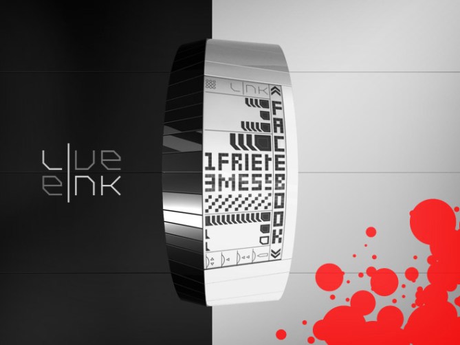
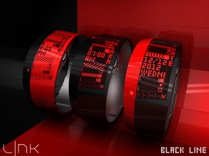
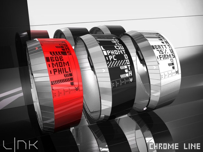
The watch has a simple bracelet style that is cut in two bands. The narrow left one contains arrow shaped LEDs that flash when something new happens and point at the direction or the item you might want to check. But first, a vibration or a sound signal gets your attention. The wider band on the right carries an E-ink display that shows your notifications like sms, calls, emails, social network events etc. as well as time, date and setting options. The two bands were made to contrast. I like the combination of black and a single color. The material color of the E-ink band can be easily matched in the (light grey) E-ink display and the (white) LEDs by the usage of a color film. There are many color and material options possible. I’m suggesting so keep a certain monochrome appeal.

The E-ink display uses different segments to display icons and characters to keep you informed. There is a limitation in what such a display can show, so I created differently shaped elements to make it look cool. If you look at the display for the first time, it looks pretty busy. But it’s actually very simple. There are different areas that are separated by thin lines. The narrow area on the right side says where you are right now. The central square area adjacent to it is the Focus Area and it shows the details of your notifications. The areas above and below the Focus Area show other notifier icons or setting icons that you can highlight in the Focus Area by scrolling up or down. That’s about it. The other elements are permanently present and not necessarily made in E-ink.

On the right side of the watch is a scroll wheel that’s also a button, just like PC mouses have. It lets you easily browse through your notifications and set anything you want. Classic Up/Down and Enter buttons would work too but I like the sleek multifunction of the scroll wheel. Using the scroll wheel as button by pressing it once or twice or holding it down allows many options like entering/leaving elements, moving or changing them. On the left side of the watch is the light button so you can check your important news every time.
The L|NK is many things combined in a simple form. It orients itself between an expensive high-tech device and a simple time teller. It’s an LED/E-ink hybrid, a bracelet and a watch, an accessory and a gadget. It is fashionable and functional, artistic and informative.
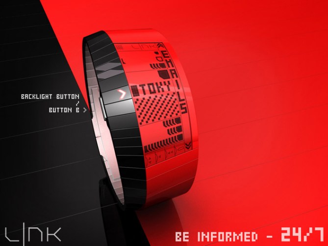
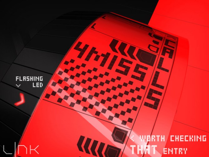
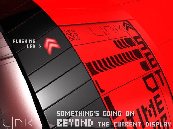
// <

I just fall In love with this design. Very innovative, I’m wondering why it is not already on the market.
Please, do it, I’ll buy !!!
LikeLike
Thank you for the nice comment! You’re one of the first to see this concept and market presence is big dream. Hopefully you get the chance to buy it.
LikeLike
Thank you Tokyoflash for posting my dream. And thank you to my friend (he knows) who did the script for the multicolor page. I didn’t even reach the state of a noob in coding so he made this dream lookable!
Hi everybody! I hope you like my artsy e-paper watch concept. Please click a color, wait a sec and enjoy the L|NK in your favorite section of the rainbow. Also take your time for the display. It looks confusing at first, that’s for the first impression and for a little wow effect each time you look at it again. Once you know the different areas, it should be quickly comprehensible.
♥
LikeLike
Only a few things that I can add for this project: five stars and a big yes.
Congratulations and good luck Sam!
(Impressive demonstration of the color picker)
LikeLike
Nice presentation! Yeah being able to alter the colour of the theme is inspired! The watch is very pretty and I love the contrast between the the two parts of the band. The display is busy but I dont mind that, kinda adds a little mystery to it. I will be very supprised if this doesn’t get made! 5/Y (and liked as liking/sharing seems to be less popular at the moment) well done sir! 😀
LikeLike
Great work Sam! The graphics are awesome squared, but it’s just way too techie for me. I also think we all spend too much time on phones and the internet as it is without being connected to them via a watch! I think I just prefer a watch with an interesting and fun display. I felt the same about Firdy’s watch too. For me they both seem like the antithesis of Tokyoflash. Anyway, I gave you 5* for all the work you and your friend must have put into this. I expect lots of people will like the idea because it’s contemporary and looks cool. Good luck with it.
LikeLike
That’s a comprehensible perspective Lloyd. That’s actually why I chose the artsy, less mere functional way. Firdaus’ watch is a phone substitute. Mine is a phone addition, creating display diversification using the info stored in the phone. It’s still a watch but this one watches more than just the time and leaves the phone (that’s in the bum pocket of the pants) be a phone. Tokyoflash have their traditions and one of them is going new, maybe strange new ways. I appreciate your view and sour support, thank you!
LikeLike
“sour support”? 🙂
LikeLike
LOL s and y are close on the german keyboard. I meant to write “your”, my finger must have slipped. sour support, I think such exists too 😉
LikeLike
The future is now! I only have one major observation; I think this design can be achieved and will look better with natural LCD and multicolor LED. The yellow one looks pretty much decent and techy! Ill call it final fantasy watch kitaaaa!
LikeLike
Sam, I love the way you’ve designed the above with colour selection for different themes. The watch looks sleek and funky, and I would probably buy it for that reason alone. All the notification stuff might be a bit too much for me – a little busy. Still a 5*, potentially “y” – haven’t decided yet.
LikeLike
It is busy indeed. Once you have it, you need it hehehe. It’s cool that the look alone is a reason to get it. I was hoping to find a balance of arts (luv it or hate it) and informantion (helpful or unecessary). DZ, thanks for the comment!
LikeLike
Amazing, Sam! Color choices now? You’ve outdone yourself, which I didn’t believe was possible. This design is sick! I definately like the red and yellow Black Line. Offer up kelly green in addition to the bright green and I’m sold! 6*?
LikeLike
Futuristic shape, Sam. Scroll wheel on an e-ink info display watch is a great idea. The color options are nice, but, for myself, I would take black line with white foreground display or chrome line with black foreground. My only minor dislike about the design is the “wheel usage reminder” — I’d rather see that space used for alarm status.
LikeLike
Thanks for the comment Logan!
Oh that would add more complexity to the display. Right now the focus area gives all status informations and the alarm status is an info that you can scroll to. Colorless for you – nice choice 🙂
LikeLike
Absolutly epic stuff here. 5 stars is not enough and this is a definite buy
LikeLike
This is a beautiful watch, but a little competition with the smartphone?
Too much for me, even if the work is superb as always!
5 * / Yes for this incredible work.
LikeLike
Very good concept! How I wish they start to put this up on the market. I am already addicted to TokyoFlash Watches! This is one of my favorite. How much do you think would this be on the market? Touch functions on this watch must be responsive or else it will be the downfall. I vote 5 stars for this watch and will definitely buy!
LikeLike
Thank you Marky! I share the same wish. I can’t tell how much this would be. My layman estimation would be 250$ upwards. And 250$ would be a bargain 😉
LikeLike
nyay! $250….. gulp! =(
LikeLike
A great concept from Mr Sam once again. Even if I wouldn’t be the right user for this watch I must recognize that it has a high potential regarding the actual web/networking trends. Beside the fact that it is really beautiful…
Knowing that TF could technically make it, makes it even more attractive 🙂
Superb display by the way !
LikeLike
♥
LikeLike
How can this be a reality? How is it being decided by TokyoFlash? Hopefully we get this reality watch this year!! ^^,
BUY BUY BUY BUY BUY!!!!
LikeLike
I love this design! But I think there should be an area with the time always on top. This would shown more that it is quit a watch. And I love the idea with the e-ink. This displays are really really great. But in the end I could not choose what colour I prefer. I think the green one in the all black design or the yellow in the black/big yellow design? Hard decision! 5* and a big, fat YES.
I would always wear this great watch!
LikeLike
Lovely input, thank you Trayo! Hm, good hint about the time being always visible. Maybe an auto-scroll to the time if there is no activity for 7 seconds would be another cool solution. Oh yeah tough decicion indeed. But cool you like the BIG yellow. Reminds me of the new Nokia Lumia 920 🙂
LikeLike
I’m still waiting on this one. Please make this a reality watch now so we can all be happy!!! This is my NO.1 concept watch. Please it has to be fulfilled this year as a christmas gift! 😉
LikeLike
I like the overall look. However, watches that are connected to cell phone are not my cup of tea, and not usefull, for me, for now. I wouldn’t buy but still gave 5*.
LikeLike
Comprehensible reason 😉 Thanks for the support!
LikeLike
Time is nearly out for this awesome concept! Best of luck Sam! 😀
LikeLike
Thanks so much Pete! (^u^)/
LikeLike
This was a nice experience, from making the first sketches until getting these nice comments here. Thank you everybody for your comments! Very interesting, helpful and lovely 🙂
Stay critical & cool & creative !
Cheers from Germany,
Sam
LikeLike