Design submitted by Matt from Canada.
Matt says: I wanted to make an analog-digital watch. I choose digital hour and analog minute and second. I choose to go with seven segments for the hour. There are six 1-hour lights and one +6 hours light at 12 o’clock. I realized that I could do a 24 hours version. In the end, I choose to combine them to do one submission.
I choose a “sliced pie” shape to get a round display. For the minute I’ve used a thick black hand and for the second I’ve used a thin red hand, just like a conventional analog watch. For the hour, there are some segments of the digital e-paper display that lights up.
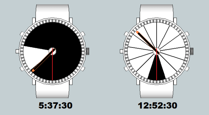
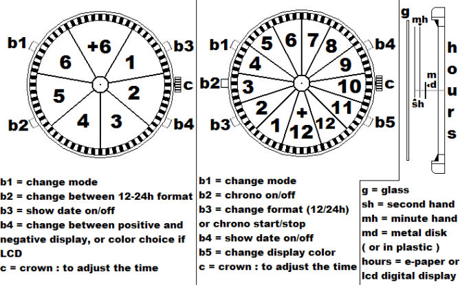
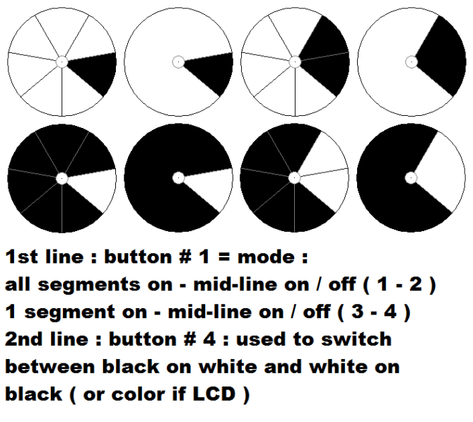
The 7 segments display is close to a conventional watch and start at 1-3 o’clock and go clockwise. The light at 12 o’clock count for 6.
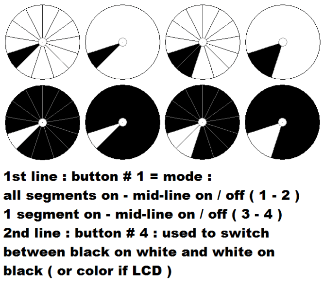
The 13 segments display look like a sundial and is also going clockwise. This mode starts between 6 and 7 o’clock. ( or could start between 12-1 ) There are twelve 1-hours light. The light at 6 o’clock count for 12, so it is used as a pm indicator.

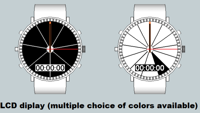
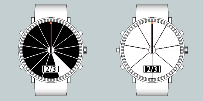
The user can switch between 12-24 hours format. Then, choose between 4 displays modes and positive or negative display for the e-paper version, or between many colors if it was an LCD display, and could have the date displayed, at 6 o’clock. If it was made with LCD, there could be a chronometer added at the same location. It would replace the date display, if that option was on.


I am a fan of hybrid watches that mix different display styles and tech. I have done a couple myself.
I think if you are going to use an analogue style display its best to stick with 12 or 24 sections. If you feel the need to use a different number its probably best to allways start from the regular 12 o’clock position so its easier for people to get thier head around. Its an interesting idea though so I support its unusualness (thats a real word now!) 5/Y Best of luck and welcome to the blog! 😀
LikeLike
Hi pete. ty for your comment. I’ve specially choose 7 and 13 segments for the unusual side. As I wrote in the form the 24h format can start at 12-1 o’clock, if it’s more popular. ( Or the button #2 could have a 3rd option )
Would it be better to have a inner circle for the +6 / +12 light ? ( I’ve realized that there was this possibility after reading your comment )
LikeLike
Hi Makko/Matt, I didnt put 2 and 2 together there lol. Is this your first subsission on the blog?
I think it would make more sense to more people to have them start from the 12-1 postition but some people do like the more unusual layouts. Yeah if it was me Id be tempted to put the +6/+12 light seperate from the “normal” segments for clarity. Maybe a circle in the centre of the watch would be a good place, but again this is a subjective thing. You have certainly put some time and thought into this concept! 😉
LikeLike
This is the 2nd to be published, of 8 submissions. ( the others can be seen on my fb page : https://www.facebook.com/MinakiDesign )
This one took 1 month part time to do. I have 17 pages of notes ( 8 1/2 x 11 ) I do the case/band with Sketch Up, then print the screen with the zoom at the good distance, and finish with paint. ( to send as png ) I’ve used paint for the circles, the angled marks ( between the segments and the 60 marks for the seconds ), the hands and the colors.
In both style, the +6/+12 are wider than the rest. If I make a circle in the middle, there would be 6-12 equally sized segments forming a circle/disk. ( I have a few other versions )
LikeLike
Ty TF for posting it.
One note : I made an error on the last 2 pics, with the text : the ( 1-2 ) is ( 3-4 ) and the ( 3-4 ) is ( 1-2 ). And I’m sorry that the text is bigger than needed. It seemed ok when I made the pics.
LikeLike
and an alarm could be added.
LikeLike