Design submitted by Lloyd from Australia.
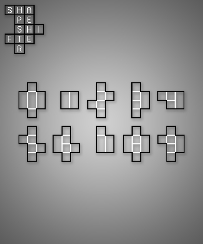
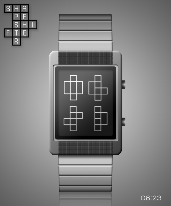
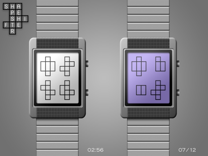
Lloyd says: “Shapeshifter” is an LCD concept watch that uses weird looking shapes to display the time and date in a slightly perplexing way. The shapes resemble those found in games like Tetris and give the watch a geeky retro feel.
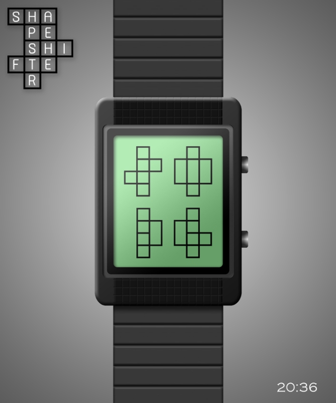
Reading the time or date is easy once you know how. Just ignore the outer lines of the shapes and you’ll be able to see that each one contains a digit.
Shapeshifter is USB rechargeable via a computer, and has an alarm. The watch’s case and strap are made from stainless steel and are available in silver or black. The display is available in different colours and is “always on”.
This design would appeal to anyone who likes cool modern gadgets, puzzles, games, geeks, art, creativity, thinking “outside the box” and having fun.
It stands out because of its unique and easy to read cryptic display.
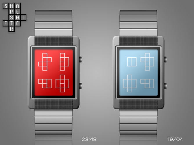
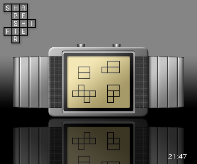
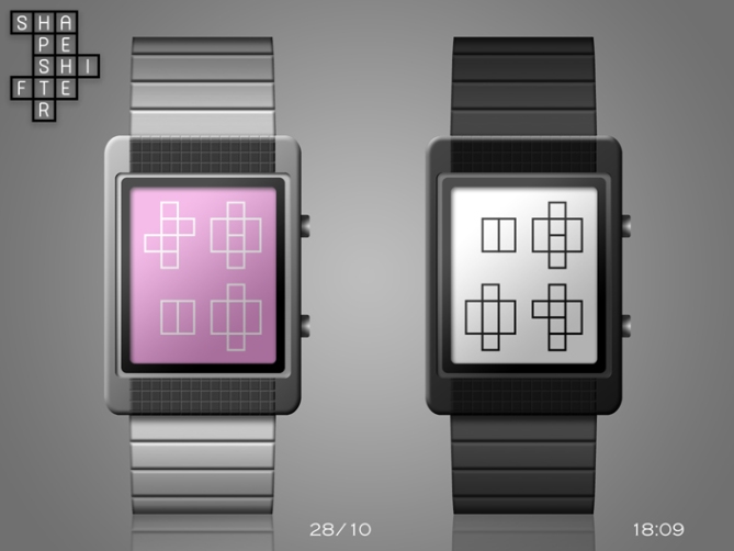


Was waiting for this one to hit. Methinks Lloyd has struck awesome on this design. The digits are cryptic enough to hide the numbers from the unaware, and simple enough to be instantaneous once you know.
Nicely done, good sir!
LikeLike
Thanx Cory! :o) Nice of you to say that mate.
LikeLike
Love the number design on this. Just using the stock images, I found myself able to visualize the numbers in the blocks. Clever little piece, here.
I’m not sold on LCD. It’s too dim and doesn’t mesh well with the watch face. I think that LCD looks cheap. How would e-paper look?
LikeLike
Thanx a lot for your feedback JP! 😉
LikeLike
Sleek as always, but I would suggest to add shadow effect to the digits so they would look more precious.
See you in Vegas!
LikeLike
OK thanx Firdy! 😉
LikeLike
Thanx for posting this design TF! 🙂
LikeLike
Another instant classic from Lloyd, simple but cryptic numbers with a tetrisie (that’s a real word now) feel. Very nice, very make able, very jealous! 5/Y best of luck! 😀
LikeLike
Cheers for your enthusiasm Pete! 😉
LikeLike
I agree, an instant classic. Looks nice. I think with a clever LCD or E-paper segmentation Tokyoflash could make a watch that carries a couple of your squary display themes ♥
LikeLike
Thanx Sam! 🙂
LikeLike
Nice one, Lloyd. I would suggest a reveal mode, as it may take a bit of getting used to, and if you don’t wear the watch for a while you might forget.
Cheers 5*/y
LikeLike
Thanx a lot DZ! 🙂 I thought about adding a reveal mode, but everytime I have someone says that it doesn’t need one. lol Also, I don’t think it’s all that difficult to remember to ignore the outside line of each shape.
LikeLike
I quite agree with dzign555 on reveal mode. I like the picture 1 because the numbers is obvious. Without the picture 1, for me, it is hard to read time.
LikeLike
OK Leonard. 😉
LikeLike
Hi Mushy, the idea is nice, but I have a little problem reading. Example, the model 6:23, the merge between the numbers 6 (which may be an 8 or 9 etc..?) Ditto for 2 and 3, except 0 is readable. Or then, would it be necessary to thin or thicken the external threads the figures?
5 * / Yes to the idea.
LikeLike
Hey Patrick! No worries. 🙂 Just imagine that the outside line of each shape is not there. You’ll then be able to see the digits clearly and you won’t get them confused.
LikeLike
Try drawing them and then erasing the outside line and you’ll see what I mean. 😉
LikeLike
OK, I understand.
I understand quickly, after long explanations, I had not made the connection with the external lines, which are different for each figure.
Thank Mushy for your clarification.
I do not regret my 5* and my Yes.
LikeLike
OK, I understand.
I had not made the connection with the external lines, which are different for each figure.
Thank Mushy for your clarification.
I do not regret my 5* and my Yes.
LikeLike
No worries Patrick. 🙂 I think Leonard and DZ didn’t see that part of the explanation either. I didn’t understand why they couldn’t understand it, cos it’s SO simple. hehe
LikeLike
You’re right, Lloyd – I didn’t read your explanation. It’s very easy to read the time now.
Cheers.
LikeLike
No worries DZ. Maybe I should have mentioned it in the diagram too to make doubly sure. 🙂
LikeLike
Simple elegant geometry. I like!
LikeLike
Thanx Xian! 🙂
LikeLike
Dam the rating should be higher for this uber cool design, this is awesome, cleverly hidden numbers 5/Y
LikeLike
Cheers Mark! 🙂
LikeLike
I don’t like the digits on this one but the case/band is nice. I would buy the red display with black lines with the gray case with black accent, if the digits where the geometrik’s one.
LikeLike
No worries Makko. 😉
LikeLike
Do you just not understand the numbers Makko?
LikeLike
I don’t. The other version is easier to understand.
LikeLike
OK. 🙂 Here’s what I told Patrick above. Just imagine that the outside line of each shape is not there. You’ll then be able to see the digits clearly. It’s that simple.
LikeLike
I just wondered cos you told me before that you had a medical condition that made reading some displays tricky. 🙂
LikeLike
there is also that factor. ( health problem )
LikeLike