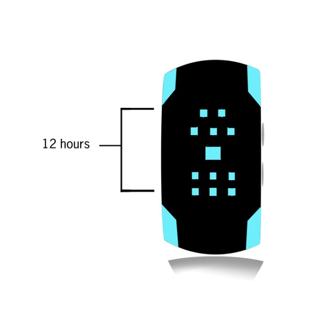
Design submitted by Emilio from the USA.
Emilio says: One day during class I became bored (again). I was looking around trying to find something to do and then i noticed a flow map. I thought to myself what if I can transform this into a watch and after a few minutes later voila.The design may seem complex at first but once understood it becomes very simple. Squares represents hours 1-12 and lines with no spaces are either AM or PM minutes by 5 and lines with spaces are minutes 1-4.
To me, although older people may find this concept interesting, I feel like people ages 15-27 or very trendy people would choose to wear this watch.
Most watches seem to be overloaded with design. What I’ve done is mixed complexity and simpleness into one with style and fashion.


Hello Emilio, welcome to the blog!
It’s cool tha boredom can turn into creativity right? I know that feeling 🙂 The design looks really cool! I thought about such a diagram when I worked on my timeline concept. It’s a great theme. I’d definitely buy it if the time telling would be a tad easier.
Let’s take the 3:06am example. The minutes, 06, they come to being because of a gap in the am minute line assembly and a missing line in the additional minute assembly. But there are already two gaps in the lower half of the display that have nothing to do with the time. That’s a little confusing. Then instead of taking away a segment to tell the time, you could just show the necessary amount of segements. Cause right now one has to remember where the 05min segment is. If you display the necessary amount, one can quickly count them. 1=5, 8=40 etc. The same for the hours. Doing so, there could come a problem: the display would look pretty empty at certain times and the flow diagram look woulnd’t be seen. If the marked segments would flash, you have both: easy time telling and the flow diagram. You know, an analog based display or a simple array can work without counting but memorizing. Hm, the more I look at the watch, the more I feel it’s not that difficult. But you see, the first impression from me, a guy who is willing to learn and who likes a certain degree of crypticness, was confusion. But that’s just me 🙂
I wish you good luck Emilio. I support you with 5* with my concerns mentioned above and YES I would get it. BTW, I really like the corner accentuations!
LikeLike
The idea is nicely simple but the display itself looks quite complicated. I would need to keep the instruction manual handy for the fisrt couple of weeks to help me read it. This is something you would soon get used to but it would be nice to have an easy mode where its shows the numbers. That said its a nice concetpt so 5/Y Best of luck! 😀
LikeLike
I am in agreement with Sam and Pete, 5 star worthey idea though 🙂
LikeLike
this is awesome! I would totally buy it. Fantastic design!
LikeLike
I think this idea is cool, something like something out of my imagination. There quite room for improvement though, as stated by Jerry-chan. Keep up good work and good luck Emilio-sama! B-)
LikeLike
The idea is ok. I would prefer if the amount of lines would be cut in half and not used to make a distinction between am/pm.
LikeLike