Design submitted by Mark from New Zealand.
Mark says: Inspiration / theme for this design came from the well known Morse code.
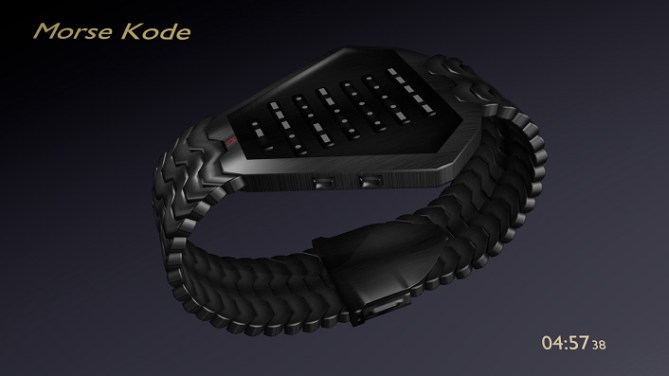
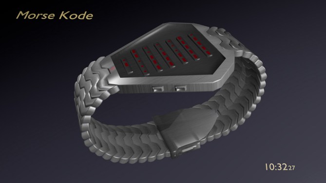
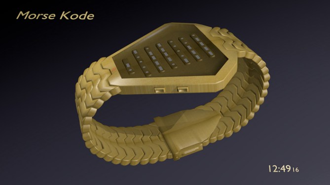
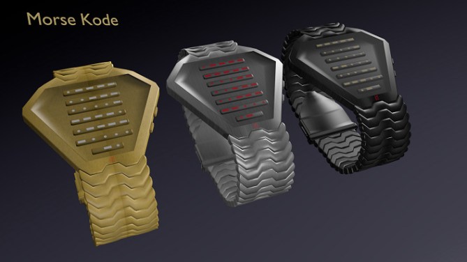
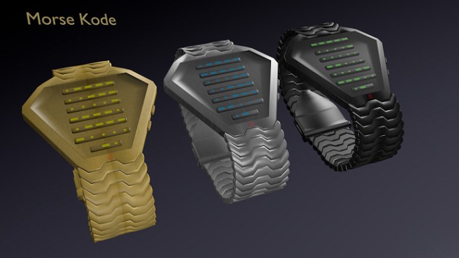
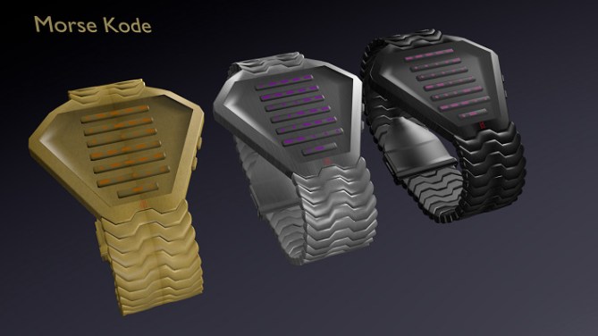
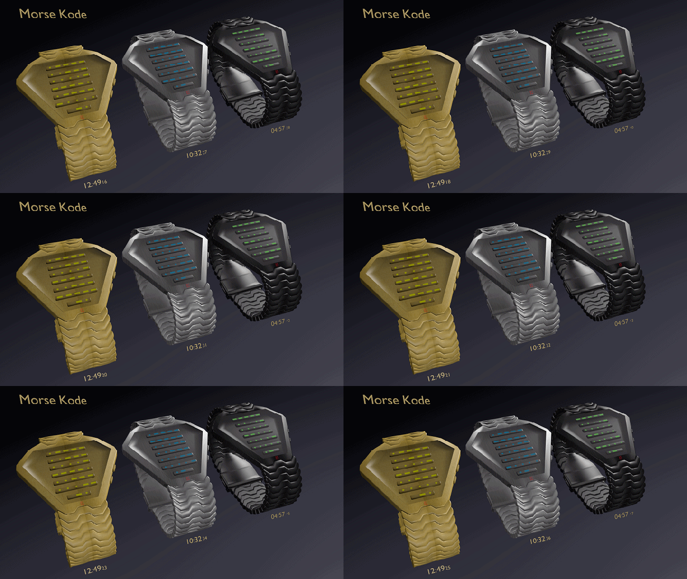
It is read from top to bottom with each line displaying one number starting with hours at the top, minutes in the middle and seconds at the bottom, which gives it a constant animation effect. The short line at the very bottom indicates AM/PM. If the dot is on the left of the dash it is AM, right of the dash, it is PM.
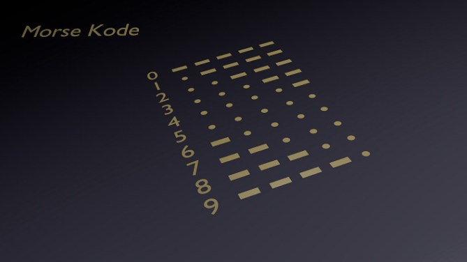
Reading the time is a simple matter of counting or subtracting the dots. Numbers 1-5, count the dots to the left of any dashes. Numbers 6-9, subtract the amount of dots on the right of any dashes from 10, e.g. —.. would be 10 minus 2 dots = 8. Zero is 5 dashes.
Both 12 and 24 hour time formats can be used, and the date is displayed in the same way as the time, day / month / year from top to bottom.
This should appeal to anyone that likes codes, puzzles or things that stimulate the brain into working.


Not sure if its just my slow brain but this design is extremely confusing to me. Then again, I’m not familiar with morse code. In any case, it does have a radical and edgy look but not my cuppa tea.
Best of luck to you, Mark!
LikeLike
to read it ignore the dashes and concentrate on the dots, cheers for your comments
LikeLike
Nice Design. Just a minor thing…I think the colour of the dot’s and dashes needs to be darker, to make it easier to read.
Diane.
LikeLike
Silly me I should have said the contrast needs to be greater, forgot some of the dots and dashes were light in colour!
Diane.
LikeLike
the dots and dashes would be alot brighter, but was experimenting with how to do a tinted glass effect which darkened the colours.
LikeLike
Morse code is a popular theme with good reason. The images even to those who struggle to read it (like myself) are still iconic. I think I would want to learn to have this design on my wrist. Very stylish! Best of luck and welcome to the blog! 😀
LikeLike
Thanks Pete, this is my first use of textures on the case design, looks far better than my rune watch submission. 🙂
LikeLike
Sorry KV, for some reason I didnt realise this was your design (could have sworn your Rune watch post said Mark from Australia, Im losing the plot! lol)
Yeah there is a definate improvement in your graphics from your earlier submission.
Keep up the good work! 😀
LikeLike
lol was wondering about the welcome hehe
LikeLike
The reading system is interesting.
5 * / Yes.
LikeLike
Thanks for the 5 Patrick 🙂
LikeLike
Hi Mark,
I’m not so interested in the Morse code, but I really like the design of this watch. It looks like a snake eating its tail! 5 * from me.
Cheers.
LikeLike
Oh, and I think it’s being severely underrated with 3.1 stars. Downrater, go away!
LikeLike
I have to agree with DZ, 3.1 is a very harsh score for this design! Please rate this concept fairly people!
LikeLike
Thanks for the 5 🙂 was going for a better triangular look than another submission I already sent in, TF must have liked this one more since this is my 4th submission and has jumped ahead of 2 other submissions.
LikeLike
I have the same opinion with dzign555 ~ The watch design is classically cryptic (in a good way) IMHO! A good work here, keep improving with blender KV…. the only thing I disagree is the shape of the watch face is not fully harmonized with the display! 4* and keep up good work!
LikeLike
Thanks Firdaus, yeah I know what you mean about the display, I wanted the lines to be the same length but that left some open space either side in the top half which I couldnt think of what to fill in with. Cheers for the support 🙂
LikeLike
Your graphics are really great, Mark, and I like your idea with the Morse code. It’s not my style, but I expect a lot of people would love it. I gave it 5Y. Best of luck! 🙂
LikeLike
Thankyou for the nice comments and the 5, I can only hope I can match the likes of Sam, Pete and others in time 🙂
LikeLike
Thankyou TF for posting this idea 🙂
LikeLike
I like the style for its unique style of face design, something different from the usual! Definante winner in my books as i like brain teasers. A great effort Mark. I give you a mark of 5.
LikeLike
cool idea, but too masculine for me.
LikeLike
@Lynn – thanks for the 5 🙂
@Heather – thanks for saying you like the idea, I am gona have a crack at a more girly design for my next submission 🙂
LikeLike
I like the idea and the overall look. The shape is nice but the width could be less, without changing the diamond shape. The time-telling method is super easy. 4.5* and I would buy.
LikeLike
Thanks a lot 🙂
LikeLike
Made a slight mod, removed the buttons from the side of the watch and moved them to fill the spaces on either side of the display
LikeLike