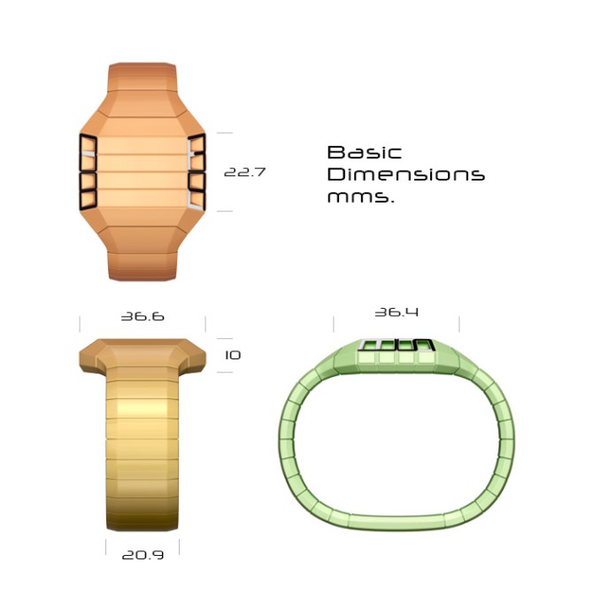
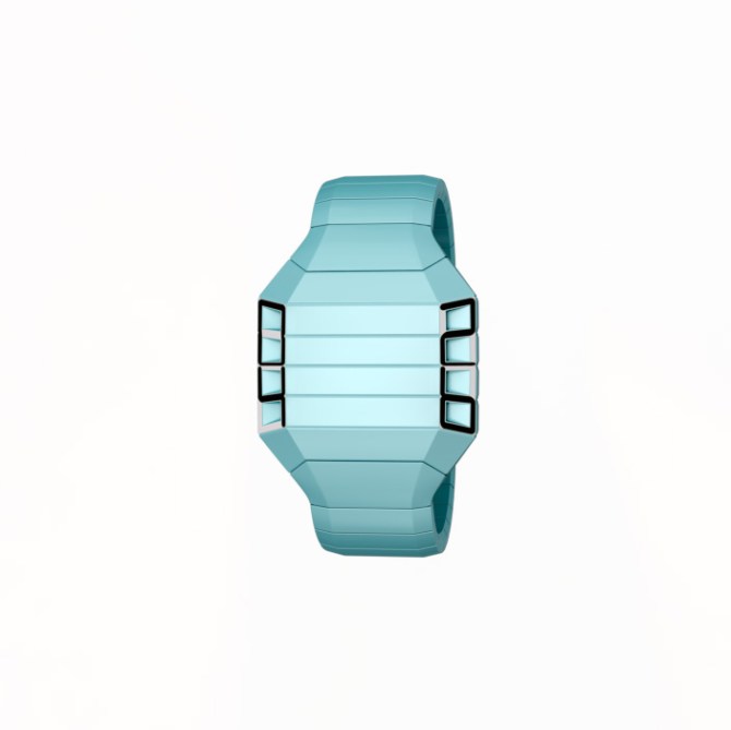
Design submitted by Devindh from the UK.
Devindh says: I called this design ‘Ebi’ because the eventual design reminded me of a lobster. The idea stemmed from my exploration of e-paper. I wanted to incorporate laser cut pieces of e-paper into a design, as this display technology lends itself to custom shapes.

The majority of the watch appears solid. My idea was to give the screens the appearance of having been cut away and revealed. The watch consists of 2 custom shaped e-paper screens. The time is told in 24 hour format, with hours on the left screen, and minutes on the right.
This watch is aimed at people who appreciate the readability and ‘newness’ of e-paper displays.
I think the use of e-paper as a design feature should help this design stand out.


Great design looks good seems make-able definite buy if the right price
5* y
LikeLike
Thanks ‘Whisp’. I’m sure that TokyoFlash will always produce watches at an affordable price, so we’ll see:) Thanks.
LikeLike
I FUCKING LIKE THIS!!!
LikeLike
@#$%%^ thanks:)
LikeLike
It’s a nice idea. I love the black and the red. It would be better if there was a 12 hour format option. Then, I might buy. ( a date/month option would also be nice )
LikeLike
and TF could make it as a LED ( but e-paper would be better since it’s a always on technology )
LikeLike
Thanks Makko. I didn’t really think of the multi function aspect of this watch when I designed it, and perhaps it is not suited to showing different kinds of time.
LikeLike
LED, LCD or e-Paper, I’m gona get this! Very good design!
Devindh I admire your work, I can sense your passion in design, I like to see more futuristic and cryptic from your work, nonetheless, this design is 5*!
LikeLike
Thanks Firdaus. Guys like you, Pete, and Sam, have the ‘futuristic’ and ‘Cryptic’ sector locked down:) I think my strengths are in minimal designs:) BTW, Congratulations on getting your watch produced. It’s great to see the realisation of your efforts.
LikeLike
Thank you sir!
LikeLike
Welcome back Devindh!!!
Wonderful shape, cool numbers. I agree with Fir, no matter what technology sits in there, it’s a very good design. Hehe, the skin colored and reddish one also remind me of an 海老. Very nice analogy and a cool name and image to advertise. I like the simplicity, the color variations, the segmentation, the holes and the way the numbers are placed – very nice. 5*/YES the blue one/Good luck!
LikeLike
Lol..Hey Sam. As I said before, I haven’t really been away..I just tend to lurk. As with Firdaus above I congratulate you on your watch. I’m sure it’s the first of many:).
LikeLike
Thank you sir!
LikeLike
Nice graphics Devindh, but it just seems a bit bland to me.
LikeLike
I think it’s just because I don’t like watches with a blank space in the middle. Also, like Firdy says, it would be good if you introduced a cryptic element.
LikeLike
Hey Mushy, thanks for the expanded crit. I think that the dynamism of the ideas on this blog can make many designs seem bland by comparison. Look forward to seeing more work from you.
LikeLike
Yeah that’s true Devindh. 🙂 Hope you send in some more soon. 😉
LikeLike
5 * from me!
LikeLike
Thanks.
LikeLike
I also think that something could or should be in the middle to give it an extra element to look at. Love the design none the less. 5/Y
LikeLike
Hi Krautesh.
I wanted to show a version with the central area containing solar strips. But I searched online and it is hard to find solar panels that can be made inconspicuous. Solar + e-paper is potentially a gr8 combo from an environmental standpoint.
LikeLike
The font used on the dimensions sheet is called ‘Neuropol x ‘ and can be found at Typodermic fonts.
LikeLike
I like this watch.
5 * / Yes.
LikeLike
Thankyou.
LikeLike
Looks very nice CC! very fresh and industrial looking, my new fave of your designs! Very interesting use of epaper, if it can be done count me in! Loving the grey one! 5/Y best of luck and welcome back! 😀
LikeLike
Hey Pete, thanks. I know that you have plenty more designs taking shape and I look forward to seeing them all:)
LikeLike
hehe yeah there are always some in the pipeline! 😉
LikeLike
oh well this look nice and simple, maby the middle needs something but still looks very nice.
Signed:MrTaco
LikeLike
Hey Taco): Thankyou.
LikeLike
absolutely 5*
LikeLike
Thanks dani:)
LikeLike
i want to eat lobster
LikeLike
Crab is nice too:)
LikeLike