Design submitted by Peter from the UK.
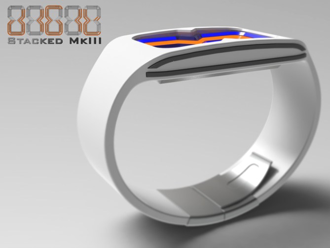
Peter says: This is “Digit Stacked MKIII” cryptic LED watch.
The original idea consisted of digits made up of LEDs, the digits were arranged one inside the other in a russian doll style. This allowed the quite regular digits to become cryptic, artistic and abstract.
The second version took that concept a step further making the numbers an hour glass shape without any cross-overs. This helped clarity and gave the watch a unique appearance.
This version adds a third dimension to the concept, literally. This version employs 4 layers of transparent plastic one above the other in which the LEDs are mounted, the light of the LEDs refracts thru the plastic layers to give a stunning 3D glowing stacked effect.

This emphasises the digit inside a digit concept in two axis and gives the display depth.
The time is read from the outside. The two outer digits are the hours and the smaller inner two are the minutes. This appears cryptic at first but soon becomes obvious and easy to read at a glance. This principle would also work just as well with the date. The 3D hour glass shape naturally creates a void in the centre of the display which could be a touch sensitive zone for controls.

This watch is aimed at a uni-sex market, the display style allows for compact dimensions and the LEDs allow for a variety of colours to suite all tastes. The simple cryptic display should appeal to people who like things that are a bit different but is recognisable to the more conservative.
All the features are based on existing and proved tech so minimal research would be required (x^^x) The external form is conventional so shouldn’t cause any technical difficulties. The stacked 3D glowing display gives the watch a unique look that will make the wearer stand out from the crowd.


Pete this is just WONDERFUL! I waited for this to come online! I love the geometry and the look of the numbers! 5*/YES YES YES YES
LikeLike
Thanks a lot Sam, yeah this concept and earlier versions has taken quite a while to hit the blog. Hopefully people will feel the same as you! Cheers for the comment and the vote! 😀
LikeLike
^ That said, let me say something to the downrater who’s awake now and here since the watch got posted.
Go to your fridge, eat a sausage, then go out and stay the hell away from this blog with your hatred. A) Tokyoflash made already watches with a rating lower than 4 so your work was in vain B) Although you know it’s not the main aspect for a watch to be chosen, you continue your behaviour. Do you know how much work it is to make such a design? People spend their spare time with this and you come and show us the middle finger. That makes you a poor being sir. C) Yes, Tokyoflash offers the 1* rating up there. If you were an honest voter, you would come here and tell why you don’t like what you see.
Sorry Pete for being stressy here but each of your designs has been downrated since it came on, as far as I could see. I’ve seen it too often by now. Your designs are wonderful! Cheesy sometimes ok, not perfect too. But so are mine too. Now one could think, I’m biased. Maybe, I can’t controll my feelings that way, but I’ll tell you whenever I see an issue with your designs, which is what everybody should do. But people, keep in mind, it’s a concept! It shows us an idea, a hint, a dream, not a final product. Be tolerant and open for the fact, that it changes anyway and in the end, if it gets sold, it still won’t please anybody in every detail but the idea, the essence of this concept will be there.
Thank you to all who are already coming here and comment in a respectful way. You’re good people.
LikeLike
I feel your anger Sam. Really its just annoying for you guys reading the blog because it spoils readers seeing the true vote.
If people do vote down for no good reason, of course, we can tell who does it, so they just waste their time.
Do you think Tokyoflash wants to work with someone doing that?
LikeLike
It’s anger now but not a sudden one, it got bigger step by step. At some point, even a cookie can’t calm me down 🙂 I still have fun doing it and I think Pete also does. I’m not afraid of the results but I hate the fact, that this guy spends his too much time to annoy. Pete… noone deserves this.
It’s a good feeling to know that you are aware of it and thank you so much for saying it for everybody to read.
As for the question, I don’t think so – not after a proper conversation with him.
Have a nice weekend Toky!
LikeLike
Thanks Sam/Toky,
I have noticed a little more (suspected) down-rating in recent weeks, posts that have started well into the 4s and soon drop down to 3.8 consistantly. It used to make me as angry as you Sam but I guess you get used to it (which is kinda sad! lol).
I tend not to bring attention to it (on the blog anyway) for fear of making it worse but Im glad you bring it up.
I certainly agree with your point about the work that goes into the concepts people submit, if the downraters knew how much time, effort, and hope that people put into these concepts they may be less quick to hit that 1* button, or may at least say why. Which is what the comments are all about “Constructive Critism”
Thanks for commenting also Toky, we all know that the ratings are not that important in the whole scheme of things and that you can see the fraudulent voting. Its more of a morale thing, if people give good scores it make you want to continue submitting (for me anyway)
Oh I nearly forgot, cheers for adding this design to the blog! 😀
LikeLike
Took me a bit to see the numbers but once I did was easy to read, very clever display. 5/Y
LikeLike
Im glad you stuck in there and gave it “time”, yeah its straight forward when you get your eye in. Cheers for the comment and the 5! 😀
LikeLike
Good design, couldn’t say more 😉 5*
LikeLike
Thanks a lot Firdaus! I could say more but im toooooo lazy! lol
Cheers for the positive comment and vote! 😀
LikeLike
Wow – you must be psychic, Peter! I had almost exactly the same idea! Mine was going to be a watch shaped like an eight, with eights inside. It didn’t have the 3D aspect, though, making yours better, in my opinion. Anyway, you’ve got the CAD nous!
5*!!
LikeLike
Thanks a lot DZ, yeah there is often a lot of GMTA here on the blog. The concept of stacked numbers is not that new with a few different approaches showing up on the blog. Hopefully this the first 3D attempt! 😀
Cheers for the compliment and the vote! 😀
PS keep practicing the CAD, you have already come along way in a short time! you will soon overtake the likes of me! 😉
LikeLike
This concept is getting better and better! Well done, Peter! 5 stars!
LikeLike
Thanks a lot Leonard, yeah this one has evolved over time. Maybe there is more evolution nessesary, perhaps thats where TF take over? (x^^x) who knows? I think the fact that a few people have gone down the stacked numbers route suggests there is mileage in the basic concept. Thanks for the comment, the well done 😉 and the stars! 😀
LikeLike
Wow, this is really awesome! ***** and a yes for sure!
I think for the animation though, the numbers should light up, in to out and not disappear suddenly. Its difficult to explain but from the inside, they all activate and then from the outside, they all deactivate instead of just 1 bar running up and down.
LikeLike
Hi Jordan, cheers for the vote. Yeah there are several ways the animation could be done, maybe there would be a choice so the wearer could decide. I did another for the post but that wasn’t added (probably due to file size) which was a negative of the one show which looked more impressive. I like you suggestion, it would look like the display is filling up like a water level. Cheers for the feedback and the vote! 😀
LikeLike
This was the intended preview animation, it doesnt show the time but another way of animating the LEDs in general:
LikeLike
Good job Pete. 😉 5Y.
LikeLike
Thanks a lot Mr Mushy! 😉
LikeLike
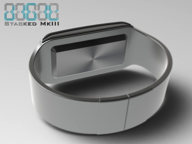
love it, pete. best make yet. the silver with mirror one rocks my socks. the black is droolworthy as well. nicely done. 5*/yes
LikeLike
Yay! The silver is my fave too! Thanks a lot Heather! 😀
LikeLike
Very nice watch!
For my part, I have a little trouble telling time, but it might be necessary that I change my glasses?
5 * / Yes especially for the look.
LikeLike
Cheers Patrick, Yeah it takes a little to get your eye in, but when you do its pretty easy. Its probably easier for some and harder for others. Cheers for the likey and the vote! 😀
LikeLike
http://gadgets.9square.net/digit-stacked-mkiii-an-led-watch-from-the-3rd-dimension
LikeLike
I like the overall look. I like the dual-colors lights. I have a minor problem with the depth of the void because it look like it will be a very thick watch. ( maybe just an ilusion ) Perhaps the time could be separated in 2 layers.
LikeLike
In theory the watch should be no thicker than a regular LED watch because the leds would be around the perimeter of the display rather than beneath. The depth of the display at the moment is about 5mm using 1mm thick layers. These could be thinner as its the angle of the edges that would dictate the thickness of the illuminated lines that make up the digits (shallower the angle the wider the lines). The original Digit and MKII (both of which never hit the blog) were flat displays (check out the albums on my fb page) So it would be possible to have a hybrid with two digits per layer and have only two layers. Cheers for the feedback Makko! 😀
LikeLike
5 mm : that’s a good news. Then, since it’s an ilusion, there’s no problem. The thing I like about the dual-color is that it’s helping the time-telling speed, by making a separation between 10’s and single digits.
LikeLike
Also the ratio of the depth of the display in relation to the length and width of the watch could be tweaked. The case could be longer and wider which would make the display look shallower in relation. Yeah the two colours does help with the time telling. Cheers for the comments! 😀
LikeLike
Time is short for this design, so a quick thanks to everyone who supported this design by whatever means. I’m a little dissapointed this didnt score a little higher, but that’s life I guess. Cheers to TF for posting this design on the blog! Cheers everyone!
Pete from the sunny isles! Lol 😀
LikeLike