Design submitted by Peter from the UK.
Peter says: This is “Turbofan” a remake of an earlier design called “Fan”.
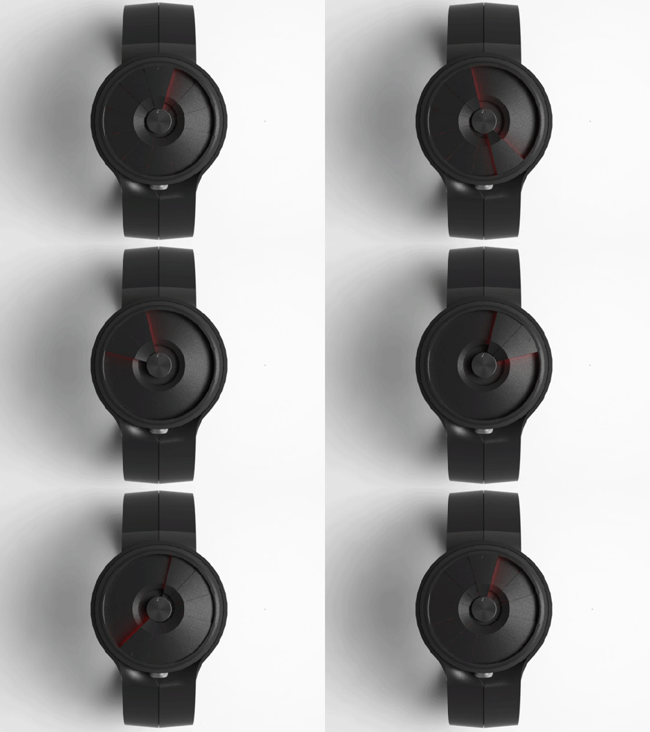
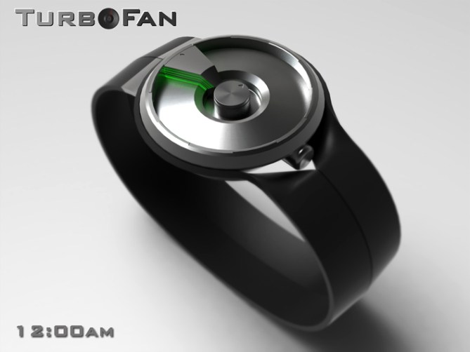
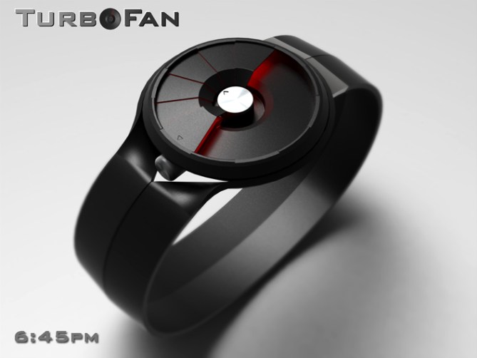
The face of the watch is inspired by the blades of a fan. This inspiration makes for a technical looking dial that kind of looks like armour plating that constantly animates with the movement of the hands.

The time is told in a traditional analogue manner. The top mounted hand displays the hours. The disc in the center displays the minutes. As the hour hand rotates around the dial it collects the fan blades as it goes untill it gets to the twelve O’clock position. Then it spreads the blades out again in a constant cycle.
There is a second method of time display possible using this style of dial. The dials goes from positive to negative, ie the top hand/blade travels for the first twelve hours fanning the blades out, then the lowest hand takes over collecting the blades back it. This method looks more dynamic but becomes complicated at the twelve O’clock position where the positive meets the negative.

This design has a very dynamic animated appearance which should appeal to people who like mechanical analogue watches. The time telling method is conventional so should appeal to the traditionalist.
The mechanical animated appearance sets this watch from others. The style also works with different material combinations.


Yes, yes, I have a favorites on this blog and they do not disappoint me.
5 * / Yes.
LikeLike
hehe I bet you have a loooong favorites list! lol Im glad you likey, this is one of my favorit of my designs. I hope others agree. Cheers for the great comment and the vote! 😀
LikeLike
Awesome mechanical analog watch! I love those blades! They look complicated but I think it can be done. I’m a fan of this one, 5*/YES/Good luck!
LikeLike
Thanks Sam. I think it wouldnt be the easiest watch to make but then when has easy always been the best option! lol Thanks for being a fan and the vote! 😀
LikeLike
I think it’s really cool (no pun intended)! I think I like the green version best. The red one is kind of a turbo volcano! I gave it a 5* and Yes earlier. Best of luck Pete!
LikeLike
Im happy with the pun! Yeah black and green always has a nice techy feel, red and black always has a slight sinister feel. “Turbo volcano” damn you guessed the name of my next design! lol
Cheers for the comment, the vote and the luck (I need it) 😀
LikeLike
Thanks for adding this design to the blog TF! 😀
LikeLike
Hey TF just a thought, if the fan blades moving with the time proved too difficult you could have them comnnected to a rotor like on a automatic or kinetic watch, they would spin around with the wearers movement. The top blade would still tell the hours like a conventional analogue and the disc for the minutes, the rest would move with the rotor. Just another way of achieving a similar look but with less complication. 😀
LikeLike
Awesome mechanical analog watch! I love those blades! They look simple but I think it cannot be done. Off course I want it to be done though, 5*/YES/Good luck!
LikeLike
Im glad you want it done even if you have doubts that it can be done. I think it can be done but its probably not the easiest thing in the world! Thanks for the feedback and the vote! 😀
LikeLike
In a word; Snazzy! =)
I really like the mechanical, three-dimensional look of it, and how clean and consistent it is. Having said that, I can’t help but think that it might be possible to do more with the moving segments. At least I would try to, but then that might mess up the whole concept (judging by my past scores, my design choices tend to be a bit hit-and miss anyway =)…
LikeLike
Hey Anders, Cheers for the snazzy comment! Im intriged to know what you would have the blades do? please tell? I wouldnt pay much attention to the scores, I seem to get poor ratings irrespective, the comments are a better idicator of the general consensus. Cheers for the comment! 😀
LikeLike
My pleasure, credit where it’s due and all that…=)
I don’t know exactly what I’d do with it, it’s more of a general feeling I s’pose so don’t take it too seriously, I don’t claim to be any shade of a design guru…=) I would say that I’d like to see more integration between the design theme and the time telling itself; using the lower blades for more than completing the look… Easily said, but the more I think of it the more difficult it becomes, as usual…=)
Yeah, I’m with you on the comments/ratings, but I suspect that the ‘truth’ might lie somewhere in between. After all, it’s easy to be harsh when clicking on a star, and a little difficult (at least for me) to be too critical when writing a comment… But then most people mostly comment on the stuff they like, so…=)
LikeLike
I see what you mean regarding the lower blades. I guess in an ideal world the lowest blade would show the seconds and the blades inbetween would fluxuate between the two, the it would be constant animation and would look really dynamic (woooo just imagining that now) but like you say that would add even more complication (TF like a challange right? lol)
Yeah your probably right about the ratings/comments, some comments are probably too fluffy and some ratings too harsh, ultimately its up to TF to interpret, the rest is purely morale boosting or destroying! lol
Cheers for the extra comment and suggestion! 😀
LikeLike
Pity it’s not getting really high marks, as I would buy this in a flash! 5* from me.
LikeLike
Thanks a lot DZ, yeah I had hoped it would get off to a better start! I will take the downrating as a compliment! Cheers for the flashy comment and the high five! 😀
LikeLike
Those light hiding under the blades making the Hands look like a laser, very futuristic and sci-friction ! And I like those laser’s hands! 5 stars!
LikeLike
I like the laser association, futuristic and sci-fi are two phases I am always happy to here! 😀
Im glad the imagery appeals, thanks for the great comment and the stars! 😀
LikeLike
*hacks in to boost teh ratings hehe* love this one, hope it can be done 🙂 5/Y
LikeLike
Thanks a lot KV for the much needed hack, I hope it can be done too and that TF have the inlclination to try!
Thanks for the positive comment and the vote! 😀
P.S hopefully your “Rune” watch will hit here soon! 😀
LikeLike
I hope so too 🙂
LikeLike
awesome 🙂 5* YES YES YES the only thing i would change is, id put a peace of glass/plastic over the to to stop any damage, Great Work
LikeLike
Hi Jamie,
Sensible suggestion, I did model the glass as it would be nessesary to avoid un-wanted friction/dirt etc. But my rendering package sometimes struggles with glass, the blades ended up with an unwanted texture so I left the glass out as it looked much better. Blummin techical issues (swears under breath) Thanks for the feedback, the yessesesses and the vote! 😀
LikeLike
This is awsome!! I would totally buy it if it were avalable though depending on the price.
LikeLike
Glad to here it Jared, lets hope TF make it and at the right price 😉 Cheers for the comment! 😀
LikeLike
Just for fun I have added a couple of new images to my fb album:
http://www.facebook.com/media/set/?set=a.314131022001965.72417.159423137472755&type=1
LikeLike
Make a blue color that would be supa cool
LikeLike
Which parts do you think should be blue? the blades like the transparent ones or the backlighting on the black or metal blades? or the case and strap?
LikeLike
i’m a big “fan” of this idea, pete! would like purple lights, though! 😉
5*/yes
LikeLike
Thanks Heather, Im glad you likey. Im sure a purple backlit one can be arranged! 😉
LikeLike
I added a purple backlit version to the fb album and a blue transparent version for Jared! 😀
LikeLike
Cool!But won’t it need some sort of glass over it?
LikeLike
Hey Mr Taco, you are correct this design would require a glass lens. Like I mentioned in an earlier comment to Jamie, I did model the glass but my rendering package didn’t do it justice so I left it out for clearer graphics, cheers for the feedback and cool comment! 😀
LikeLike
My mistake Pete, great job!!
LikeLike
simply put………awesome!
5/y
LikeLike
Great comment! Simply put…..thanks a lot Diclonius! 😀
LikeLike
This watch…is…Amazing! The design of it is really sleek without any ridiculous pieces, and the concept is so ingenious! I would have to say that i would 100% go for the purple lit one you showed in the FB album. You get a 5* from me sir! Great job, and i hope to see your work fulfilled!
LikeLike
Thanks for saying Garette! Cheers for taking the fb album into account too! I’m glad you like it and I thank you sir for the kind words and vote, lets hope there are more that think the same so this one stands a chance! Thanks for the great comment Garette! 😀
LikeLike
that’s a watch. WOW!!!!!
LikeLike
Now that’s a comment! Thanks a lot Elm! 😀
LikeLike
I like the overall look. The small minute disk would make it more a week-end watch, because you can only approximate the time, which is ok. ( unless markers are put under the glass, around the disk, on a “paper” )
LikeLike
Thats a nice idea Makko, rather than printing the markers they could be etched or moulded into the glass which would be subtle enough not to compremise the look but give the extra accuracy to make it more practical. Cheers for the feedback and the suggestion! 😉
LikeLike
I’m glad you understood what I wanted to say.
LikeLike
Good ideas are the easiest to understand! 😀
LikeLike
http://www.scoop.it/t/only-good-news/p/2119434297/turbofan-mechanical-watch-with-armour-plated-blades
LikeLike
According to the computer this ends very soon.
Big thanks to everyone whote voted, commented and shared/Liked!
Thanks to TF as always for adding this design to the blog!
Cheers!
Pete form team GB! 😀
LikeLike