Design submitted by Scott from the UK.
Scott says: I’ve watched a fair amount of sci-fi, from Star Trek to The Matrix and of course Tron! 😉 In nearly all of these there are super hi-tech computers and interfaces that look unbelievably complex, almost impossible to understand; yet they always have someone happily pushing buttons seemingly understanding everything?!
I’ve always thought they must know something we don’t, there must be some kind of trick or some sort of ‘code’. So i decided to see if i could come up with my own interface/display that would look like gibberish to most, and obvious to others. Kind of like the dreaded ‘Blue screen of death’ on a broken computer.

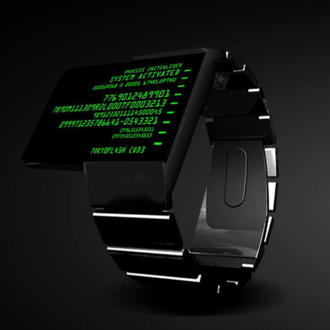
I also love a-symmetrical designs so that is the design brief of the overall look. I’ve made the top of the straps raised slightly to give a ‘clamp’ effect around the face.
I have designed 3 colour choices: Matrix Green, Decepticon Purple and Blue (screen)
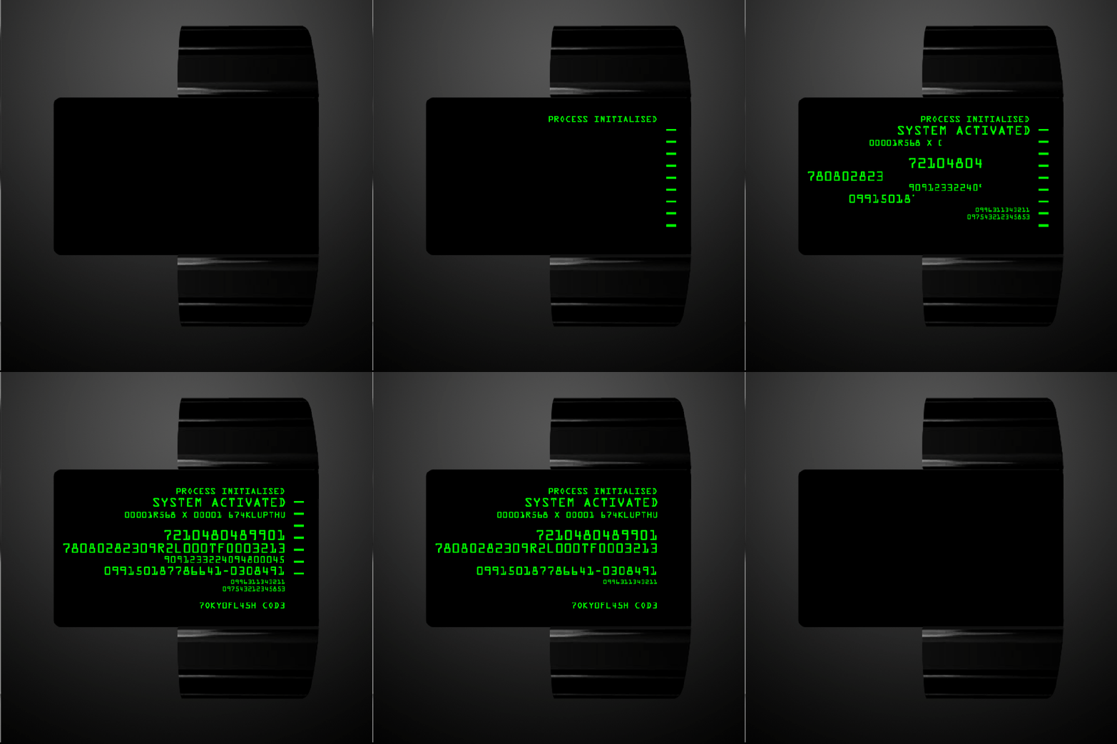
There’s nothing much cooler than a touch activated watch, therefore to activate Code you simply swipe down the right hand side of the watch (indicators will illuminate as you do).

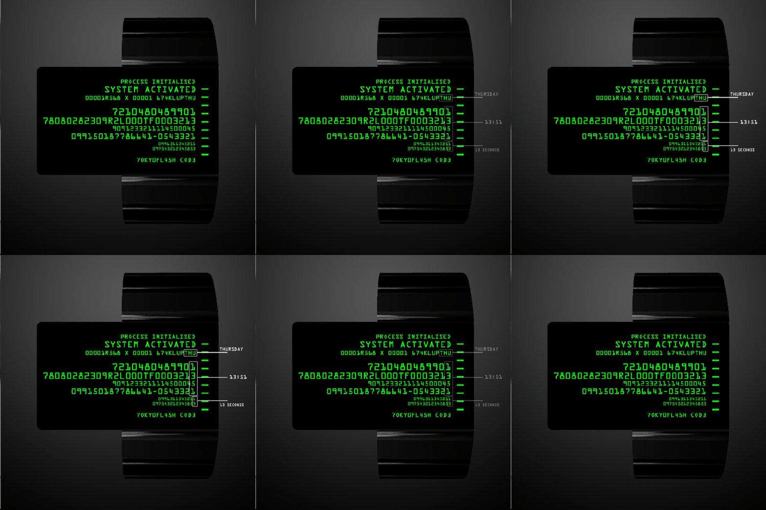
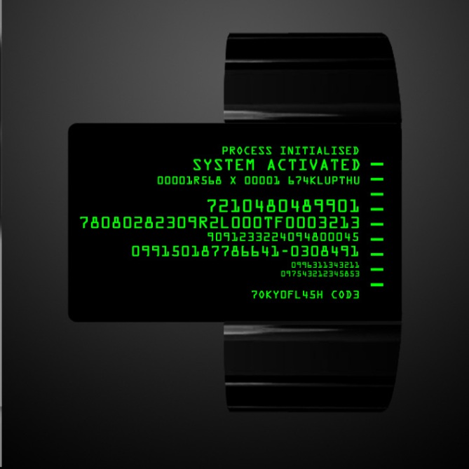
At this point the watch will light up with what looks like random numbers, but telling the time is super easy. So easy in fact you can tell the day, hours, minutes and seconds at a glance (whilst others will be scratching their heads!)
To read the time you simply look at the last digits of every line (the date is the last 3 letters of the 3rd row)

Hopefully the animations add to the mystique of the watch.
What would be really cool would be if you could set the red herring/misleading numbers as memorable birthdays, passwords, telephone numbers etc via usb to a computer.
The large screen also lends itself to other features such as bluetooth synchronisation with mobile phones to display incoming calls.
Hopefully this should appeal to sci-fi geeks like myself and anyone that loves computers and technology.

![]()


I absolutely love the idea. 5*. I would definitely buy it.
LikeLike
Thanks Makkovik
LikeLike
excellent!!
LikeLike
Thanks GTR
LikeLike
WINNER!!! 5/Y
LikeLike
Thanks Krautesh
LikeLike
I want one this century!!!!! Beam me up
LikeLike
Acknowledged Larry, Engaging system interlock. Pattern buffers synchronised. Phase transition coils at stand by. Energising. 🙂
LikeLike
A bit crap to be honest.
LikeLike
Sorry, that was a bit blunt. 🙂 I expect a lot of people will like it though.
LikeLike
No worries you are entitled your opinion. Thanks for checking it out.
LikeLike
Very cool idea! It’s definitely something I would wear. I wish you would hide more information in the code. You could let all first digits show the date for example. While the seconds change, some other numbers should change too, to not give away the solution so quickly. Some letters could show the month. Bluetooth fun or some other technology (like an accelerometer) that uses the display, that could do so much, is highly welcome. Bluetooth could grab several information from the smartphone and display it in a coded way. Like weather info or alerts. Many possibilities! But the ease in time telling remains. Welcome back to the blog Scott and good luck!
LikeLike
Hey Sam.
“You could let all first digits show the date for example” Yes, true. Or you could split the letters of the day through out the date line/3rd line eg T34H786U551R12S679D12A78Y = Thursday.
“While the seconds change, some other numbers should change too” Good point. If that is possible i think it would be a good solution to keeping it cryptic.
Thanks for your support! 🙂
LikeLike
Another brilliant concept from Scott, A sure winner.
LikeLike
Thanks Dad 😉
LikeLike
I like the idea and the overall look is very nice, very tokyoflashy. My only gripe which Sam has also commented on is the fact a large proportion of the screen has no involvement in the time telling. It would be nice if the excess code displayed part of the time. I would have suggested that the large area displayed the seconds in large digits made up by the code and gaps in the code in a similar manner to Mushy’s “Encryption” watch. Most would not see the digits just a constantly animated code.
Yeah welcome back Scott, spooky too cos we were just talking about your submission. 5/Y 😀
LikeLike
Hi Pete,
“the fact a large proportion of the screen has no involvement in the time telling” – Yeah i get that and i knew that might be an issue for some. There may be a better solution to utilise the other numbers. What no one will realise is that there are some import numbers in the design (for example my date of birth is in there – you just have to know where to look!). If you could set the watch to include passwords/D.O.B etc it may become more useful.
Thanks for your support!
LikeLike
Why make it simple, when you can make it complicated?
5 * / Yes.
LikeLike
Hehehe 😉
LikeLike
Ok, I like the idea, Kisai Terminal sounds cool. You can put more information there instead of just random alphanumeric. *spoiler* I have a concept code named “terminal” too in my design scrap, but was entirely different from this, mine more like inspired by airport terminal 😉
Goodlucky scotty 5*.
LikeLike
Thanks Firdaus
LikeLike
Thanks Patrick
LikeLike
I created a watch design which named: Data Stream. Based on the streaming line of encrypted machine code as featured in: The Matrix film trilogy, the units / number required to display the time where located on the line centre of the Screen.
LikeLike
Cool. Have you submitted it to the blog?
LikeLike
Gorgeous design, but the touchscreen has me worried. Have you bought/worn one of the touchscreen watches? They smudge if you look at them funny and really don’t look that good.
Switch to a button, maybe square off the rectangular display, and it’s a 5 from me. A 4 as-is, but I do love the aesthetic.
LikeLike
Hi JWL. No i actually don’t own a touch screen watch yet. I totally understand your point though….however there is something incredible cool about swiping down the face to activate it. How about a free mini cloth with every watch to help keep it clean? 🙂
Thanks for your comments.
LikeLike
Really great idea. This would so fool my geeky friends!
LikeLike
Thanks Ben. That’s exactly the point of this design. I wanted something that would completely bamboozle friends (or enemies for that matter!) 🙂
LikeLike
OMG you have to make this one, its possibly the best design yet, how long do take from picking a design to bringing it out? Will it be out for christmas???? I love the way the screen sticks out the side of the watch
LikeLike
Hi Kirsty. Wow, thanks for your comments. If…(and that’s a big if)… it is selected, it would probably take at least a year. First of all the design has to get enough votes for it to be considered, so please spread the word! 🙂
LikeLike
If this thing could talk to a smartphone over Bluetooth and display incoming texts or tweets, I would buy one for each wrist 🙂
LikeLike
Hopefully that might be possible, you never know! Thanks for your comments.
LikeLike
i like the concept a lot. i agree with some other people’s suggestions to make the superfluous data more useful, but personally, the aesthetic is a bit masculine, and i wouldn’t want a watch whose screen sticks out that much. good luck!
LikeLike
Hi Heather. Yeah, despite a lot of my friends asking me to design a female watch, i have to admit most of my designs will be more masculine. The best i could do was introduce a purple display to try and make it more unisex…but i actually prefer that myself!
Thanks for your comments. 🙂
LikeLike
i want it! definitely
LikeLike
Thanks Franco
LikeLike
id buy this in a heartbeat. especially if it had Bluetooth capability.
LikeLike
Thanks Jeremy. Fingers crossed!
LikeLike
That is sooooooooooooooo cool i loved every concept and idea like how you could show an in coming call and stuff also the idea of you being the only person who could read it is awsome 2da MAX
LikeLike
Thanks Jared
LikeLike
Make it not use milatary time.
LikeLike
Checked pretty much every design on this blog and I think this is my favourite, me being a computer guy an all. Really hope this one is made cos it definately needs to be 😀
LikeLike
Cool. Thanks Jono. I was hoping the bluescreen version might specifically appeal to ‘computer people’.
LikeLike
Super cool watch. I’d love to wear this on my wrist 😀
LikeLike
Thanks Jon B, hopefully you’ll get the chance!
LikeLike
Nice work reminds me of The Matrix
LikeLike
Thanks Mr.Taco. Yeah definitely although this wasn’t my intension when i first set out to do the design. It just seemed to fit as part of the process.
LikeLike
pleaseeee let me buy this watch
LikeLike
Fingers crossed. Thanks Jun Fan Lee.
LikeLike
5* I would wear this watch 5 billion percent please create this watch if you create the blue one sort of make it like the blue screen of death on old windows computers and my dad would go crazy for this watch
LikeLike
5 billion thank you’s 🙂
LikeLike
i REALLY like this design! 5/y!!
just one question though.
i wear watches on my right hand, however i’m not sure if it would fit right.
LikeLike
D’oh!I”l hold my hands up and say i didn’t actually consider wearing it on the right hand. The A-symetrical design really only lends itself to the left hand (taking into account the bend of the wrist). I don’t really have the solution to that other than to have a right handed version which probably is feasible from a retail point of view.
Thanks for your insight! 🙂
LikeLike
Ideally the colours would be changeable (except the BSoD, which has a different background colour), for those of us that don’t like purple or green.
I agree that the other text could be made more useful – perhaps it can be linked by bluetooth and people can put in their own text from a .txt file or some such if they so wished?
A dev app – simple, easy to use – would be ideal, actually, for people wanting to move the time and date elsewhere, display different information and so forth.
Great idea, would love more freedom on it.
LikeLike
Yep, great suggestions! A dev app would be ideal for this. Thanks for your comments.
LikeLike
I’m seconding Sunder’s suggestion of a dev app, and would love to have bluetooth integration. Would also snap up the purple version in a flash since I’ve been hankering for a purple interface for some time. Also like how the watch is right-aligned with the strap 😀
LikeLike
I’ve loved purple ever since i saw the decepticon logo for the first time! Thanks for your comments.
LikeLike
I would buy this yesterday. As an IT guy, this is perfect for my tech junkie lifestyle.
I’d love to see some other info on the watch like others have mentioned such as various bluetooth functions with your phone.
One thing I’m curious about is how comfortable it would be to wear with the protruding screen. As great as it looks, it might dig into your arm when you bend your wrist.
LikeLike
Thanks Mantastic.
Your right, on the right hand the protruding screen may be an issue. I guess it would all come down to how well the watch naturally sits slightly higher up your wrist to allow it to bend.
LikeLike
Bad@ss!
I would be the first in line to buy the matrix green model..
Please email me as soon as this watch starts being produced!
TONY L<3VE-
LikeLike
Thanks Tony!
LikeLike
wow, this is really cool idea !!!
don’t forget to tell me if i can own this one
LikeLike
Thanks darkness_hero (cool name btw!) 🙂
LikeLike
Thare’s no other easy way to have good grade than to create the essays and that is, as well, simple to buy the art essay at the good essay writing service.
LikeLike
know this is just bad ass, I will pay what ever for this watch.
LikeLike
Thanks for your support Itachi1
LikeLike
Best of luck Scott! 😀
LikeLike