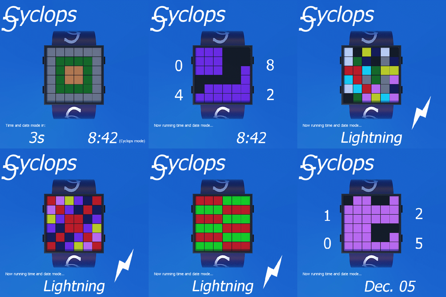
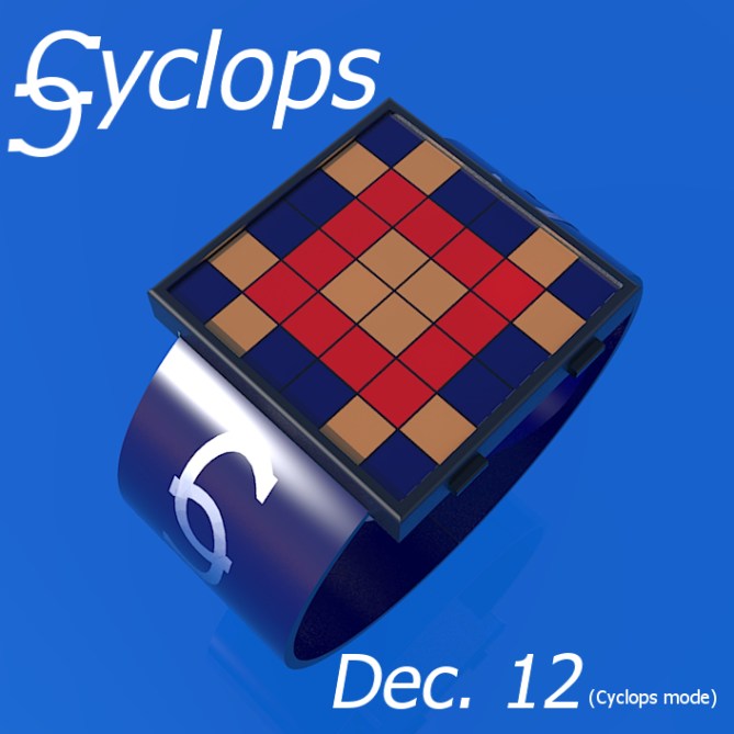
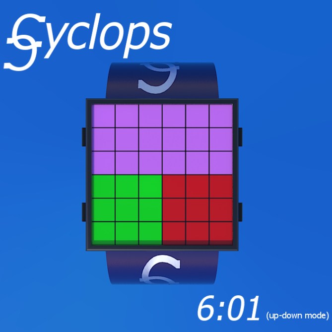
Design submitted by Dietrich from Australia.
“Cyclops” is a revamp of a previous design submission – the new design uses a square interface instead of a round one. Dietrich says: The original idea came to me when I was looking at designs on the Tokyoflash website and thinking that many of them are based on “codes” of some sort. Then I hit upon the idea of colour codes.
User can choose between two main modes: “Cyclops” mode and “Up-down” mode. In each one, three areas are colour-coded to represent the numbers from 1 – 12. After looking at the colour-code chart and a few example watch faces, it’s easy to see how to tell the time. The watch is also colour-blind friendly, because it provides date and time cheat modes, as well as an animated “time and date” mode with fireworks. The fireworks could optionally be set to light up every hour, drawing attention to the user.


Dietrich says: This watch would be a real attention grabber, because it’s colourful! I could see this watch catering to both genders, and to a discerning demographic. It would look both sophisticated and playful – not childish and not too “brainy”. Anyone who loves colours would love this watch.
This design has sophistication and practicality, as well as beauty. The colourful design makes it stand apart. The code is partially derived from “ROYGBIV” to make learning easy. The cheat modes and the “time and date” mode make it accessible to colour blind people and learners. An optional standby mode would conserve power. It is very unique.


Welcome back Dietrich!
Oh I support this concept! I have a concept in the digital factory that uses colors too and I hope this won’t interfere with this one.
I really like the different display layouts you are offering us. The case is nice and simple – nice for cubists and fans of geometrical arts. The lightning animation is very cool!
The one thing, that will also be the problem with my concept, is the color coding. I’m using the numbers 0-9 only having 0 as black and 1 as white and the other colors in spectrographic order. So color fans have an advantage. That’s still hard to learn and I expect some tears hehehe. Do you have a suggestion how to learn the numbers? I have realized, when I make up a story that includes the color and the number, I can memorize very well. The more absurd the story, the better it sticks in the brain hehe.
That’s why I support this, cause I think it’s possible to learn and then it’s time to have fun!!! Good luck D!
LikeLike
Thanks, Samukun.
I wonder what TF does when two design concepts are very similar? Maybe they can merge our designs? Anyway, looks like I am not scoring so well this time.
Maybe I am a bit biased, but I think my scheme is very easy to learn. It is far easier to learn than some of TF’s watches!! (I still struggle with the Hanko.) I really thought about this carefully…how can I make it easy to memorize? How can I make the colours distinguishable from one another? The colours actually follow the colours of a rainbow, loosely.
For a rainbow, it is ROYGBIV – red, orange, yellow, green, blue, indigo, violet. “ROYGBIV” is an acronym used in physics.
I changed this to ROYGB, pink, violet. That’s 1-7. Pink is the 6 ball in snooker. The reason I did this is because I thought indigo would get confused with blue.
I had to be a little bit inventive with the rest.
So:
0 = light green
8 = grey
9 = light blue
Then the scheme repeats itself for 10,11,12, but this time light green, red and orange (0,1 and 2) are combined with indigo to make 10,11,12.
In hindsight, I would possibly swap grey with black, meaning black = 8 – reminding of black ball in billiards. Also, silver/ grey is really the standby colour for lcd watches, black is actually on and using power (I think).
The cheat mode is just a “press the button” option. If one forgets the colour code, find out what the actual time is, then work backwards to the colours. There is actually no need for a chart, in my opinion.
Pity it is bombing a bit, because I think wearing a colours only watch would REALLY draw attention. I mean…where are the numbers?
Thanks to TF for publishing this, and thanks to others for their support and interest.
Cheers,
Dietrich
LikeLike
I like the simple geometry and look and the colours make it look fun. I struggle with the time telling method. The simple blocks turned off method (cheat mode) is fine but I without the explanaion printed on my arm I think I would find cyclops mode difficult. Maybe if you had a colour key on a removable panel on the strap for training purposes, then when your proficient you take it off (like training wheels on a kids bike) Best of luck! 😀
LikeLike
Hi Pete,
Thanks…yeah, it would take a bit of getting used to. The cheat mode is a push button option that quickly reveals the time. So with deductive reasoning one can be reminded which numbers correspond to which colours. Please read above explanation…perhaps it won’t be so difficult with this info in mind.
Cheers,
Dietrich
LikeLike
Wow, very cool, simply complicated or complicatedly simple either one more appropriate 😉
I think the overall design still has a room for improvement but I still love the idea! 5/y*
LikeLike
Thanks Firdy! Yeah…I thought this design might cause a bit of a stir. That’s what these watches are all about!
LikeLike
First, the color codes. Required a color chart to read the time… very inconvenient! Secondly, I only like the cheat mode. Cheat Mode, is simple enough to tell us the time clearly! For further development, my suggestion is concentrated on the Cheat Mode and better… no need to many colors! Simple is the best for this design!Good Luck! 5 stars from me!
LikeLike
Thanks Leonard. Maybe TF could make both watches!
Actually, my preference would be for the colour mode rather than cheat mode. One could select from either mode – ie. not just a quick on/off glance, but permanently in either mode.
Thanks for your support!
LikeLike
i like it alot..but it should be rectangle not square heeheh
LikeLike
An ok design, because when there is this many color to remember, i’m usually passing. ( and the color for the 5 and 7 are to similar ) The “cyclops” and “up-down” modes could be made using less squares. The “cheat” mode, could have a colored line dividing it into 4 squares.
If TF would make the up-down version with 4 squares, I would buy. ( then it would be 10 colors, and replace the 5 or 7 by a dark, almost black, blue, like the 10 )
LikeLike