Design submitted by Peter from the UK.
Peter says: I have noticed a trend with the latest releases of new watches that TF prefer designs that are simple/feasible and predominately LCD.
So I decided to create a watch which fitted this criteria. I had two designs in mind, one was a four dialled lcd analogue design that shared the same time telling method a “hunter time killer” and a new time telling method which involves lines dissecting a shape to create numbers of segments. I decided to merge these designs to create a very simple time telling method that would be very easy to implement. Division was born.
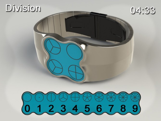
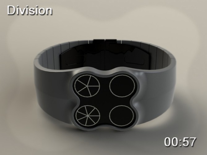
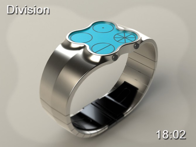
This design consists of four circular dials, the dials are dissected to create segments, the number of segments in the circle equals the number.
Empty Circle with no segments = 0, a dot in the centre creates one segment = 1, a line dissecting the the circle in two = 2 etc etc
The two top dials are for hours and the bottom two for minutes. The date could also be described in the same format.

The simple time telling method and circular dials suggested a simple and playful form. This hopefully will appeal to people who like simple modern products that have a playful style and understated appeal. This design would lend itself to a multitude of colour and material combinations which would suite young and old. The slim line case profile and smaller proportions will hopefully appeal to both sexes.
This design stands out form others due to its simple but funky looks, its unusual but easily read time telling method and its feasibility form a development and production perspective.


Thanks TF for adding this design to the blog! 😀
LikeLike
It’s so simple and looks so nice. I really like the divions and for me it would be easy to read. I think if one reads this watch for a while, one would have a better understanding of how to divide a pizza for 7 people. Mhhh pizzaaaaa. The 4 circles are one thing. The case is… not really another. It’s adapting to the circles! Very nice decision Pete.
I thought about another numbering system for the 0 and the 1. 0 means having 0 pieces, so a fully black circle would result. Hm, but this massively dark circle would but the display out of balance… 1 means 1 piece (of pie) so what you have for 0 now would be a good one. Anyway, I like what you did so.
5*/YES PLEASE/GOOD LUCK
LikeLike
Originally I used a blacked out circle for zero but it looked out of place. My other alternative for the one would be to have a line from the center of the circle to the outside (half a cut) this would still leave one slice.
I think after a while you would get that used to the circles that you wouldnt need to count the slices/segments, you would recognise them instantly.
Cheers for the feedback Sam! 😀
LikeLike
Yeah definitely would get used to it! No counting needed after some days! Will always remember this watch now when slicing up round food 😛
LikeLike
In your case thats quite often! lol
you are the cookie monster!
LikeLike
Love it, but I’d prefer the face design is simply squared or round. A very good and fresh concept, yup it is time in pie chart. Last but not least, goodluck and welcome to the blog!
LikeLike
Pie, cake, pizza its all good, if only the watch was flavoured too! lol
I think a square face with rounded corners would look good also .
Thanks for the luck and the belated welcome! 😀
LikeLike
Really enjoyed seeing this design. The time concept is elegant, clever, beautiful & cool.
1, 2, 3 & 5 just look great as shapes – I’m not sure why but they just satisfy me to see them – ha ha – is that strange?
12:35 is going to be my favourite time of day!
I think it would work great with e-paper as it could look exactly as you have illustrated.
LCD would need slight change due to the converging lines, but still possible.
LikeLike
Thanks for saying Toky, I was worried this design maybe too humble and not showy enough for the blog.
So its a relief to see it being well recieved so far.
Its kinda like a circle based “stencil”, which is probably why it feels familier and comfortable.
I know what you mean about the shapes, they are strangely alluring, maybe this means something on a subcouncious level? or just reminds you of friday night pizza? lol
I understand that with LCD the lines would have small gaps when they meet , I dont think that would detract (should have drawn it with the gaps in hignsight), e-paper would be cool, it would give the design some texture. Thanks for the feed back and the comment! I will now look forward to 12:35
LikeLike
I love concepts like this! Not sure why, the face colours don’t grab me – but that’s easily rectified. And since it’s a pie concept, I’m definitely getting hungry for this watch.
5*
Cheers.
LikeLike
If the display was LCD then there could be a wide choice of display colour, so hopefully something to suite all “tastes” Should have called it pie-chart! lol
Thanks for the comment and the 5! 😀
LikeLike
Looks really cool Pete. 🙂 5* and Yes!
LikeLike
ooops see comment below! lol
LikeLike
This watch in form of four-leaf clover will bring you luck, Pete!
5 * / Yes.
LikeLike
OO
OO
Cheers Mushy! Thanks for the 5! 🙂
LikeLike
Sorry Patrick, I miss commented. I hope I have the luck of the Irish for this concept.
Thanks for the comment, the 5 and the Yes! 😀
LikeLike
You been drinking Pete?
LikeLike
No I made the mistake of stopping drinking! lol
LikeLike
ah ah ah
St. Patrick forgive Pete
LikeLike
hehe St. Patrick! Thats gonna stick! I will call you that from now on! 😉
Cheers mate! 😀
LikeLike
Of Pete agreement, but in all simplicity, ah ah ah
LikeLike
GoooD!!! 5 * / Yes.
LikeLike
Thanks for the comment Timur! 😀
LikeLike
For anyone who is interested I have added a couple of different colour combinations to the Album on my fb page (PF Design) Check them out if you like:
http://www.facebook.com/media/set/?set=a.284328834982184.66833.159423137472755&type=3#!/photo.php?fbid=309378022477265&set=a.284328834982184.66833.159423137472755&type=3&theater
LikeLike
The original version of this had a cover plate that covered most of the face besides the four cricles of the display. I will render a couple of images tonight to add here, just in case this appeals to people who perhaps dont like the expance of display this version has. Stay posted 😉
LikeLike
I added a couple of images with the coverplate on to the facebook album. click the link in the comment above. 😀
LikeLike
I recommend to check the new images. I like the lates red/black version most.
LikeLike
Cheers Sam! 😀
LikeLike
http://techcracks.com/2012/05/division-lcd-watch-concept-by-peter-fletcher/
LikeLike
http://www.christianresidentialdrugtreatment.com/division-lcd-watch-concept-by-peter-fletcher
LikeLike
nice design. I prefer those with a cover plate, especially the red. I would buy.
LikeLike
Thanks for checking out the other images with the cover plates. Im glad that version appeals.
Hopefully one day you will get the chance to buy! Thanks for the feedback and the vote! 😀
LikeLike
I saw that two of my friends liked it on fb and 1 commented it . ( one of the pic )
LikeLike
Thats great, thank them for the interest if I havent already 😉
LikeLike
Time is nearly up for this post.
So a big thank you to all that voted, shared and commented and TF for posting it here on the blog! 😀
Cheers
Pete for the UK 😀
LikeLike
Good luck Pete! I think you did well with the digits… so cakey 😀
LikeLike