Design submitted by Logan from the USA.
Logan says: Chromodynamics is my most beautiful watch design to date. My goal was to display the time with a complex arrangement of colors.

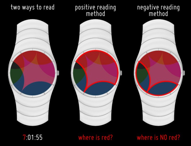
Chromodynamics is a fully analog watch with three semi-transparent disks that rotate like normal watch hands. The red and black disk is the hours hand, green and black is the minutes hand, and blue and black is the seconds hand (hours, minutes, seconds read in order RGB). The way these disks overlap creates complex color arrangements, but the time is still easy to read. In fact, there are two different methods for reading the time (see diagram — e.g., to determine the hours/red part, you can either look for where the red color is or where the red color is not). The case and strap are made from polished aluminum.
I think this display would also work well on a pocket watch.
Chromodynamics is for color lovers! For people who want to savour the passage of time. Psychedelic analog.
Complex but readable visuals from a normal analog mechanism.


Nice work Logan, looks great and works well. Takes a little getting used to, but once you master it, its easy.
5stars and Yes! Best of luck sir! 😀
LikeLike
Thanks, Pete!
LikeLike
Very nice Logan, it’s quite sexy too if you notice…. But does really work on artistic side and time telling is easy despite of it’s look. What do you guys think?
LikeLike
Haha, Firdaus 🙂
Yes, the time telling is actually easy. I’m glad you agree.
LikeLike
I like this color combination! Very beautiful! I want to buy a beautiful watch like this.
LikeLike
Hi Logan,
change the green disk to yellow, because it’s not lights, just paints (substractive color mixing).
LikeLike
Thank you for your comment. I didn’t use yellow for two reasons: 1) Because some indoor lights have a yellow tint, using a yellow filter will cause a greater change in the watch’s colors due to artificial lighting conditions, which isn’t desirable. 2) Green looks better, try it and judge for yourself.
For reason #1, all the filters should all be produced with spot colors of pure pigments, not with a standard CMYK process. We don’t want any yellow in the mixture.
LikeLike
really elegant, those color looks are just awesome, i just want one :p
LikeLike
Thank you, WatchMad!
LikeLike
I totally support the idea, its a must-have-on-the-wrist. I would start doing research now if I were tokyoflash. Research for actual color behaviour. For me, the current display is too pink. Could be helped with some experimenting I think. The pink goes well with the white case, that has to be said 🙂 As for the colored shapes, maybe the different discs should have different radii. Right now 9 exteme situations occur on the display border of which only 3 (the ones where two same colored shapes touch) are important. Finding the important points and distinguishing the colors could be simpler. Easy to say for me while I tend to make my displays kind of inconveneient 😉 But if I assume, TF made it like this, I would take the challenge and try to get used to it. So 5*/YES for the idea and good luck! A-na-log!!!
LikeLike
Thanks for your detailed comments, Sam! I worried a little about some people not liking the pink. This comes from the red being on top of the stack of disks. In my diagrams above, red is on top, blue in the middle, green on the bottom, with a white base plate, and all disks have 50% transparency. If you adjust the stacking order, you’ll get different colors, but I thought this order made the different color regions easiest to distinguish. However, you could certainly play with other colors and/or transparencies and see what you get. (Incidentally, I also made a design with no colors — just black and white of various shapes with different transparencies, but I thought that would be too difficult to read, especially under dim lighting.)
About the shapes, yes, you can definitely experiment. My preference would be to keep the radii the same, though, for the following reason: if the radii are different, then you can read the time by ignoring the colors, in which case the colors are just added decoration. I prefer that the colors have a functional purpose. So, I’d encourage experimentation with different shapes dividing the black and colored region of each disk but keeping the radii the same.
LikeLike
Pink shmink, thats only my personal taste 🙂 You can change the color order for other results – peace of cake. But a 50% red is only pink on white ground. The color mixes instantly with the one below it and there won’t be pink actually.
Oh thats a good point about reading without colors then. True, the colors should keep their function.
LikeLike
Red-green colorblindness makes it hard for me to appreciate this as much as I would wish…
LikeLike
Thanks for your comment. Now I wish I had presented my black-and-white version. Because this design relies not only on the colors of the three filters, but also their overlaps, I think it would be very difficult to pick colors that would work. If http://colorfilter.wickline.org is accurate at displaying what this looks like with red-green colorblindness, then the difficulty level goes way up.
LikeLike
As an artist, I can very much appreciate your coloured dial. It looks very nice, and is unique.
Diane.
LikeLike
Glad to have an artist’s perspective here.
LikeLike
Tutors have got really negative outlook about plagiarized papers. Thus, be very wary when buy online term paper, because you do not want to caught plagiarizing.
LikeLike