Design submitted by Cory from the USA.
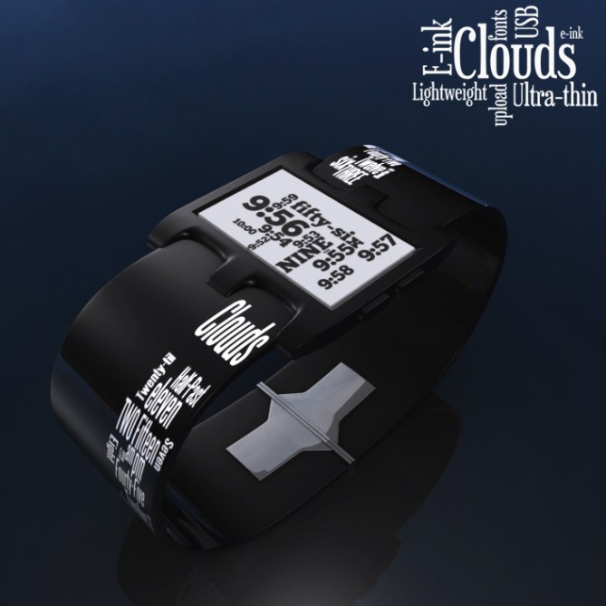
Cory says: Wordclouds are a new phenomenon that has shown up in internet culture. It seems that a watch using E-ink that displays a wordcloud of the current time or date in interesting fonts would be a cool thing to have on your wrist. From this idea Clouds emerged.
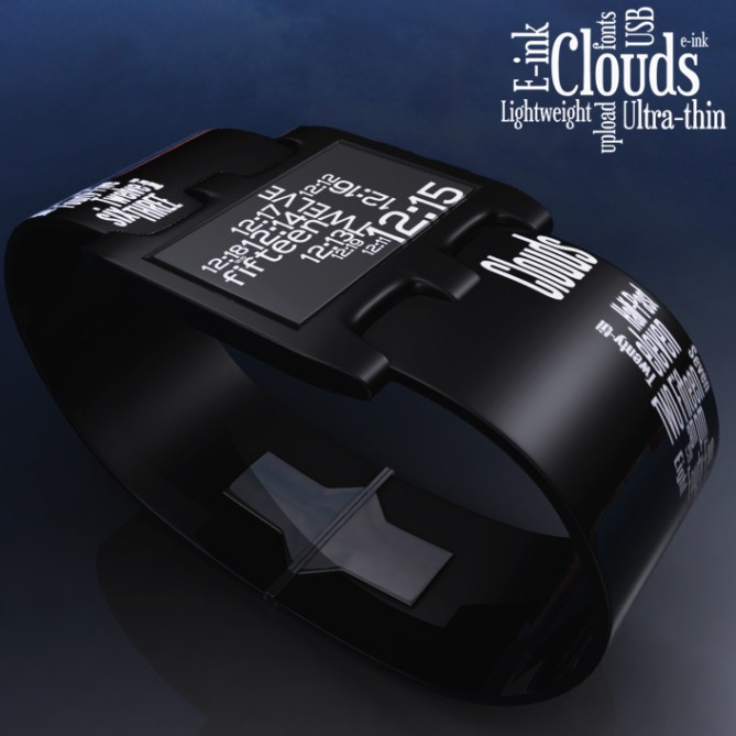
The word cloud always displays a ten minute segment of time. The current minute is the largest of the cloud, and the size descends for four minutes into the past, five into the future. Hour is always displayed in an all caps word, and minutes are always displayed in a lower case hyphenated word, or phrase like “half past” or “quarter till”
Those who enjoy the light weight, long battery life of E-ink devices would enjoy this simplistic design. The interesting patterns generated by word cloud software on the watch face will never be the same arrangement twice.
The semi-gloss polyurethane strap coupled with an ultra thin light weight case makes for an interesting combination. Any font can be uploaded to the watch via USB which makes for endless combinations of clouds.


Ultra thin ultra contemporary e-paper wordcloud watch? Bought! *waving with some € bills* This one’s using the full potential of e-paper! Cool straps too. 5words/YES
LikeLike
i like this a lot. great use of e-ink. i like the idea of uploading fonts too. 😀
5*/yes
LikeLike
nice watch Cory,very fresh thinking 5*
LikeLike
Interesting. Contemporary. Fashionable. Feel like want it 😉
LikeLike
Very cool, Cory! Nice job. I really like the thin strap and I bet this watch is very comfortable to wear. I also like the idea of endless combinations which makes each watch a little bit different.
LikeLike
Beautiful design but I don’t love the text on the band. A simple black band would suit in better in my opinion. As for the watch face itself, I love it. I love using a test clock on my Android phone and I think it’s an elegant concept for the wrist. Being able to customize the cloud is just icing on the cake.
LikeLike
Thanks Tokyoflash for adding this design to the blog!
Also, thanks for the remarks, all!
@Heather: This being my first E-ink idea, I wanted it to be something that made use of the technology, having it customizable with different fonts seemed like a no brainer.
@Sandra: I agree that it would likely be a comfy watch. I have several metal link TFJ watches, but I have to say that my Satellite’s PU strap is more comfortable, better for casual attire too 🙂
@Jascry: TFJ usually does several variations on a design, a plain black strap would be an easy choice.
LikeLike
Hi Cory,
I like the idea and the result looks neat, this feels very Tokyoflashy.
But for some reason its not doing it for me so I have rated it 5* but no as I can’t imagine me buying it. Best of luck tho! 😀
LikeLike
Its probably best to mention that my comment is in relation to the blog and TF’s existing range. If I were to see this in a shop at the right price I would probably buy it.
LikeLike
It’s always interesting to have new ideas for the “e-paper.”
Following is a question of taste.
All this deserves 5 * and Yes, for the good work and idea.
LikeLike
I like this design. I don’t know the limitations of e-ink but I think it would be cool if the face told the time and the strap said the day, date, month, etc. They could also switch so the face said the date and the strap said the time. I can see the cloud including the words for the time of day: morning, afternoon, night… and possibly the seasons. Make it change it up so it doesn’t always say the same information other than the actual time and it would be quite entertaining. 5* and very likely yes (depending on what TF did with it) Good Job
LikeLike
This one is getting interesting feedback.
@Pete: Tokyoflashy has become a great compliment on this blog 😀 Thanks for that!
@Patrick: Hopefully the taste of Clouds would be palatable.
@Swift: Bendable E-paper has been put forth by several companies, so I think in the near future having the whole band as a changing display would be feasible, and awesome!
LikeLike
Good Idea Cory ! I like your display. It could be a good app, too
LikeLike
I really like it! My favourite design 🙂
LikeLike
I like this. It is VERY unique. Unique is what I go for. It doesn’t have lights or bells etc but that’s ok because it is SO unique that collectors like myself would snap it up before it’s uniqueness.
LikeLike
Thanks Nico, hmmm… wordcloud app… :gears turning:
Ebu, favorite design! sweet! love to hear this 😀
Unique and sleek! It’s what I was going for, Ari. Good to hear.
LikeLike
Wow! Looks nice and well! I use already a Seiko EPD on my wrist and a Qlocktwo at home… to combinde both highlights is a great idea! If the price is well I will buy two of them immediately! Congrats for this very stylish design!
LikeLike
I think this is very interesting!
If it could be made in a narrower design as well,
it could be more feminine,
appealing to women, many of whom (like me),
find it uncomfortable to wear chunky watches.
It does look rather poetic though.
Diane.
LikeLike
@Hugii: Thanks for the immediate buy! Good to see you think it’s stylish 🙂
@Dianekmt: A more feminine version seems doable, perhaps a narrow case and strap would look more suitable on a lady’s wrist. Poetry as a timepiece 🙂
LikeLike
http://www.designbuzz.com/wordcloud-watch-creative-typography.html Design Buzzzzzzzzzzzzzzzz!
LikeLike
http://gadgetsmatrix.com/archives/wordcloud-watch/12039 Gadgetsmatrix took the red pill 🙂
LikeLike
I agree on all comments particularly the removal of the text from the band. It should be black.
Nice work.
LikeLike
I like the face of this watch. As many others have said, please remove the text on the band.
Also, a choice of black or white would be awesome.
LikeLike
@docrbob and Marco: This seems to have become a consensus of most commentators. I think perhaps a plain black strap with ‘Clouds’ as a small, unassuming indention on one side, and the ‘Kisai’ logo on the other would be more palatable. Thanks for the input 🙂
LikeLike
I would buy this masterpiece of design even with or without text on the strap. But this could be a good markting-issue itself: provide the watch with a black and a white strap without text and a white and a black strap with text and a small tool to change the strap.
I am so in hope that this watch will be produced in some weeks…
LikeLike
Masterpiece! wowow! Thanks so much Hugii! Glittering endorsements like this are wonderful to read.
LikeLike
http://tntfactory.com/wordcloud-watch-uses-e-ink-to-display-the-word-cloud-of-current-time/ TNT! Dynomite!
LikeLike
http://www.theplatform.info/feedcontent/article/129439 Dat Platform
LikeLike