Design Submitted by Heather from the USA.
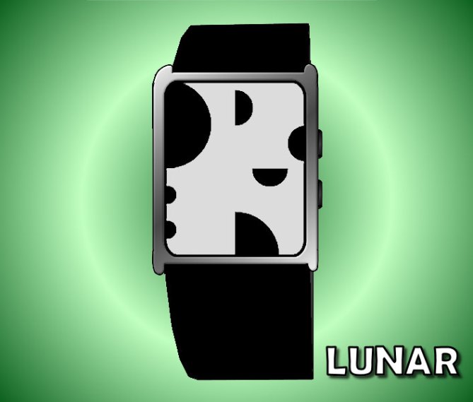
Heather says: My favorite type of display for a watch is a digital, read-at-a-glance, “always on” display that appears cryptic to the outsider. I started with a rectangular four-quadrant format for the digits. By cutting out circular pieces I found that I could create some recognizable yet abstract looking digits.
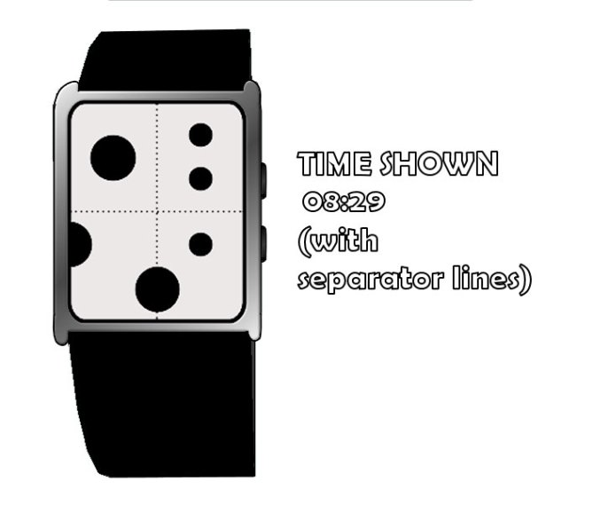
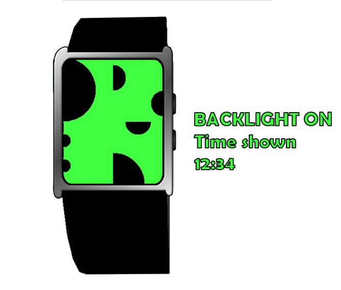
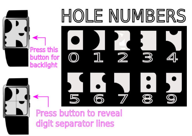
By placing the four digits into the quadrants without showing lines to separate them, the display appears to be simply an artistic looking pattern of dots – maybe swiss cheese, or moon craters. The eye can be trained to recognize the digits so that time can be read simply at a glance, but there is also a built in function to help. Press a button on the side to briefly reveal “digit separators”. This can be used either if you’re in a rush, or as training wheels when you start learning the digits. There is also a backlight for reading the time in the dark.
I see this design as being appropriate for both men and women – especially those interested in art and geometric shapes.
This design stands out because it is quite easy to read at a glance if you know what to look for, yet it seems absurd to an outsider if you tell them it’s actually telling time.


I cannot unsee the cow since I saw the concept for the first time 😉
The way how the numbers are created is very artistic and so is the full display. I would like a chrome background for the LCD numbers – would look very stylish. I get along well with the time reading – right up my alley! The optional digit separator lines are wise for training or if on is in a hurry. Hm, I tried to find a flaw, but the cow phrase was everything I got. 5*/YES
LikeLike
Thanks for your comment and vote, Sam! I never actually saw “cow” until you pointed it out — just cheese and moon craters 😉 But I actually LOVE your idea for a chrome background for the LCD numbers!!!!!
Now I want this to be made even more! LOL
LikeLike
I have exacly same comment as Samukun but I’ll replace “cow” with ” cheese”.
In my opinion though, the sphere shape and so so should one with white or whatever colors and black background would look more like lunar.
Cute and geeky numbers you got here!
LikeLike
Hey, Fir! Thanks for the comment and suggestions! I think different colors would be good too, but I was just trying to be simple and show the display idea of the digits. I especially like Sam’s idea of the chrome background! 😉
Cute and geeky is a good description. Thanks for that! 😀
LikeLike
so creative! people would have no idea how you can tell the time with that thing but hey, it works.
LikeLike
It’s a nice “cheese” intelligent, because in addition, it tells the time.
5 * / Yes!
LikeLike
I like the principle behind this concept. Its very criptic untill you know how. I think this version looks like cow print (its like one of those phycological tests) which makes me think this could be a fashion watch.
I would like to see a negative version (white on a black background) which would appeal more to guys I think. Also would this priciple work with square geometric shapes? Cos that would be preferable to me anyway.
Its a nice concept with bags of potential 5* but No from me in its current format.
LikeLike
Thanks so much for your comment, vote, and suggestions, Pete. I didn’t think this one would be for everyone – it’s a bit feminine in it’s current format, I know. But different colors is an easy change, and could make the watch more appealing to a larger variety of people. Fashion watch – yeah — maybe teenagers!
It would work with squares, but that would be very similar to my “Segmental” concept posted earlier…Maybe I’ll try that out though, and see how it looks. 😉
Thanks again!
LikeLike
Hi Heather,
Sorry I couln’t see the moon in your watch, maybe there was an eclipse….
I couldn’t decide on happy cow, or holy cheese! ( could be something to do with the milk connection, he he he). It is an innovative design with a ‘familiar’ feel to it. Very Mooooooooving!
Diane.
LikeLike
Hi, Diane! Thanks for taking the time to comment here! I saw moon craters, and thought “Lunar” was a more appealing watch name than “Swiss Cheese”. (I didn’t even think of “Cow”) 😉
It seems based on several comments here that perhaps I should have given more color options in my images. Well, live and learn. 🙂
LikeLike
hey i must say this watch is one of the best i have seen in the series so far
i really hope it will be published because i would buy it in minutes
good job 🙂
LikeLike
Hi,
This is fabulous and so creative. I wonder if you’d have other colors available? Heather, I would definitely buy this watch.
LikeLike
Thanks, Rachel! Other colors seems to be the suggestion of the day. Yes, I can see lots of other color options that could look pretty cool. I was just trying to get my display idea across, and assumed people would imagine the color possibilities…but I guess the white and black just leaned too much towards “cow”…
Thanks so much for your support!
LikeLike
Can’t read it properly!
LikeLike
Ckvirya, thanks for commenting. Are you saying that even with the digit separators, you can’t see the digits to read the time? It should help to look at the image that shows you what all the digits look like. You just read the four white digits (the top two for hours, and the bottom two for minutes). I hope this helps.
LikeLike
I really like it, the seperating line feature is a great addition, because reading it is a bit tricky 🙂 I would love to buy this watch.
LikeLike
Thank you to everyone so far on here who has taken the time to comment or vote on my design. It is greatly appreciated. Thank you for your support.
And thank you to Tokyoflash for posting this design to the blog. 😀
LikeLike
From a technical standing, this watch would most likely need to be an LCD matrix of dots. It would have more of a pixelated graphics look in that case, rather than the solid shapes seen in the images.
That is because each LCD segment must have a small gap around it & you cant have a shape overlapping another shape.
Alternatively an E-Paper display could be used & then it could be just as you see here.
LikeLike
Hello Tokyflash and Heather
This design is not 100% fit into my taste but at technical point of view, I believe it can be made of mirror LCD + EL back lighting resulting in smooth edges and capability of displaying contrast effect thanks to EL back light . I’ve steel sometime at work to redesign this concept to fit your explanation about LCD matrix. I believe it can be made of LCD.
I will not claim anything with my piece of work but please take a look on my interpretation of the idea that might look more “ready to be made”.
Thank you.
LikeLike
That’s almost exactly what went through my head Firdaus. On the ELL ON version, you wouldn’t see the black lines actually. The only “disturbing” lines you would have are coming from the small half circles that are embedded in the big one. Those would be white then. That’s quite ok. Let’s see how far this concept goes 🙂
LikeLike
Wow! Thank you Tokyoflash for your input. It’s nice to see your presence here on the blog. 😉
E-Paper would be interesting, because then those who prefer a black background could easily invert the black and white. But if Sam and Firdaus are correct in their interpretation, I still feel the mirror LCD would be quite intriguing!
Thank you so much, Sam and Firdaus, for your outstanding support of my idea! It is greatly appreciated. 😀
LikeLike
I second or third Heather’s comment, its nice to see TF’s imput/comments around here.
This plus the healthy debate about GMTA has really created a buzz around the blog today.
Its nice to see and has given me new enthusiasim.
I like the e-paper suggestion as it would give the user more choice regarding the style of display (white on black, black on white etc etc) and would help with the uni-sex ethos.
Keep up the good work everybody! 😀
LikeLike
That is not very hard to buy essays at the research paper writing services just about this topic. Thanks a lot for such nice theme.
LikeLike
I read this as: OMG THIS WATCH IS SO COOL. And it’s true.
LikeLike
I love the design, the idea behind it sorta reminds of movado watches…i think the chrome would look good. If it were made, I’d buy it
LikeLike
Thank you, Valencia, for your comment and support! 😀
LikeLike
this is cool, I would definitely wear this! I love the concept of the wearer being the only one able to tell the time… them and whoever else owns one… which would be virtually no one! 5* great watch!
LikeLike
Thanks, Torsten! I agree about the concept of the wearer being the only one able to tell the time at first! That’s a big part of why I’ve been a fan of Tokyoflash for so long – most of their watches are like that 😉
Thanks so much for the comment and vote!
LikeLike
Great display !
LikeLike
Thanks, NL1, for your support!
LikeLike
This is very clever indeed! I love the way your designs are a fine balance between cryptic and simple. I don’t find the overall appearance completely satisfying though. It does remind me of Swiss cheese or moon craters, something i’m not sure would be cool enough to wear. I would love to see a refined version of this with a cooler appearance. Well done again, looking forward to your next idea!
LikeLike
Avatara, thank you for you compliments, and also for your honesty. I can see how it may not have a “cool” feel in its current state. Would you like it if it was mirror LCD, as some have suggested above? (I do) Or, do you think maybe different geometric shapes, as Pete suggested?
Thanks again, and I’ll do my best to keep coming up with ideas that please! 😉
LikeLike
I LOVE YOUR WATCH! My son’s birthday is coming up and he would love to own this watch. It is definitely cool and original. Good Luck Heather! I hope it gets made.
LikeLike
Thank you so much for your support, Ally! If it is chosen to be produced, I doubt it would be released in time for your son’s birthday this year, but who knows? Maybe he can have it for his birthday next year! 😀
LikeLike
Very clever, I know I’d definitely wear this watch. I’ll buy it if it gets made. I would probably have a collection of your watches if each one got made 😛 TokyoFlash please make it !!!
LikeLike
Eliza, thanks so much for taking the time to comment on my design! Wow! That’s quite a compliment – it would be so awesome if TF decided to make a collection of my watches! 😉 Comments like this make my day! Thanks again! 🙂
LikeLike
Wow! Another cool design by Heather. I agree with Eliza if each one of your watches were made I’d buy all of them. It would be funny to have a watch that only the owner could read easily and quickly. Nice Job!
LikeLike
Thanks, Jacob, for your support! I hope you have the chance to do that some day! 😀
LikeLike
Nice job, Heather! It is creative. I have never seen a watch like this before. It is nerdy and chic at the same time – appealing to more people. It sort of reminds me of the Dalmatian too, which I like!
LikeLike
Thank you for your comment and support, jcsable!
LikeLike