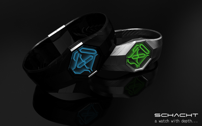
Design submitted by Sam from Germany.
Sam says : The inspiration for this watch comes from the infinite tunnel you can create with two mirrors and from the way, the Kisai 3D Unlimited handles LCD. My idea is to combine the tunnel effect with a colored LCD display and an interesint way to show numbers.
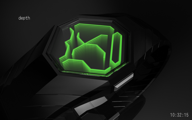
There are four rhombically aligned numbers of which the two top ones show the current hour and the two bottom ones the current minute. The seconds are shown by crosswise positioned numbers in the center. All six numbers form a display that looks like alien hieroglyphs or a circuitry – cryptically looking but actually simple. By placing a mirror below and above the display, it gets visually repeated and forms a vertical tunnel, “Schacht” in german. The top mirror is transparent on its backside and allows us to see the display.
It’s a watch for anyone with a geeky side and a sense for cryptical ornament.
The watch looks confusing at first but isn’t hard to read, once you get used to it. The tunnel effect gives the display an interesting and eye-catching depth.


the layout would take a bit of getting used to, but I’m digging it.
LikeLike
Thank you 🙂
LikeLike
More infinity!
I like the alien circuitry look. It’s cryptic but readable. The tunnel effect creatively adds depth to the cool display.
I luv it 😀 Hope you do too!
Thank you Tokyoflash for posting my concept!
LikeLike
Cryptic. I’m digging it too. Hrmmmm… Wonder if gdad63t24t2452y8i25uoiu5iouousfsj &&^%%Y…. This one has a strong theme and has more Tokyoflash feel – just my personal thought. A bit complicated, but it is awesome display! 1 star + 6 stars – 2 stars! and Yes!
Voted 😉
LikeLike
Oh thank you Fir! I didn’t quite get the gdad…%%Y passage. Now I’m curious 🙂
LikeLike
first, Sam, congratulations on being the last posted design of 2011!
here’s my view on this one:
+the infinity effect has already proven to be popular, and making it digital is a great twist.
+digital and always on LCD displays are easy to read at a glance – i love that.
+the digits are new, and the arrangement is new – very strange looking at first, but also very readable as you say – your animation is very cool!
+although the seconds are a bit harder to read, that doesn’t even matter because the fact that they are always changing is just an awesome addition to an already cryptic display.
+the backlight is pretty neat!
+i prefer the black, with either blue or green display
+/- i personally don’t love the straps, but that’s just personal taste – the key here is the display – if TF wants to change the straps, they will. also, i would adjust the 4 slightly just so it’s not so easily confused with the 9.
5*/yes
LikeLike
Oh NOOOOO!! Why it’s Sam??? Just realise it, I’m so jealous now!
LikeLike
YEEESSSS mwahaha… I’m glad I can still surprise.
LikeLike
Yepp, I second the comment about the seconds. And since they always change, it’s the perfect chance to get used to the numbers. Sure, it make brains twitch at first but what is the wearers initital brain twitch is the other people’s mind blow.
Yeah the straps are just a carrier. Imagine whatever you prefer 😉
Actually the bottom segment of the 4 could go. 4 should have a vertical ending. <- A note for the hopefully future designer.
Thank you for all the other points and generally your detailed review and the rating!!
LikeLike
I wonder who’s design will be the first of 2012?
LikeLike
This one’s passing the barrier 😀
LikeLike
speechless,5* yeahya
LikeLike
Thanks G!
LikeLike
Оптимизация сайта здесь
LikeLike
Top5? This concept? Cool!
LikeLike
Still a nice watch of Sam, with similarities to the latest design of Heather and Firdaus in typography and with that of Pete in the belt, which does not mean she is not beautiful, but it ‘is somewhat in the same vein (personal taste).
I like what Sam does, so I allow myself this little comment.
This model deserves 5 * / Yes, work looked after as usual!
LikeLike
The objects depicted in these images are fictitious. Any similarity to any watch concept or product is merely coincidental. 😉 Yes, there is a slight parallel in the approach to these concepts. Oh the straps are just simply segmented, they look like hundreds of straps I guess, hehehe.
Thanks for your critical view and your honest and nice words and the rating 😀
LikeLike
Very beautiful lokk of the future and I love, “can be a bit difficult to read”, but the pleasure of wearing a watch like that, yes yes yes (5 stars) 🙂
LikeLike
Yes thank you Alain!! And dont forget: it’s always on!
LikeLike
Hi Sam
Loving this design! The numbers share a style with my edge watch especially with the extruded feel but with your design is a vitual depth as apposed to a physical one. Infinity tunnels seem to be a popular theme at the minute although probably has more to do with the random order of posts.
My only slight dislike is the crossing of the seconds, if this was my design I would have just had them in the same style as the hours and mins just at a different angle or something. But thats a subjetcive matter.
Very TF and hopefully makeable!
I cant think of a clever equation so will just give you 5 stars and Yes Sir
LikeLike
There is indeed a sudden interest in infinite mirrors it seems. I’m glad that I found a different way too. The numbers are actually a derivation of the ones I used in my On Line concept. And you will see, I’ll ride that horse until it retires xD
Yeah the seconds. I say, seconds in general aren’t seriously needed at all (pointing at the watches in the shop). Here they are an interesting looking bonus making a properly filled display and serve a purpose in the meantime (telling seconds). Having them here doesn’t mean I wanna compete with a stop watch 😉 It’s all a matter of argumentation. Another angle would mean another size to fit in or other distances between each number. So having one thing assumed perfect reveals imperfection around it suddenly. Actually here it’s super relaxed: all numbers have the same size, display harmonically filled. (dramatic pause) But as you say, it’s subjective. There is always a pro and contra 🙂
Thank you Peter for telling me your impression. And thanks for supporting!
LikeLike
Ha! At first I was like WTF? and half asleep, so I couldn’t read the thing, but after looking again is surprisingly easy, and very cool looking.
LikeLike
Thank you Ace! That’s pretty much the effect I was hoping to achieve.
LikeLike
i think it’s your second best watch design well done sam! i would just change the strap
5 * and a happy new year …
LikeLike
Thank you Rachid! Happy new year to you too!!
LikeLike
another GREAT design.
the whole idea of a watch with “depth” has been done i few times recently, but knobody else seemed to REALLY nail it…….you did. 🙂
5/y
LikeLike
when i say depth i’m talking about the mirrors btw 🙂
LikeLike
Thank you diclonius! I think, and the designers of the other mirror watches might agree, that this effect hasn’t been used enough yet 🙂 It’s so simple and effective.
LikeLike
Love it! Wrap one up for me. 🙂
LikeLike
Okidoki 😉
LikeLike
Although I like the look of this watch Sam (your graphics are always brilliant, like Pete’s and a few others), I think the digits are a bit clumsy, especially in the middle. That said I still like their overall appearance, which is slightly contradictory I know. 🙂 For me this is worth 3.5. I can’t give this so you’ll be glad to know I’m not going to vote. 🙂
LikeLike
Cool, thanks for your honesty. It would be boring if everybody liked the same 🙂
LikeLike
I just wish more people would be honest on here Sam.
LikeLike
Seems they are here 😉 But I think I know what you mean…
LikeLike
hehe the digits kind of remind me of chromosomes. Sorry Sam I was just having a bad day.
LikeLike
luvv it! I really like the strap design, the way it fits with the watch is glamorous! The only concern I have is that the overall digits (or rather pointer thingys) are a bit off with the rest of the design. But still, I think it looks great!
LikeLike
Hi moose! I’m not sure what the pointer thingies are, but I see, the numbers dont fully fit your taste. But cool you like the general look 🙂 Thank you!
LikeLike
Awesome Design!
I would certainly buy one or even a couple if it got built. I’d expecially like to see it in matt black aluminium as the angular surface of the case looks very “Stealth” and it would also add to alien-ness of it too.
LikeLike
Cool thank you Ben!! What LCD color would you like with the black aluminium?
LikeLike
great design. looks very cool.
LikeLike
had to come back and hit you with another 5*, this watch is cool, I would happily pay $200 if it could be made as seen here. YOU DA MAN!!!!!!
LikeLike
For this watch I would happily do the dishes for a month! lol (oh crap I already have to the dishes anyway) You know what I mean! 😀
LikeLike
Thanks @ Garbiel 🙂 Cool Gordon, hehe. LOL Pete
LikeLike
LOVE IT, best “infinity reflection” one in my oppinion. 5 stars and a gargantuan YES
LikeLike
Thank you Charles! To infinity and beyond!
LikeLike
Amazing watch! 😀 I would get one for sure! 🙂
LikeLike
Thanks for letting me know Kr☺sager!
LikeLike
Endless 5, forever yes! Black/green what i want!
LikeLike
😀 Muchas gracias senior!
LikeLike
My favorite design on the whole site! I would purchase it right away!
LikeLike
I’d buy it in a heartbeat.
Sooo stylish.
LikeLike
Woohoo, Harrison & Mdk7! Thank you for commenting!!
LikeLike
Thank you everybody for your thoughts! It’s cool to get such feedback! Makes me wanna do more 😀
Stay cool, stay critical, eat cookies.
Sam from Germany
LikeLike