Design submitted by Lloyd from Australia.
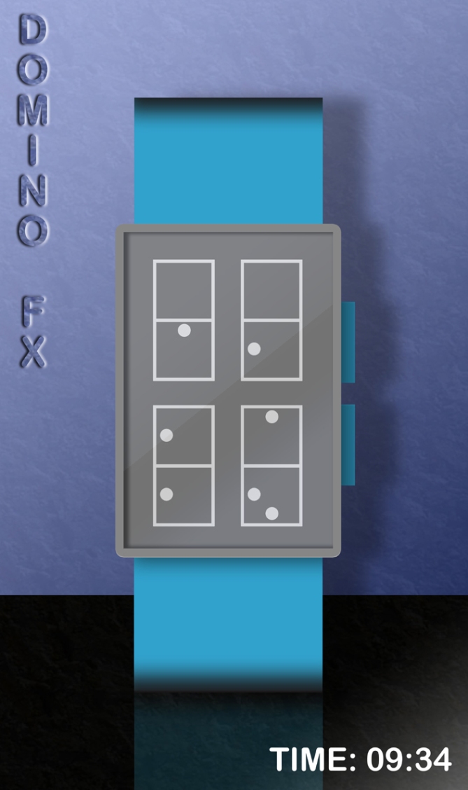
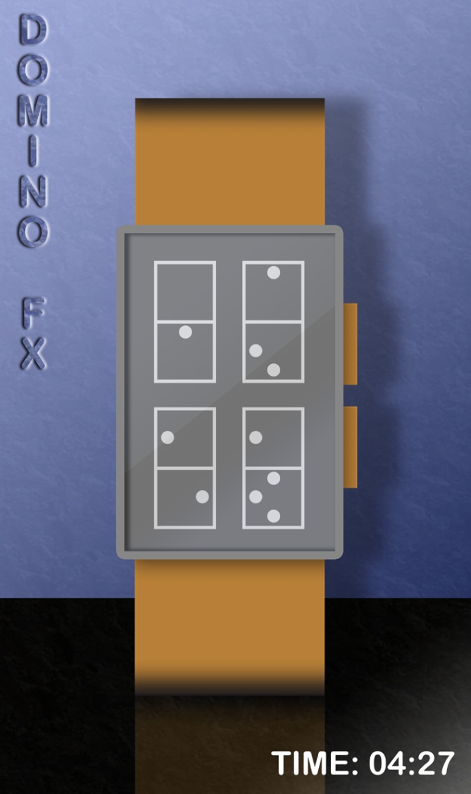
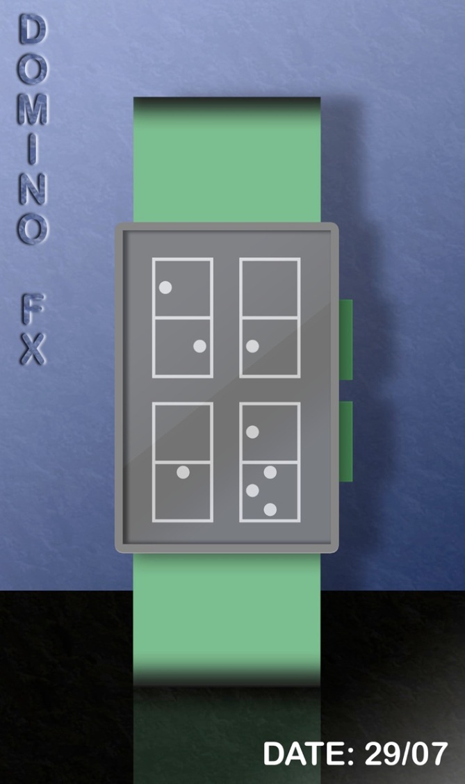
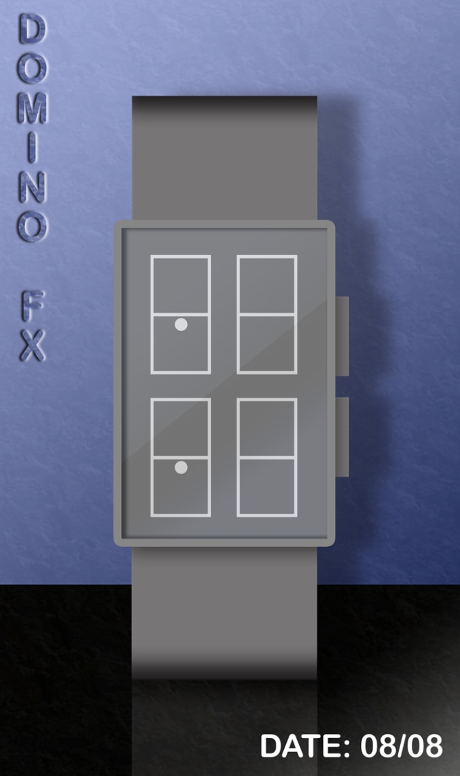
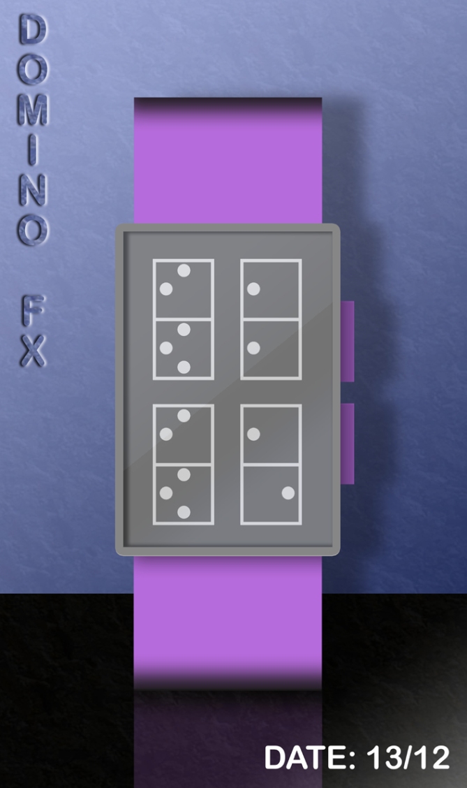
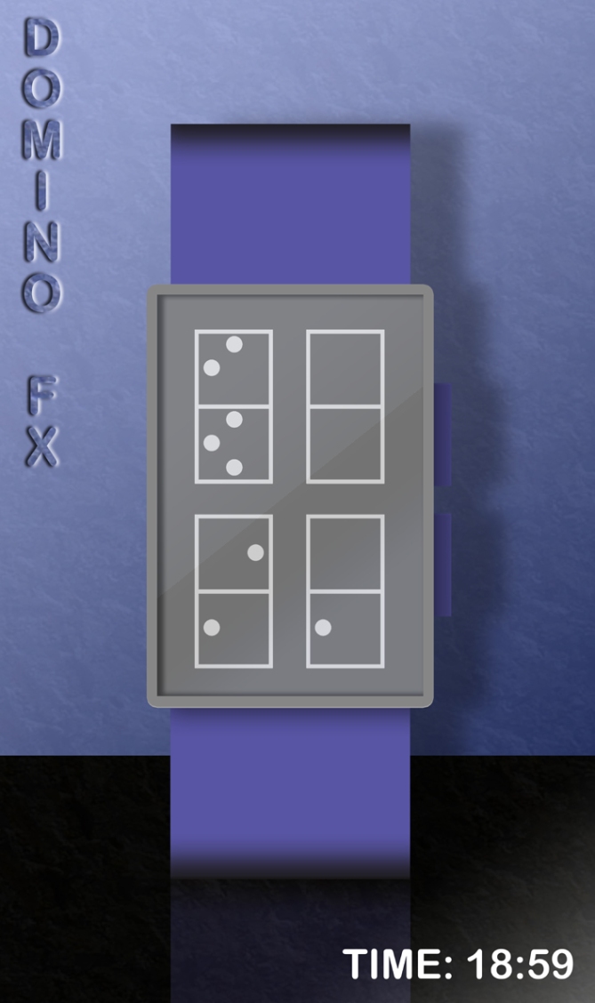
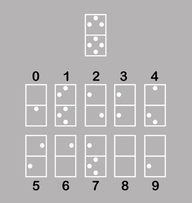
Lloyd says: “This watch design is based on one of my puzzle ideas and, although it looks baffling initially, is actually incredibly easy to understand. It is called “Domino FX” because of the 4 domino-like figures in the display. However, these are not really dominoes, but digital 8s with up to 7 spots arranged inside each.
Up to 3 spots may appear in the top half and up to 4 in the bottom half. These spots indicate which, if any, of the 7 straight lines that make up each 8 must be omitted to make the time or date visible. You know when a line must be omitted because a spot appears right next to it.
The strap is made from a man-made material and there are 2 buttons for displaying the time and date. The watch is USB rechargeable via a computer. I think this watch would appeal to anyone who is interested in quirky things, games, puzzles and fun, modern gadgets. I think this design stands out from others because of the unique display which is both perplexing and simple at the same time. The design is also minimalistic and understated.”
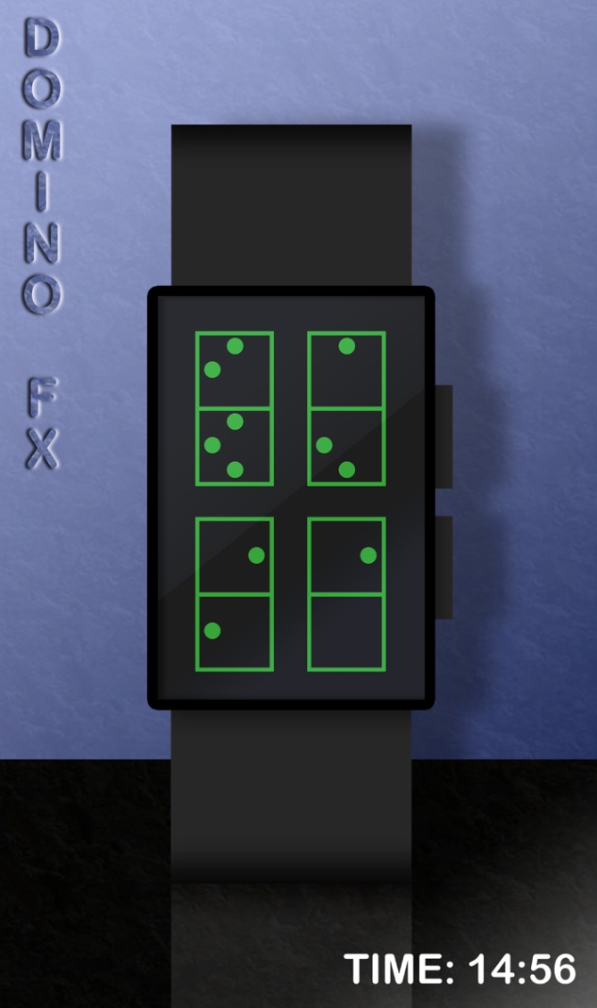
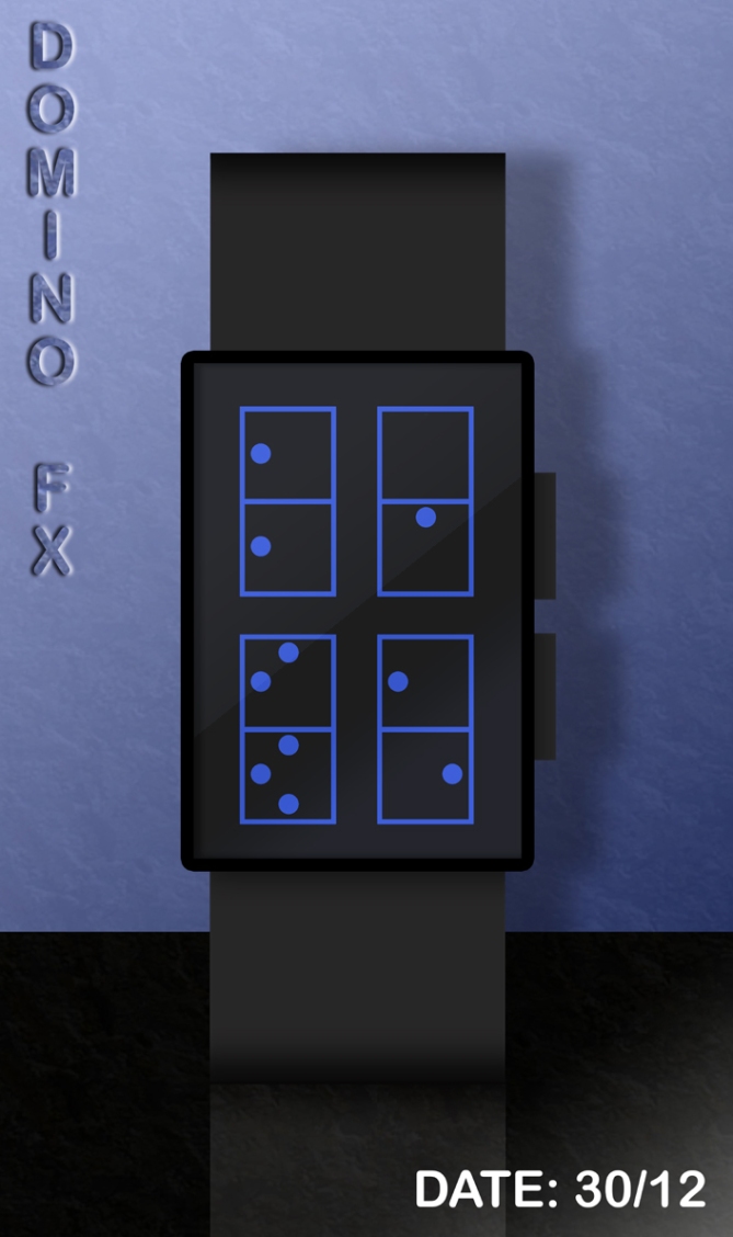
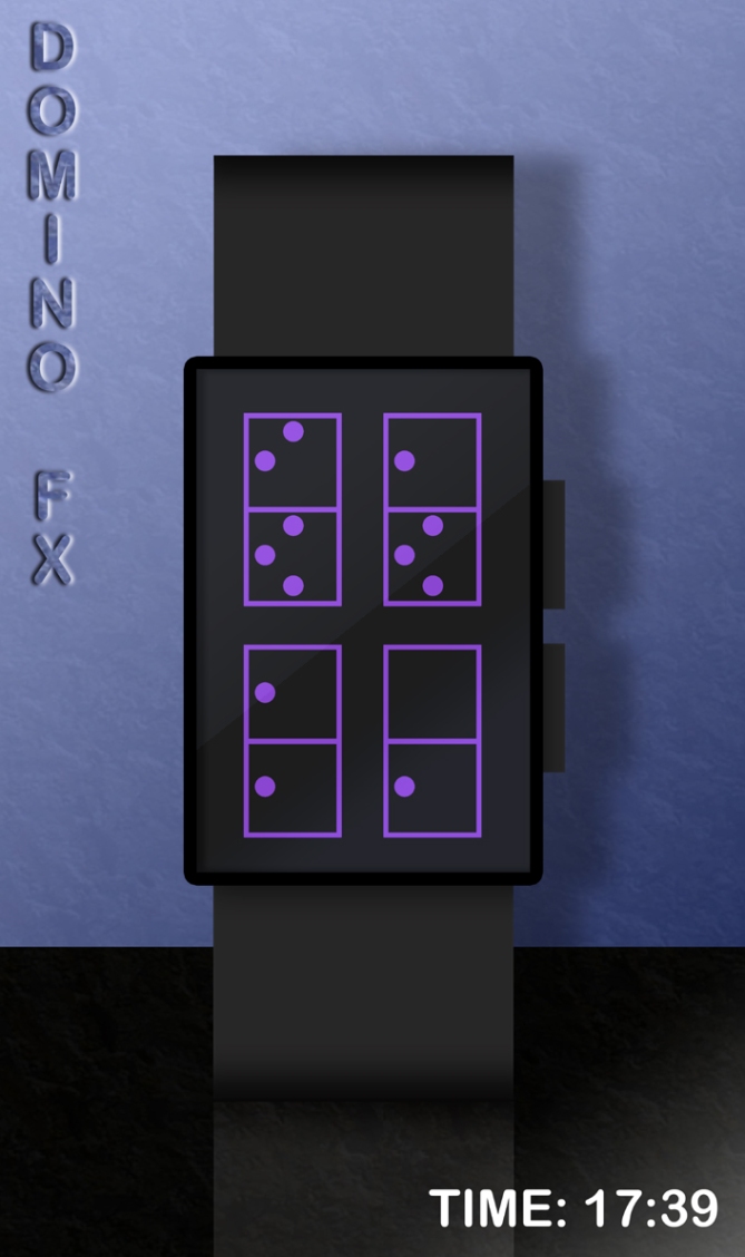
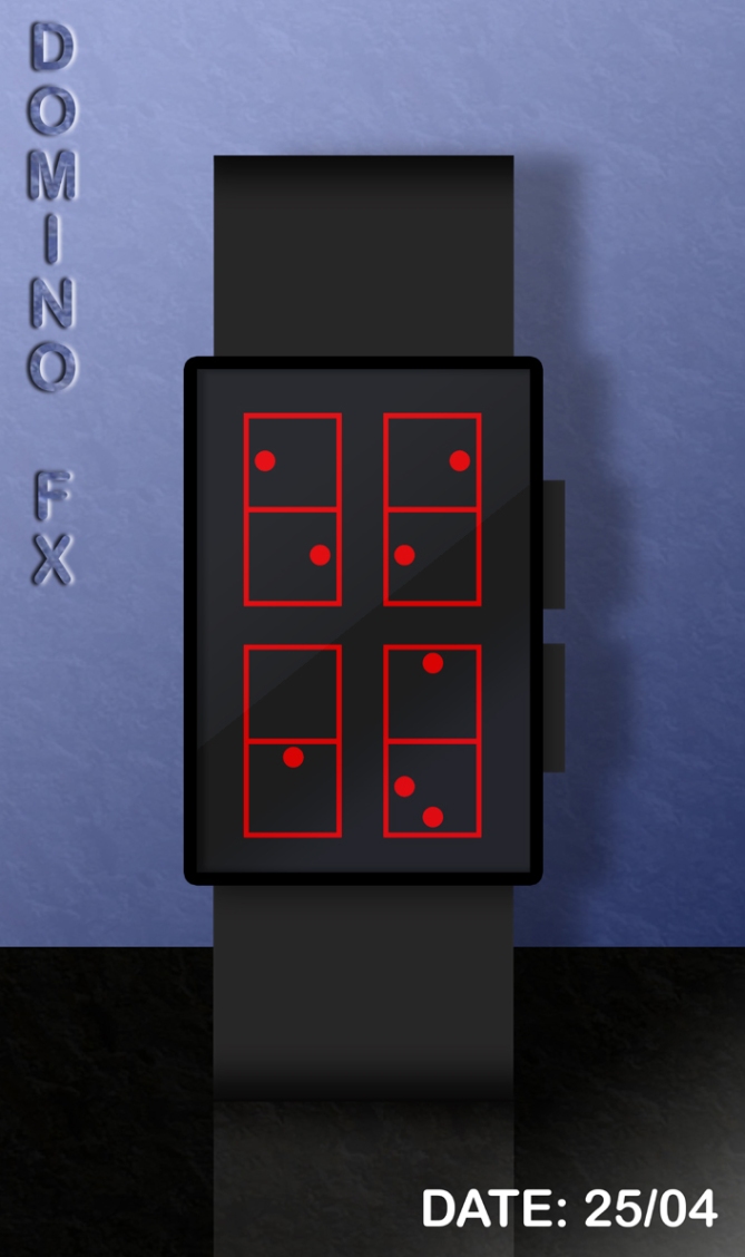


Great simple, vivid and jolly design … love to have this on my wrist … nice colors …
LikeLike
Thanx Ranjan. 🙂
LikeLike
I like the sleek design, and the subtle colours. It is clear to read, and the display would baffle the uninitiated. A real talking point, and cool design.
I think people would see this as quite a fashion statement, without going ‘over the top’.
I would wear it!
Diane.
LikeLike
Thanx Diane. 🙂
LikeLike
Let’s see:
+Looks Great
+Easy to read
+Variant friendly
Could have a winner here.
Oh, before anyone says “Hey! that’s been done before”, may I advise you to: Shut. Up.
It’s just childish.
LikeLike
Thanx Naggarok. 🙂
LikeLike
This watch is great and so cool! I really like the blue and black one. It definitely hasn’t been done before. Lloyd is a complete genius (And did I say it is so COOL!!!!)
LikeLike
Thanx Ahsoka. 🙂
LikeLike
Really awesome puzzle to keep time! J’dore!
LikeLike
Thanx Ai. 🙂
LikeLike
What no link from “Robert” showing something with the vaguest of simularities?
I like this Lloyd, simple but criptic but easy to learn! supprisingly intuative! Black and Red for me!
I was hoping there would be a animation! 😉
5 stars and of course yes!
LikeLike
I’m tired, would only be shouted down! Otherwise, I like that! The principle is not copied, only the same name. Cryptic like Heater’s watches.
I’m not so evil yet! 🙂
5/y
LikeLike
Its not my design but I thank you anyway! 🙂
LikeLike
Thanx Pete and Robert. 🙂
LikeLike
I was feeling too lazy to do an animation. 😀
LikeLike
it reminded me of you pete but it is different enough i suppose
LikeLike
Yeah its totally different from mine, which is good cos mine did terrible! lol
LikeLike
Yeah I wonder why that was Pete. 😉
LikeLike
I like the cryptic quality, but I don’t like dominos, so the basic look doesn’t work for me. It’s a neat idea, though, that can perhaps be adapted to have a different look…perhaps something that the eye can more easily adjust to…? maybe an extra line segment where the lines should be omitted instead of a dot? (and the rectangles not completely closed…)? I dunno…just ideas… 5* for cryptic reading creativity, but a “no” from me as is…
LikeLike
Domi-no worries Heather. 🙂 Maybe I should have used the original idea which you know about and just changed the look of that watch. 😀 I suspect the domino look may not be very popular but it would be easy to modify them so that they don’t look like dominoes. Domi-NO!
LikeLike
Oh once I understood the numbers, it worked pretty good. Like on any tokfoflashy watch, one has to be willing to learn. A negative mode would be helpful – helpful to understand the numbers step by step and for times, you’re in a hurry. That’s what people sometimes tell about my concepts, and today I’m the one who feels that way 🙂 The domino look could be a tad stronger. Maybe letting the dominos have another color than the surrounding area… more prominent. I say maybe, because the simple look has defnitely a certain appeal. I must say, your crypto light is a tough competition to your other concepts, and to the rest of the blog. But maybe TF sees something in this one. Good luck Lloyd!
LikeLike
Thanx a lot for taking the time to leave feedback, Sam. 🙂 It’s funny, I thought the display was really easy to read by TF standards. Anyway, I’ll try resubmitting the original idea with an improved case some time. Maybe I should send in another idea similar but different to the Crypto-Lite one too. Look forward to seeing your next submission on the blog.
LikeLike
Hi, Great collection I am impressed by the efforts you have put in to display these watches. Add one more here G-SHOCK GA-110FC-2AJF. It is available at http://bit.ly/crazybluegshock
LikeLike
Great information, I’ve been looking for something like this for a while now. Thanks!
LikeLike
***/:'( it’s too hard to read for me. I like the approach of transforming the normal numbers into something artistic, but this time it’s not my cup of tea. Even if it were easier, the look of the numbers isn’t convincing. as I can see, you are a very creative person. I wonder what’s coming next!
LikeLike
No worries Acantha. 🙂
LikeLike
Actually, Acantha, I don’t think you quite got the idea of the digits, judging by what you said, because you should be able to see regular digits.
LikeLike
I l ike the design and would wear it. My acquaintances would imagine it was an odometer or heart rate monitor and be afraid to ask.
LikeLike
lol Thanx Lynn. 🙂
LikeLike
http://technabob.com/blog/2011/12/13/domino-fx-watch-concept/
LikeLike
Thanx Pete. 🙂
LikeLike
http://www.tomsguide.com/us/Tokyoflash-Watch-Concept-Domino-FX,news-13511.html
LikeLike
I LoooOOOooove this watch. You guys gotta make this thing so I can buy. I have been telling all my friends about it and its simple Domino design that looks like nothing but a set of domino’s yet it tells the time.
LikeLike
Thanx David! Nice to know someone likes this design. 🙂
LikeLike
Best of luck with this one Lloyd! 😀
LikeLike
Cheers Pete. 😉
LikeLike