Design submitted by Heather from the USA and Sam from Germany.
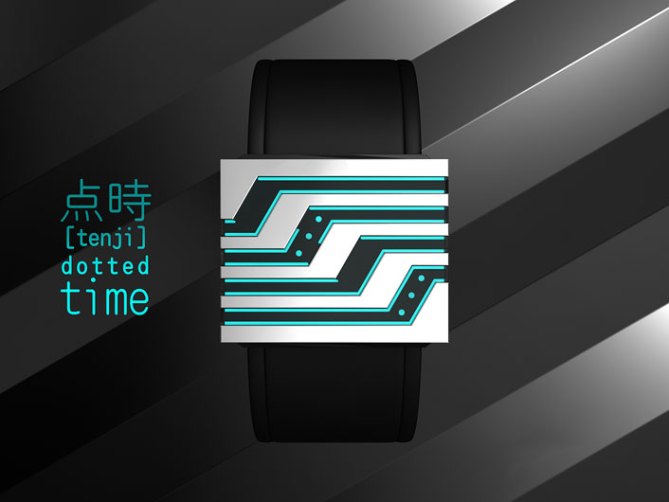
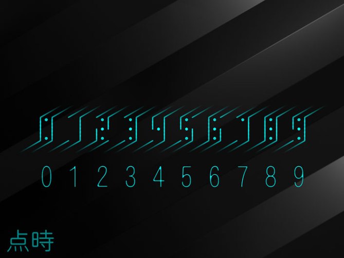
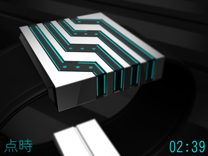
Heather & Sam say: Tenji (点時) is Japanese and can be translated to “dotted time”. The basic idea is using classic digits and replacing each horizontal line segment by a dot. Sam and Heather had a collaboration before and after sharing some thoughts about the basic idea, another collaboration was born.
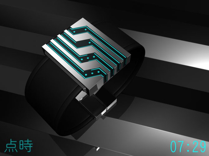
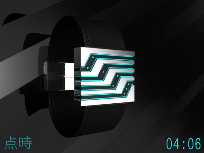
Time telling on the Tenji is pretty simple. The digits might look unusual at first, but once you know how they were made, it’s easy. They are aligned in a dynamic angle, so you may tilt your head slightly to the right to read the four digits along the diagonal of the case. It is an always on LCD display on top of a neon cyan background. Each number is embedded in a black band-like inset that wraps around the edges of the minimalistic cubic case. The slight resemblance to the Kisai Sensai was highly welcome. The soft silicone straps make a nice contrast to the metallic case.
Anyone who loves ultramodern and futuristic unisex watches and prefers an always-on, read-at-a-glance display will love this little beauty!
Tenji expresses LCD in a new stylish way and is a fresh mix of geekiness and minimalism.


Nice Colab guys, very sleek looking and simple but cryptic time telling method. Can’t find any negatives! Good work 5* and O’yeah!
LikeLike
Hey, Pete! Thanks for the comment and vote, and for sharing the link!
LikeLike
Thank you Pete!!
LikeLike
Thank you, Tokyoflash, for posting this design to the blog! 😀
LikeLike
Thank you indeed. 😀
LikeLike
Love it!
The square block type case & rubber/leather strap look great & with blue LCD it looks very futuristic.
Time telling is great. Regular digits with a twist, its so easy but sneaky at the same time.
Definitely would wear this.
It’s kind of perfect as it is, but I always look for a way to improve or criticise the designs I see on here. I hope you don’t mind.
The only thing I could say is if you experiment with the lines & dots a bit.. maybe thicker lines… then it might be easier to recognise the numbers at a glance. (a smaller gap between dot & line helps the brain fill in the missing parts easier)
I wouldn’t want to disturb the excellent design you already have, but very thin LCD lines, right next to the edge, might be hard to see in reality. (due to shadows etc) & just a slight thickness change could make a big difference.
LikeLike
Hey, Onisan…Constructive criticism is always welcome. I agree about the lines – I feel it looks good now, but just a bit thicker could do the trick to make it a bit easier to read for some. Especially “in reality” when Tokyoflash decides to produce it, of course. 😉 (as you said, due to shadows…nice idea)
LikeLike
Oh yes please, constructive critiques are gold!
Yeah, some little tweaking here and there is allowed. Heather and I also tweaked around and were content at a point. If Tokyoflash take it, they will have their own testing time until they are happy. We don’t know about about the shadyness actually. I am suggesting a neon bright background. You know, like those text marker pens. Those colors always stand out, even at weak light. We’re idealistic here of course, hoping it would work. Adding more space around the numbers wouldn’t harm the concept.
Thanks alot Oni!!
LikeLike
hey Miss Sable! I love your watch design! Hope you get it published!
LikeLike
Thank you, Sasha! 😉
LikeLike
hey Mrs. Sable, awesome design, just one thing. Maybe lessen the angle of the tilt a bit, so it’s easier to read. Overall great design!!!!!!!!!!!!!!!!!!!!
A++++++++++++++++++++++++++++++++++++++++++++++++++++++++++++++++++++++++++++++++++++++++++++++++++++++++++++++++++++++++++++++++++++++++++++++++++++++++++++++++++++++++++++++++++++++++++++++++++++++++++++++++++++++++++++++++++++++++++++++++++++++++++++++++++++++++++++++++++++++++++++++++++++++++++++++++++++++++++++++++++++++++++++++++++++++++++++++++++++++++++++++++++++++++:-)
LikeLike
Hi Heather its Matt nice watch design
LikeLike
This is such a cool design! It took me a minute to see the number patterns but, once I did, it looked sooo cool. Great job!
LikeLike
Thanks for your comment and support, Lily! 😀
LikeLike
Thanks for trying… and succeeding 😀
LikeLike
very cool!
i’d get it….. 🙂
LikeLike
Well, thank you, diclonius! I’d get one too! 😉
LikeLike
wow this is great and it lokks right up tf’s alley, good work guys 5* oh yeah
LikeLike
Hey, Gordon! Yeah, we did aim for something that would be up TF’s alley… Love to make people go “wow”. Thanks for your comment and vote!
LikeLike
Creativity at its finesttttttttttttt
LikeLike
What a nice compliment, Justin! Thanks so much for your comment and support 😉
LikeLike
Really nice design… when will it be available?
LikeLike
We can’t say at this moment. Let’s see how it goes along here (comments, rating) and if Tokyoflash can imagine it in their catalog. With some luck added on top, this watch could become real… Thanks for showing interest 🙂
LikeLike
WTF 3.8 was 4.2 only a couple of hours ago!
LikeLike
Ouch >.< That silly guy still seems to have too much time.
LikeLike
Ok, that was unprofessional, but I think I made a point 🙂
LikeLike
This message is from designer, and customer of Tokyoflash who actually purchase watches, and will be continuing to purchase only the awesome from Tokyoflash. So please listen to voice of people like me!
As for this watch design;
This is fantastic, I really mean it. The reading method is genius, the decorative led lines make it very special and unique. It’s minimal and suitable for unisex. The design is very creative. Very successful cooperation here. This design deserve flat 5* whether like it or not. Whoever hit other star than 5 is confirm jealous. Whoever hit 1* many times, need to see a doctor. I will purchase this watch if its ever being produced.
THE BEST!
—————————————–
Tokyoflash Ni multicolour LED
Sensai Black
Twelve 5-9 Q version black
Shinshoku / Corrosion
Kisai RPM Acetate granite
Kisai Kaidoku black+blue LCD
Kisai Seven white LED
LikeLike
I can only nod and smile at your comment. Thanks for that!!
LikeLike
Wow! Now that’s support! Thanks, Firdaus! 😀
LikeLike
This is a very creative and unique design. Should be a big seller
LikeLike
Thank you Nino! We won’t disagree 🙂
LikeLike
Cleverly simple, simply clever.
LikeLike
Thanks for commenting!!
LikeLike
Ah, it’s a watch that I like well, with a metal bacelet for me, but this watch is very beautiful like that.
5 * / Yes.
LikeLike
Thank you very much Patrick!! We looked at metal versions of the straps before but sorted them out. It’s a polished stainless steel version and an IP-black one. Maybe some artists and manufactors take care of this decision in the future… 😉
LikeLike
6* for the metal version!
LikeLike
Sorry to say this, I know you all are mature enough to handle this, but the design is honestly tedious and while flashy, rather impractical. I would not use this. I do not know many people who would. There are a few, but not many. Fact is watches are classy and traditional… this would not be my cup of tea. The numbers are rather annoying, the design is mediocre, but your enthusiasm is spectacular. Keep that and the sky’s the limit.
LikeLike
No problem Jane, we do apreciate honesty and personal taste is nothing to be sorry for 🙂
I’d like to comment on some things you mentioned, that go a bit beyond personal taste.
“Impractical”: Yes, we are letting comfort go in favor of the look.
“Not many people”: We are indeed not designing for the masses.
“watches are classy and traditional”: A clear No. I recommend checking the rest of the blog and also the Tokyoflash shop to see, what environment this watch concept is situated.
Thanks Jane, we’ll keep the energy 😀
LikeLike
Sam, it’s been a while.
I want this watch.
It’s perfect!
Great design seriously.
Great job to both of you.
I really hope it gets chosen for reality.
LikeLike
Hi Beto! Nice to have you around again 🙂
Thank you for your feedback! We hope too.
LikeLike
Again amazement! Wonderful creative pairs. Honors and maximum support.
LikeLike
Thank you Laszlo! It was fun to cooperate with Heather ^^
LikeLike
Thanks, Laszlo! Sam and I think alike, so it seems to work nicely when we design together.
LikeLike
the numbers look awesome! so easy to read too! that’s what I’m talking about on the arashi watch. here we have one color, a simple order with little confusion and you just read it and don’t count. that’s perfect for me. the case is just a box? first I thought, it looks too cheap, but more details would be too much actually. are there no buttons? let me guess, its touch activated. I would’ve liked to see a red or a green version. anyway, *****/YES
LikeLike
Good point about the case. You see it right (well, like me at least). The numbers are the eye-catcher, the rest serves as carrier and is kept neutral. We wanted to keep the case clean. The time setting buttons are on the backside. And oh yeah, the backlight is touch activated 😀 Thanks for your insight Acan!!
LikeLike