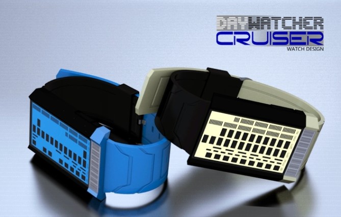
Design submitted by Firdaus from Malaysia.
Firdaus says: This is sequel of my previous Day Watcher concept. Now redesigned to be more minimal, stylish, added extra functionality and incorporated with solar panel to support longer use.
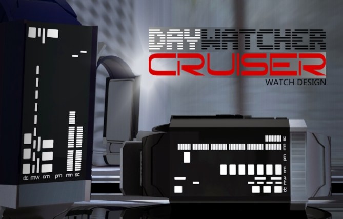
This watch is a must for everyone who value time and love razor sharp minimal watch design that is unique and different. No need to press button. The animation is always on.
Day Watcher Cruiser is a new way of telling time beyond hour and minute. It is easy to produce, can be made available at an affordable price tag and has exceptional style and functionality. Watch your day!


This takes me back to some of the old school Tokyoflash watches like Latitude & Pimp, but its a modern & new approach.
The display is simple, classic, easy to use & looks great. The case & strap are interesting with the 2-tone effect it has a unique look.
Question about the milestone feature… if your milestone is 9pm & now its 8pm then there would be no gap, so it looks the same as 9pm normal time?
or, if your milestone is 1:00am & now its 11:50pm the milestone markers would be covered over?
Anyway, still awesome. I would definitely wear this. 5/yes
LikeLike
+Excellent rendering, and I like the name.
+I think the two-tone strap idea is pretty neat, as onisan mentioned.
+I like the idea of a solar panel for longer use.
+Animating the seconds is a nice idea.
-I see how a person who likes to have a lot of information from their watch might like a watch with this format, but for me, it’s just too much information. I don’t want to think that long when I look at my watch for the time.
-A decade marker does not seem to be very useful. A watch that can give you this much information should also be able to tell you the exact year.
-Time-reading aside, it’s not unflattering, but also not my style – even the pink one and the purple one. I can see how some girls might be interested in wearing it, but the fact that the case is so large and clunky will keep me from a purchase.
LikeLike
very edgy me like!!
LikeLike
Excellent love it!
LikeLike
love it. % stars and yes.
LikeLike
Hi Firdaus, beautiful design with lines very modern and original.
Extremely full in information, good work!
5 * / Yes, yes!
LikeLike
Hi Firdaus,
Am I right in thinking the display is ment to look like a city skyline? If this is the case a more 3d look would add to the theme. Either way very sharp looking with a techy feel. I too like the two tone strap idea. The renderings and presentation as always top banana!
My only critism is there is quite a lot going on (too much info) but that is something the user would soon get used to. 5 stars and Yes! 🙂
LikeLike
Firdaus,
This watch looks simply awesome! I can hardly wait to see this one come to life… 5* all the way!
LikeLike
Firdaus, looking good on this design. I would like the option for date instead of day of the week, but it’s a minor quibble. Overall I really like this design, it’s very smooth on the eye, but also gives a lot of info. Yellow one plz 🙂
LikeLike
Amazing watch idea/design
still love the bleed watch more though 🙂
LikeLike
sorry way too hard to read. A light for every minute? Looks cool but too much going on.
LikeLike
but should definitely buy the bleed watch angelic. That is awesome . You should start your own company you are mad talented. Angelic bleed I want it now!
LikeLike
haha I meant to say I hope they make the bleed watch. That’s a winner for sure . I would buy it right now.
LikeLike
bleed for the win. insta-buy
LikeLike
PLEASE LET ME BUY THIS I AM BEGGING YOU!! 😥
LikeLike
LET ME BUY BLEED 😀
LikeLike
But what about date? (day of month)
LikeLike
To these handles; onisan, Heather, Gordon, Aaron, Gabriel_BB, Patrick, Pete, Greg Zentkovich, Cory, infectedtofu, ryanwiley, jonny hart digital, Jun Fan Lee says, Anton, and the rest who support this design as for now.
Dear all
I’m the designer of this concept design.
First, I’d thank all of you for your time and interest to the design and comments. There’re professionally written comments, and not to mention some emotionally sounds and one that sounds like revenge mission too, however, all comments are appreciated.
To answer some questions; overlapping milestone marker and current moving time can be solve by blinking or another marker/square inside the square. This is a day watcher concept to see how much time you spent, how much time left, other means to tell the time beyond hour, second, date format etc… so there’s no exact date of a month. A decade is essential IMHO even though there’s no exact year shown, its subjective and depends on you; it can be 2012 the first marker to the next 10 years / decade etc.
I understand this design might not appeal to everyone, just like the rest of Tokyoflash watches too, most designers and fans here don’t own all Tokyoflash watches, so that’s not a big deal, but noted. Also, I don’t see this watch to compete with Bleed watch design, since its different concept and theme, however, I’d love to see that bleeding watch comes to live too, so its good to finger crossed for it.
Hey Tokyoflash, what do you think?
Thanks
————————————————–
Tokyoflash Ni multicolour LED
Sensai Black
Twelve 5-9 Q version black
Shinshoku / Corrosion
Kisai RPM Acetate granite
Kisai Kaidoku black+blue LCD
Kisai Seven white LED
LikeLike
3.6? Really? Come on people these scores are not at all appropiate to the design!
LikeLike
To some people, its a competition, to me, its my pleasure. You get what you deserve.
What have you achieved in life so far? ——> pointing finger to the dude who always kill my rating.
who cares duh
LikeLike
Brilliant insight, Firdy. Star score, who cares? TFJ has said they don’t worry so much about them. Number of *****’s SO subjective. Comments, FB shares, and general buzz are a much better indicator.
+1
LikeLike
I second and third that.
LikeLike
Now this is aesthetics! I’m a big fan of the display. So many good looking rectangles that look indeed like a city skyline. The milestone function is a cool one. I could imagine different alarm sounds for decade, year, etc. I just imagine a decade milestone, that would be cool! “Look, I set this alarm 9 years, 5 months ago, when I had the plan to build up my own watch shop. Now look where I am now” 😀 The geometry isn’t 100% my taste, but the black version would be it, if I had to choose now. Good luck Fir!!
LikeLike
You have a good observation skill, no wonder your designs keep improving and getting more interesting. Thank you for the input btw 😉
—————————————–
Tokyoflash Ni multicolour LED
Sensai Black
Twelve 5-9 Q version black
Shinshoku / Corrosion
Kisai RPM Acetate granite
Kisai Kaidoku black+blue LCD
Kisai Seven white LED
LikeLike
I want this watch!
LikeLike
suits my taste…
LikeLike
Like the shapes, but the signs is too much for me. (this is just my personal opinion)
5/Y
LikeLike
Beto wants this watch, which also suits toti’s taste. That’s nice feedback.
Thanks all.
LikeLike
A classic Tokyoflash design! A watch I’d buy! Even reminds me kinda of ‘Wipeout’.
Cheers
LikeLike
this is the best concept that uses just rectangles in my opinion. I’m sick of them actually, it’s a boring way to tell time. the time for rectangles is over I thought, but this layout is just beautiful! the watch looks extraordinary. I would get that instantly. hypothetical *****************/YES
LikeLike
Looks like this entry RIPs soon! Very underated score imho! Best of luck Firdaus
LikeLike
Cheers all. Thank you very much for the input. You guys rock!
LikeLike