Design submitted by Sam from Germany.
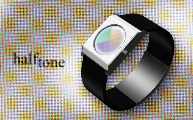
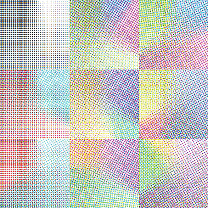
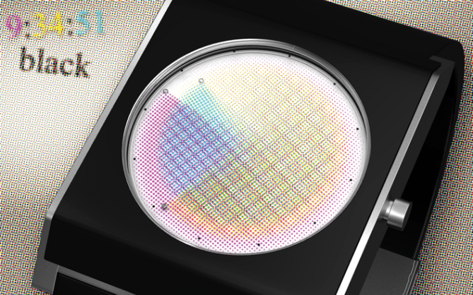
Sam’s initial idea was to create an ever changing display which works with interference (short term change coming from the second hand) and color change (long term change coming from the hour and minute hands). Halftone is actually a technique used in printing. It works like an LED screen – it simulates any color by just using a few. The difference from a LED screen is that it’s not limited to a rectangular grid. The few colors of cyan, magenta, yellow (and black too) are applied in tiny dots. From a certain distance, this dot pattern cannot be seen anymore and the basic colors seem to mix to the final motif.
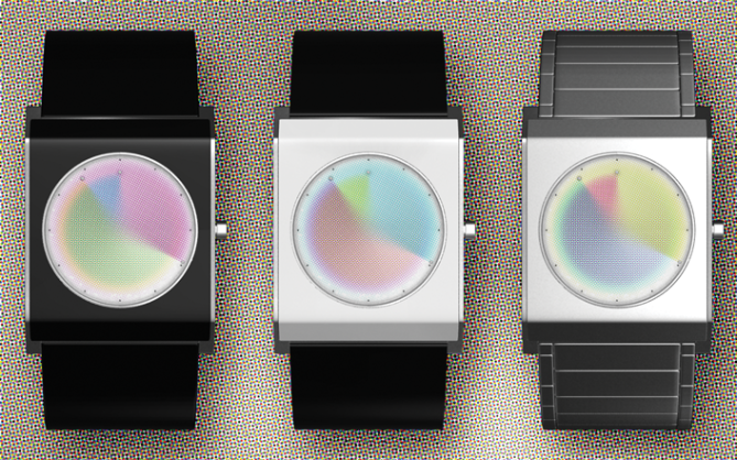
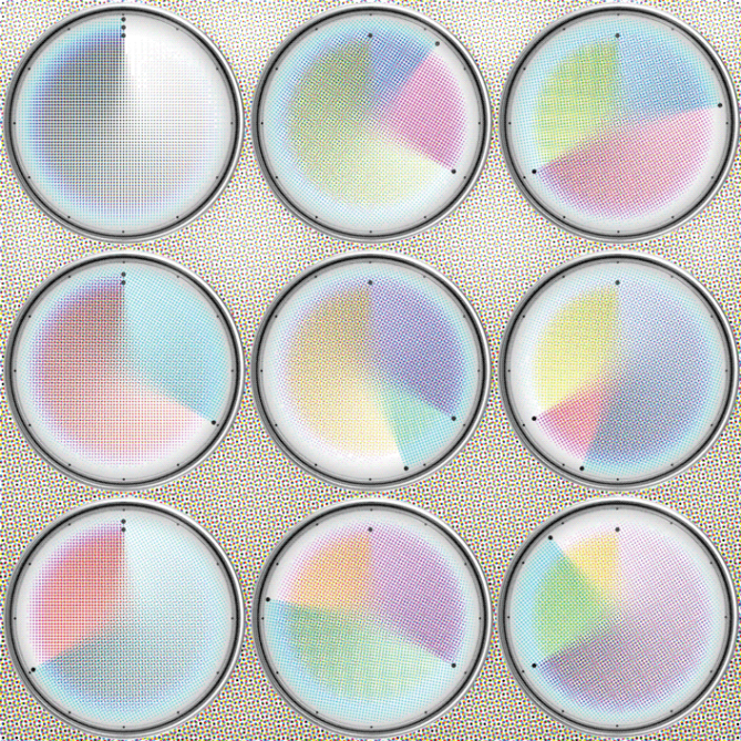
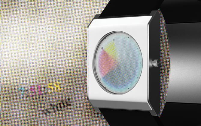
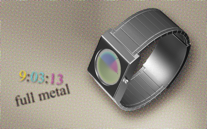
The Halftone watch is an analog watch with three superimposed colored layers which work as watch hands. Each color has a sharp edge and a metal dot which represents the actual watch hand position. Behind the sharp edge the colored dots get smaller and smaller within 360° until they are gone which creates a fading color density.
The different orientations of the watch hands and the different densities of each color create many different interference patterns and colors so each time you look at the watch, it surprises you with another image.
This watch design has a sober and neutral case which makes the watch wearable with different clothes.


5 yes. yes yes yes yes yes!!!!!! i want that watch!!!! please!!!!!!!!!!!!!!!
LikeLike
Hi i 🙂 Thank you!!!!!!! ok one more !
Please tell around if you’re a big fan.
I also recommend my little facebook page for some work in progress pics and this youtube preview: http://www.youtube.com/watch?v=qzLH-PMrXyo
LikeLike
5’d also, this is fantastic.
LikeLike
Ok thank you. I also love this freakin pop art design… but what a nick name of yours ;-/
LikeLike
Thank you, you b… you fluffy owl 🙂
LikeLike
Very cool idea Sam. 🙂
LikeLike
Thanks Lloyd!
LikeLike
very cool… this is EXTREMELY similar to an idea i had and have been casually developing, so of course i like this 😀
well done!
LikeLike
Gahhh damn 😉 Yeah we sometimes have this >great minds think alike< effect around here. It's tough to find a niche sometimes, and other times it's so very easy. I hope you are not discouraged now. Thank you cort!
LikeLike
need i say it Sam
LikeLike
quite low profile but still impressive for personal art pleasure 😉
LikeLike
Phew, I needed to google what “low profile” means. I came to the conclusion it means subtle 😀 Thank you Fir!
LikeLike
Hi Sam, beautiful poetic idea to use a rainbow sky to tell time.
5 * / Yes, very nice!
I have a technical question, in broad daylight, is the subtle colors will be legible enough?
This watch could also be called “Benday Watch”?
LikeLike
Thank you Patrick! I like colors and tried a shy approach 😉
Oh yes it will look best in super sunlight. It is printed paint on transparent disks. It’s as good to see as a newspaper picture, if the right paint is used. There has to be a good balance between opacity (casting shadows on the background) and transparency (creating the mix colors). In the end, the three chrome indicators are the important time reading elements. They are always prominent.
Ben-Day! I never heard this term before actually. But Google helped me. If it’s not copyrighted, that would be a cool name for the watch.
LikeLike
The “Benday” is the result from the mixture of primary colors, if the name is protected, I do not know, but it is in the language running, of the graphic designers and printers.
In any case, this design of watch, is very fresh!
LikeLike
Very subtle, very clever and very cool. Would it be possible to make the colours more intense or would that ruin the colour merging effect? either way 5* and erm let me think about this…..Yes
LikeLike
Hm let me think… The dots could have a strength of 100%. What would be the result: Color mixing would only occur by next-to-each-other dots (magenta next to yellow looks red from a distance) which could work, but the top layer’s color would be dominant and limit the color variations. I tried that with a lower density for the top layer but I couldn’t find a good mix. And even with 100% opaque dots, each layer would be 50% (plus/minus) saturated and look a bit weak. I could let the dots go and use a continuous color dispersion, but I was a little proud of the ever changing interference pattern as the second hand moves. So, there is pro and con… I mean pro and less pro here, hehe.
Thank you Peter!!
LikeLike
Comperhesible answer! thanks 🙂
LikeLike
I want to be the first to say I didn’t have a similar idea! lol
LikeLike
WOW! I wanted a color-changing watch — I was thinking along the lines of color-changing overlapping shapes, but this is cool too!! LOVE that it changes with the seconds (and I love the indicators – I can’t read it without them) — I like the all black version, myself…if it’s made, I hope the case won’t be too big or too clunky/thick. If it’s thin enough, I’d wear it! 5* — more if I could.. 😉
LikeLike
Hmhm, finding the right proportions is a tough job. Could be a tad more slim indeed 🙂 The seconds cause some color changing indeed and an interesting change of the interference pattern.
Thank you Heather for reviewing and rating the watch!
LikeLike
Of course, I had a similar idea recently :(.
In my design I use transparent sheets in different layers, with CMYK colors to create an illusion similar to yours (as you can see here http://www.grimaldos.es/cursos/imgdig/ilus/prev/cmyk.png).
Anyway, I like your idea. 🙂 5*
And good luck 😀
LikeLike
Awww Ignatius, don’t despond* (I hope I found the right word). I don’t have the patent of cmy and k and of rotating colored discs. There is still alot possible with this base idea. I only show one possible execution 🙂
Thank you for your kind words and your vote!!
LikeLike
I know. I will try to send my idea, but it looks that my last disgns don’t like to Tokyoflash. Of 7 designs/ideas I sent, have only posted the second one (Ronu).
I don’t blame them, they are who choose, but I think my ideas are original, and is a little depressing that they don’t tell you what they don’t like about design.
Re-viewing your design, I think the square form doesn’t looks good. I would like better a circular form. 🙂
LikeLike
Yeah I see the argument about a circular case. I tried to break out the classical scheme. I actually like this washing machine look 😉
Oh look, this watch design got submitted to TF early in july. It took a while to come online. TF is actually pretty openminded toward concepts. Sometimes it takes a while. Good luck!!
LikeLike
I had the same idea for a watch, only it was totaly different and it looked terrible(lol). Not one of my favorite of your watches but very clever and unique.
LikeLike
By your own ruling you now have to link some images! lol
LikeLike
the thought had crossed my mind but I didnt want to steal Sams thunder
LikeLike
Hm I have some more colored discs ideas in my sketch book and took this one for now. I always hope I’m alone with my idea or different enough from existing ones. Colored discs with overlap effects seem to be a dream of many people it seems. There are many many possibilities. I hope you keep your creativity!
If you like, you can send me pics of your concept to samukun(at)gmx.de 🙂
Thanks for your comment Gordon!
LikeLike
Wonderful, Sam! Halftone adds something special, beyond using uniform-color screens (that idea exists in a few watches, but I think yours is genuinely different).
I like the case for myself, but I think you could really hit a home run with a smaller case specifically for women.
How about a physical prototype? 🙂
LikeLike
Yes, I agree about the case size. Actually it isn’t that big, but the proportions imply some chunkiness. I try to involve the girls more in my designs, but making things unisex… maybe I find some design rules online, ehehe. I also agree about the color screen ideas. Some designers here also said, something like that went through their head. It’s a simple idea with different ways of execution.
Oh a physical prototype? Mhhhhh you make me think… should be possible within the month this watch is loveable here. I keep you updated, if I do.
Thank you for commenting Logan!
LikeLike
another great design….not as epic as cypher, but still very good 🙂
my only minor concern would be how easy this would be to read on a sunny day.
LikeLike
Hehe thanks diclonius. Oh I see no problems with the readability on a sunny day, or maybe I’m missing something cause you’re the second who sais it, hmmmm…. I can tell, analog watches are definitely better readable than LED and LCD watches. If you know about the chrome indicators, it should work properly 🙂
LikeLike
Das ist so cool! 5/yes
LikeLike
Vielen Dank Sandra!!
LikeLike
http://gadgetsmatrix.com/archives/halftone-led-watch-design/8894
LikeLike
Encore une belle original montre que l’on voit déjé à notre poigné 🙂 Bravo Tokyo
LikeLike
Merci beaucoup Alain!
LikeLike
I don’t like it. Very boring design. Not very practice.
LikeLike
No problem. Check out the other watches (not necessarily mine), maybe you’ll find one you like 🙂
LikeLike
Hi Sam, not long left for this entry. Its a shame this hadn’t had more shares etc. Its a really nice simple idea with an artistic twist! Come on people there is still a few hours to give it a boost! 🙂
LikeLike
Indeed 🙂
It’s not a superwatch but a nice alternative to already existing watches, that’s my conclusion for this concept. I’m glad the idea is out now and other ones can follow. And they WILL follow. Thank you everybody for your comments, especially the supporting ones!
Best regards,
Sam from Jordan
LikeLike