Design submitted by Laszlo from Hungary.
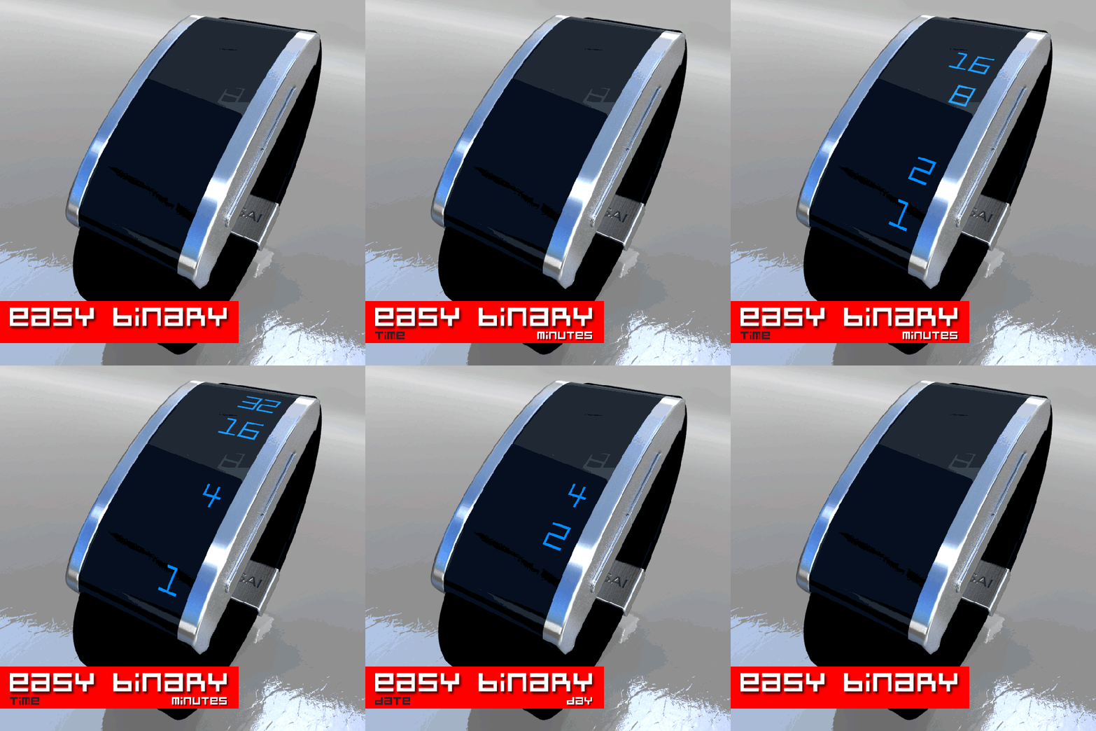
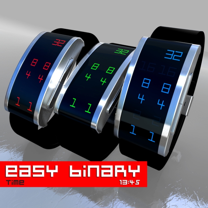
An easy to read binary watch in digits with time and date functions.
The LEDs show digits that make reading time easier compared to dots or square designs. The LEDs on the left side indicate the hours/months and right LEDs indicate minutes/days. Once activated, the digits animate to ultimately show the current time.
The sleek casing and the black crystal lens go together to make the numbers stand out.


I like binary watches. However I dont like when 2base watches use our 10base math. I would give it a higher rating if it were to use only 0 and 1 (but i guess that would make it less “easy”. A pretty solid watch, but not my favorite.
LikeLike
… readability was the primary goal. I know it’s a bit confusing to the fans of the binary, but the majority didn’t specifically geek.
Thanks for the feedback Tzu!
LikeLike
I’m not really a fan of binary so making it easier to read suites me just fine, and I like the looks too, very contempory looking. Retro Red for me.
Me likey 5 stars/Yes
LikeLike
Yes, this makes it easier the binary thinking.
Thank you Pete!
LikeLike
Personally I’m a big fan of binary, I’ve been wearing a binary watch nearly every day for the last 6 months and I’m finding now that I can read it very quickly. definately a learning curve though, and I know many people are put off by the assumed complexity. This shows clearly how simple it is! So maybe people will realise u don’t have to know anything about electronics/computing to be binary literate.
LikeLike
I have one (01 The One), but unfortunately, it gets hard to read without glasses. I think it would be easier!
Thank you Keiron.
LikeLike
how about this design but with ordinary time telling + animation? IMHO, even more cooler. Why if there’s digit there and I need to read binary? I don’t think an easy looking, harder to read is a good design factor. Think otherwise, hard looking, but easy time telling. A yes from me if its not binary here. Now you get 5* and no from me. Goodluck Laszlo!
LikeLike
I think Firdaus has a good point about the easy looking, harder reading. If the watch would be always on, the cool but not spontaneously readable numbers would have a stylish function too. Imagine the second image all the day. People would look and get confused. A little animation each minute would add some diversion.
Anyway, I really like the style of the watch. A massive dark case with metallic bars holding the display which continues into the straps? Very nice. Very fashionable again 🙂 It also goes well with the simplicity of the time telling. Classic time telling would be simpler of course, but not really tokyoflashy. Maybe the 0 and 1 option could be made available parallelly, so you when you are used to adding the numbers and recognize their positions, you can try the harder mode. I think that would be fun.
The blue one for me.
LikeLike
good luck for this entry Laszlo! 🙂
LikeLike