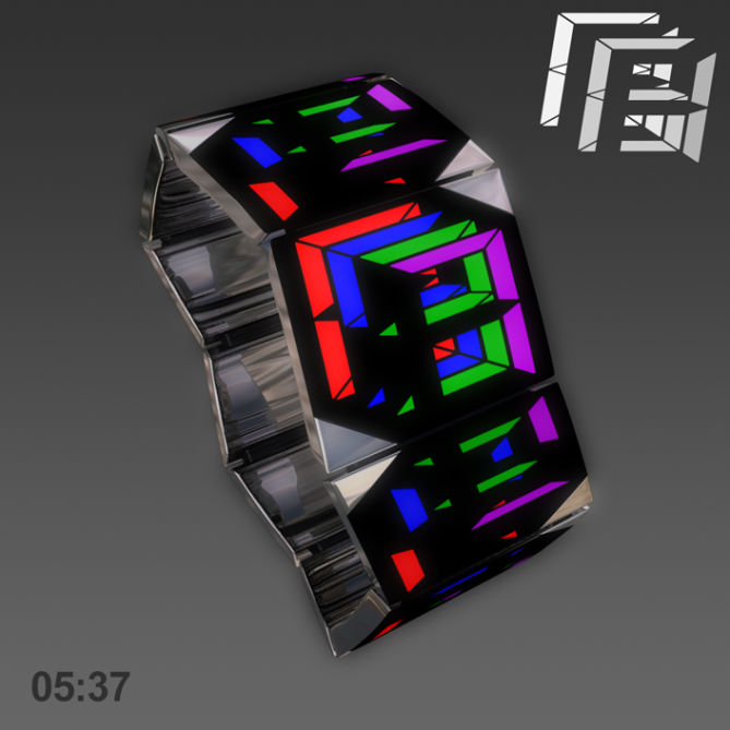
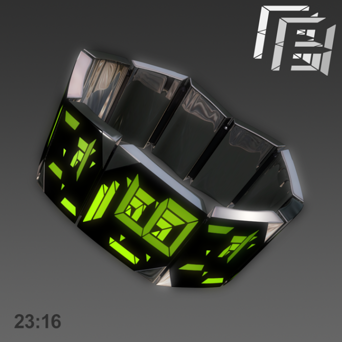
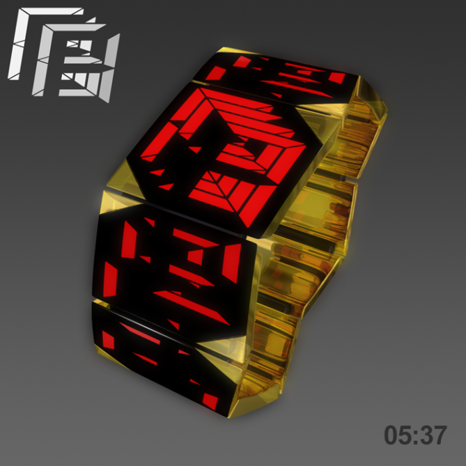
Design submitted by Anders from Sweden.
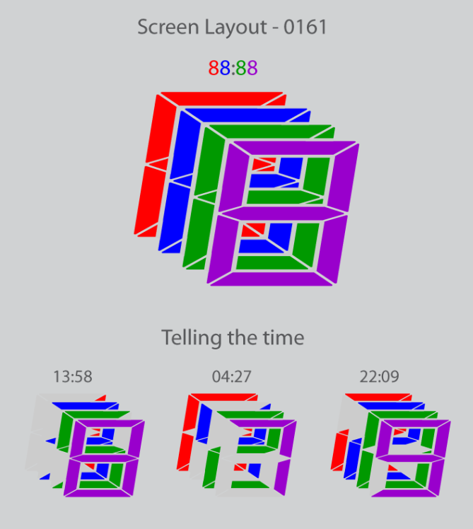
Anders says: “This concept was born when I toyed with the classic digital watch display, trying to make something new. I landed on overlapping the numbers, making them partially obscure from each other. This makes time-telling less obvious and the zig-zagging links add interest. Auxiliary display also allow for low-tech, classic animation”.
Time is shown in the classic digital fashion, but the overlapping numbers breaks up the LCD panels. It is tricky to see the digits at first, but once you start thinking ‘in depth’ you will soon adjust. The links nearest to the main display light random elements to add to the wow factor.
The simplicity of the technology and function means there is room to go the extra mile with the materials; steel, alloy or precious metal links, and the display panels are covered by scratch-proof glass to really give that premium feel. Time is set by touching buttons on the display corners.


the design is AMAZING looks like it would be tough to read at first but i guess that’s how all these watches are. this watch does however look like it is one of a kind and it would defiantly be something that i would buy. 5*
LikeLike
Now this is a watch! My jaw dropped once I saw the picture and figured out how to tell the time. It looks complex but is actually really simple to tell. This is how I like TokyoFlash watches, please, please PLEASE make this watch a reality!!!
LikeLike
i second this statement.
LikeLike
I love the chaotic look of it. Looks like it would do well as a hinged bracelet style piece. very cool, Anders-sama! 5/y
LikeLike
This design is very eye-catching. I would buy this in a heart beat!
LikeLike
yuhuuuuu!!!!!! 😀 i want it!!! make it please please!!!
LikeLike
I like the principle behind the display method (I’ve done something similar on one of my concepts, see digit on my fb page if your interested by clicking my yellow name) but for me with the extra panels it looks a bit busy, a simplified version would suite me better. 4*/No in its current configuration
LikeLike
Wow, that’s an eye-catcher! The display idea is very cool. The multicolor displays are pretty easy to read and good for practicing. The monocolored displays look awesome! Alien but somehow known. It takes a bit, but reading them works! If you wear this watch, your friends do really look at you like a car OoO The geometry fits well to the broken style display – many angles. It’s not fully my taste though. I’d like it less zig-zaggy and I’d also like a width difference between “case” and “straps”. Now it is one bracelet and I would prefer a differentiation. A bit more like this. Imagining TF takes care of this, it’s a 5*/Yes – my final verdict 😀 Good luck for this stylish piece!
LikeLike
Thanks Sam! (And everyone else who’s commented, music to my eyes). The zig-zag is a consequence of the slanted digits (as I think you understand, judging by your comment). I tried square numbers first, but it just looked too static; the dynamism of the skewed version won me over.
Always with the straps…! =) I know some, like you, prefer the strap to be differentiated from the watch itself, but in this case I think the form works best ‘in the bracelet style’.=) It does make it look a bit like a piece of jewellry, but I think the angular, almost austere styling retains enough masculinity to keep it unisex. It’s very much a point of taste, of course, and I’d like to know what others think about this. how ‘girly’ or ‘mannish’ can a watch get before it doesn’t work? An interesting topic, regardless…
Nicely manipulated image by the way! =) You obviously know your way around a pixel or two (as if we didn’t already know…)
LikeLike
Like Sam, I LOVE the way of reading the time, but I’m not a fan of the case. However, I believe that detracting the printed pattern on the rest of the watch is enough. I’m a male, but I’m fine wearing bracelets, though I don’t wear’em all the time. Sam’s image manipulation also works, but I would prefer it without the printed pattern on the strap 😉
LikeLike
wow! now that’s some bling! 5*
LikeLike
I like the display and the case separately, but together they are too “loud” for my personal taste. I think the ideas here could be split into two stronger watches.
LikeLike
…too much for me…the watch is too busy IMHO..
LikeLike
I love watches that have not just one face..but many faces..and this is it! epic design, many screens = much coolness! 5 star and yes
LikeLike
You always have interesting concept but the presentation but the presentation might shuffle off people from like the entire design. Even it is probably true to be too busy, but I still like it, minus the classical golden finish ofcourse. Make it silicon or plastic watch with less parts, would probably looks futuristic.
LikeLike
Watches fantastic, we like very much…We would Like buy
LikeLike
Wow I like this concept, It looks pretty cool, futuristic, unique and elegant, I would definately buy it if they decide to take it into production.
LikeLike