Design submitted by Cory from the USA.
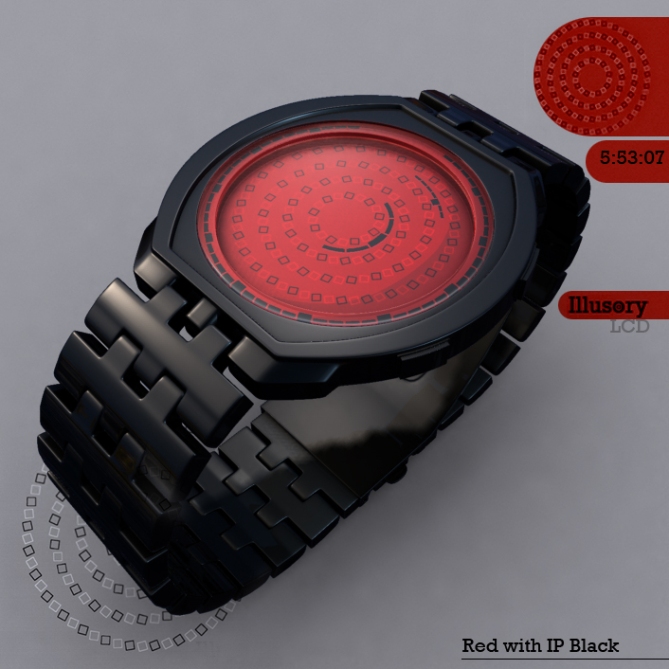
Cory says: “Optical illusions are interesting because they manipulate our imperfect perceptions. While browsing through several optical illusion sites, I ran across Pinna’s Intertwining Illusion. Discovered by Baingio Pinna of the University of Sassari in Italy, the circles appear to spiral and intersect, but are in fact an orderly set of concentric circles”.
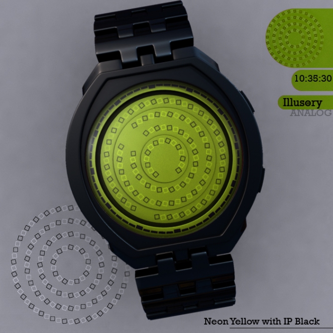
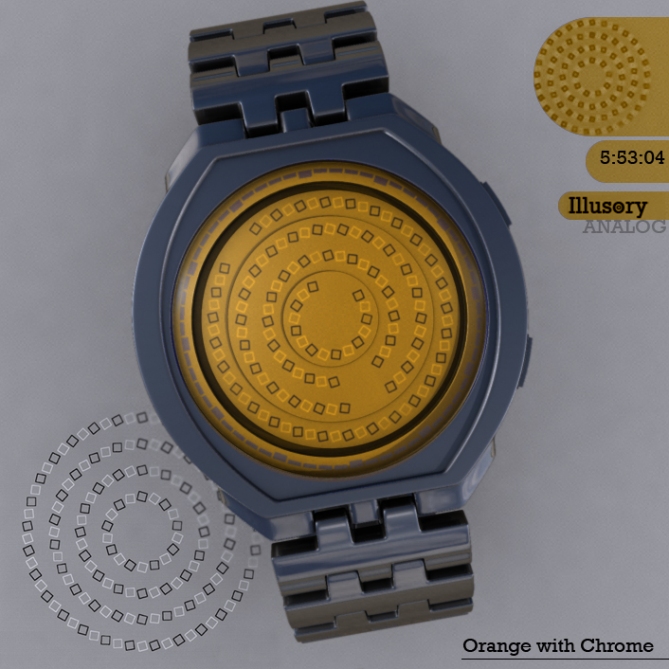
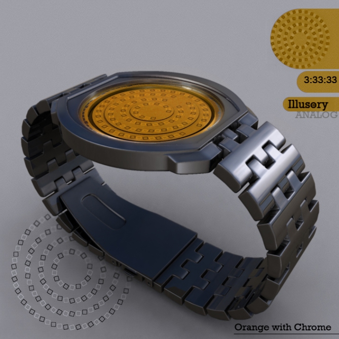
The center ring denotes hours, outer rings for minutes, and middle for seconds. For faster recognition, there is a larger notch in the LCD display every 5 minutes, 5 seconds, and 3, 6, 9, 12 hour marks.
The trick of the eye when admiring this watch will hypnotize those who admire this design’s unique take on the Pinna’s wheel.
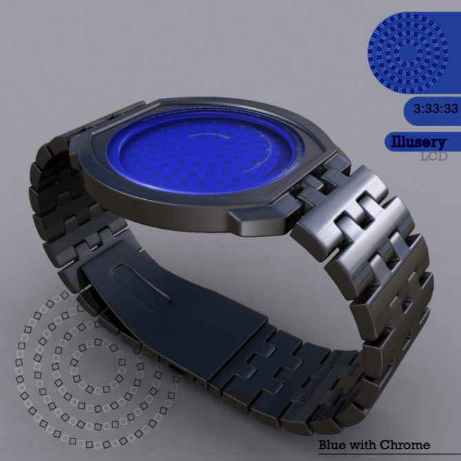
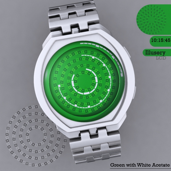
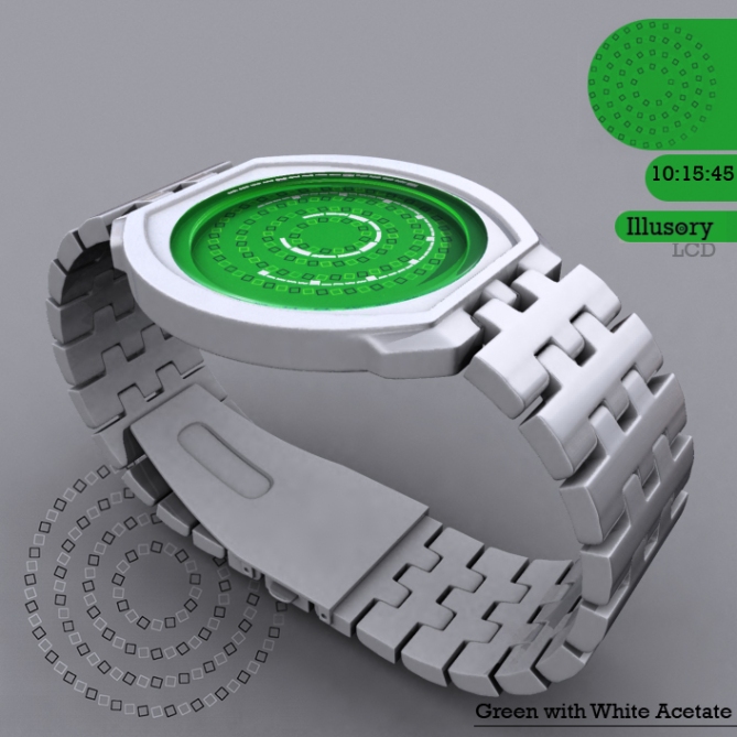
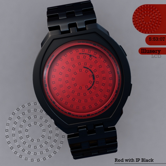
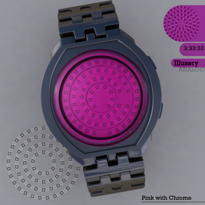
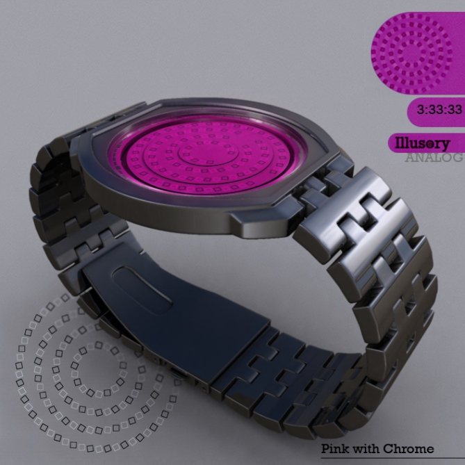


My favorite one yet!!!
LikeLike
Interesting idea, I really like the illusion (never seen it before actually). That said, I think the design would benefit from using the elements of the illusion (rotated squares) as the actual display, by having them change colour, say, rather than having them as divisors between the LCD panels. As it is, I think there’s a danger that the indicator circles interfere with the illusion. If that makes any sense…=)
The case and strap are tidy if a bit middle-of-the-road, but on the other hand it doesn’t compete with the display.
All in all, nice concept but loads of potential!
LikeLike
excellent design. I like it. 5 stars from me.
LikeLike
nice design, the display looks complicated, but its actually very simple. interesting design in range of artistic watch. yup, and 5.
LikeLike
I agree with Anders, The display should be part of the illusion squares, its a nice idea and viusally very interesting. For me the case is a bit regular looking. I like the bright colours aswell, with a few subtle tweaks could be sweeeet! 4* and why not! 🙂
LikeLike
BTW the renderings are very good! 🙂
LikeLike
nice watch! that graphic illusion is wild
LikeLike
Thanks for the commends and feedback, guys! 🙂
@ Anders & Pete, the first iteration I tried had the illusion used as the time telling method, but believe it or not that destroyed the illusion worse than the rings do in this version. I came to find out that Pinna’s wheel depends partly on the angle of the boxes, size, color contrast, and (most importantly) number of boxes. Any time I changed the central ring to 12 boxes (i.e. for hours) instead of the 18 from the original illusion, it lost some of the effect. I tried several other configurations for the boxes which all fell short of creating the same effect as the original Pinna’s wheel.
I also found that the rings were easier to tell the time on from an instant recognition standpoint. Counting boxes that are shifting and intertwining on one another seems impractical. I decided that it made more sense to have the time telling method exist alongside the illusion rather than being part of it.
LikeLike
You make a fair point, if the display was part of the illusion it would be very difficult to read beacuse it would be moving with the illusion.
Sam makes an iteresting point about an anologue version, you wouldn’t know which bit is moving, or even better a anologue with a disc instead of hands with the illusion on it, now that would be trippy! 🙂
LikeLike
Trippy? Lol! Made my day xD
LikeLike
Perfectly understandable, having a cool idea and making it work as a feasible design can be two very different things (speaking from experience), and it’s always easier to criticize…=)
LikeLike
The illusion works if you let it. It’s really nice to look at.
I also thought about letting the time reading be part of the illusion. I wonder how it would’ve looked like. But I’m glad, the hypnotic appearance is not obstructed my the time reading elements. I also wonder if this could’ve worked as analog watch, with subtle smooth moving hands…
The overall impression is good. I like the small little details like the extra level in the display and the fact that the bright squares aren’t white but a lighter version of the surrounding color. The shape of the case is nice. Also cool color/material combinations.
Look, it’s Andrea’s favorite, so you have the girls on your side too. That’s shouldn’t be underestimated 🙂
It’s a soli, good looking watch design which deserves to be made.
LikeLike
I like the illusion, but I would also prefer that it be integrated into the display mechanism.
LikeLike
I liked a comment by Pete above with the idea to do an analogue version of the watch. I could see it being similar to the Eleeno watches, with rotating discs, and just have one of the boxes missing to mark where the hour was.
Thanks, Logan!
LikeLike
Typical, the first good idea I have and I gave it away! Doh! 😉
LikeLike
😀 I’m excited to get started on this variation. I still like the LCD one, but the analogue could prove to be awesome and a half, too!
LikeLike
Cory, I think analog is a good way to go with this idea. Look forward to seeing what you come up with, if you try that.
LikeLike
I like the illusion alot, however the time display method is not unique enugh for me. I’ll give it a medium 3 star for the illusion tho.
LikeLike
TFJ seems to be going for easier to read designs lately, so this was a primary factor in the design. I see your point, though, and it’s good feedback for sure. Thanks for the input, Tzu!
LikeLike
Fans of TFJ seem to want more accessibility with the time telling method as well.
Maybe multiple modes, a ‘hard’ mode where the notches aren’t present (like how it looks in the vid) for those who want more of a challenge in reading the watch.
LikeLike
Cory,
I know that you indicated that you tried to use the illusion as the time telling method and it destroyed the illision worse than the rings.
I don’t know what you tried, but I don’t exactly like the watch without the illusion participating in the time telling. Otherwise, it’s an “ordinary” watch with a “pretty background” IMHO.
Might I suggest that you try an animation/idea that has the full Pinna’s illusion at 12:00, and REMOVES squares as an indicator of the time. For example, I was looking at your picture of the watch “blue with chrome” image and the Pinna image in the lower left corner of that picture is cut off by the watch. The cut off image is still pretty effective at being an illusion. If you can figure out a “square removal” system of telling time it might be cool. I understand that at different times of the day the illusion would be better or worse, but it would be cool that relative to 12:00 the illusion would be mostly “full” and visible. Maybe you can come up with something and maybe not, but the illusion “as a background” just doesn’t sell it for me. I’ll be on the lookout for any revisions you have!
Thanks!
LikeLike
Now that’s a detailed critique. Very nice, that you thought this deep about it and shared.
LikeLike
Thanks for the input, I will take yours and the others into account on v2.0 of the watch. Keep an eye out in the near future 😀
LikeLike
You nailed it with the latest images that have the time indicated by the removal of the squares!!! I wonder if you tried viewing it “to scale”. I mean the squares are pretty small to begin with, I was just wondering how easy it is to tell the time when the display is “actual watch face size”, not expanded like in the pics. I know that the illusion is dependent on the size, angle and number of the squares, but is there a way to make the squares a little bigger? Just my thoughts. If you determine the time is “readable” when the pinna wheel is actual watch size, that’s good enough for me.
Also the LCD/black border to show indicate the number positions might be better if you only include the five minute marks, not the smaller boxes for the in-between numbers. I rated you this time! Great work!
LikeLike
Nice to see someone passionate about the designs! I thought about doing just the 5 minute marks, but thought that outer ring would be a bit empty without the smaller ticks. The illusion is dependent on the size of squares in relation to one another (they all have to be the same size with the same gap between each).
It seems that the reason the gaps work well for the time telling method because they draw your eye to it. In relation to the actual size thing, zooming the camera out and rendering the thing doesn’t seem to break the illusion, I can post a link to some images. Though, you can get roughly the same effect by stepping back from the monitor far enough for the image to be the same size as your wrist. Dun dun! PERSPECTIVE!
Thanks for the rating, and the feedback!
LikeLike
I also think an analog version without interfering led fields would look better. Or led and involving these squares. The idea itself is nice, but just a nice background is not enough. I wait with my rating and look forward to your v2.0
LikeLike
The analog versions have been posted above. Center disc is seconds, Outer disc is minutes, and the hours are in the middle. The gap in the pinna’s wheel is the marker.
LikeLike
Perfect! It looks moving already on the still images. I swear, when I scrolled down, I thought the discs move! I like it alot and I would buy it. *****/YES
LikeLike
Nice work Cory! Quick turn around too!
If I could I would give you an extra star to bump my score up to 5* 🙂
LikeLike
Star ratings are good, but what I really like to see are comments like these! Thanks guys! It made my day. 😀
LikeLike
This design is epic, I would totally buy it. simple enough to read yet a vast futuristic edge to it…this is what tokyoflash is all about.
LikeLike
Thanks a lot, JFL! Epic is always a good descriptor to read of one’s idea. I’m grateful for it! 🙂
LikeLike
Love the display but it feels kind of feminine to me so I think it would suit a more friendly case. Something softer. Love the display though. It could have hours, minutes and seconds moving in from the outside.
Oh, hang on, i’ve just realised this is an analogue watch. I thought it was LCD. Either way it’s cool. Would prefer if it could be done in coloured LCD though.
LikeLike
My initial images were using an LCD display, but I got a lot of feedback that people wanted the illusion to be a part of the time telling method. So I mocked up some quick analog images and posted those to TFJ. The top images and vid are the LCD method, and the bottom variations are the analog.
For the analog method, Center disc is seconds, Outer disc is minutes, and the hours are in the middle. The gap in the pinna’s wheel is the marker.
The case can be narrowed and softened to make it more feminine, as there seem to be several ‘likes’ by the female Tokyoflash fanbase. That’s TFJ’s decision. I trust their judgement in making alterations to bring it to market either as a unisex, or a women’s watch.
Thank you for the comment, Avatara! 🙂
LikeLike
and I also (personally) prefer the LCD one to the analog, but I like them both.
LikeLike
Only 12 hrs left on this entry, I hope TF see potential in this. Best of luck Cory! 🙂
LikeLike