Design submitted by Firdaus from Malaysia.
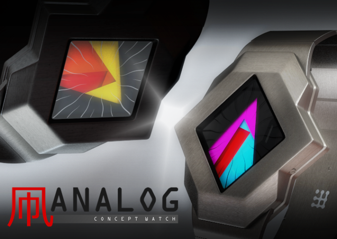
Dimension art, geometry, and angles are what inspired Firdaus’s new watch concept. The design also has a little artistic element of kites and octopus.
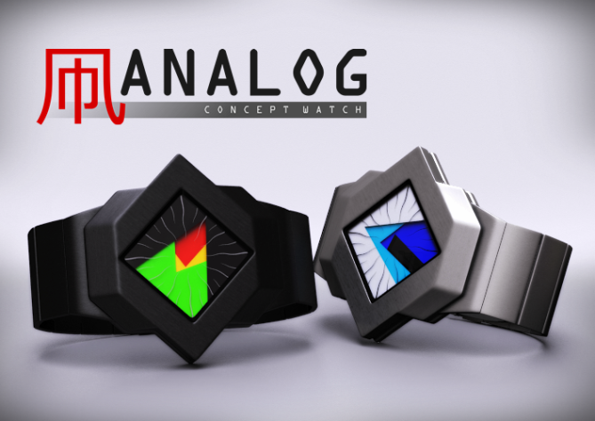
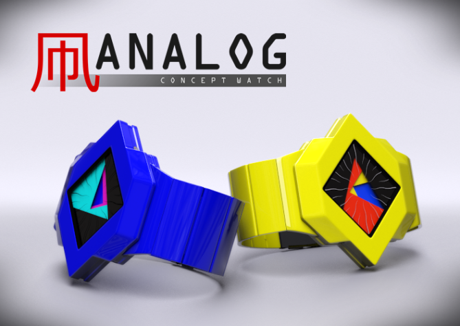
This watch design is a conventional easy to read analog movement watch based on unique and artistic Tokyoflash designs. There are four levels of luminescent disks with three cut into sectors of different angels to form a state of the art analog dials. The lower disk sector points to the hours, the second sector to minutes, and the third sector to seconds.
The geometrical time movement forms artistic art effects without the need to press any button.


Bold, colorful, creative, simple, stylish, original.
5*, no doubt in my mind.
LikeLike
Simple but comprehensive comment. Appreciate it. Thank you Jordan 😉
LikeLike
Very nice display concept, Firdaus, and the case shape is well-matched.
LikeLike
Very nice comment logan. Firdaus thanks you 😉
LikeLike
Very clever Firdaus!! I like the analog watches. Just an observation: the wavy lines is not my taste. I would love to wear this! *****/ Yes!
LikeLike
Very nice of you Laszlo, and thanks for the input 😉
LikeLike
Now this is awesome! Fir created a hit again!
The geometry is aweome and the time reading system is great – simple and effective. Very artistic eye-catcher. I bow to your skills 🙂
LikeLike
Thank you great designer. Your input is highly appreciated 😉
LikeLike
Very Cool!!! 5*/Yes
LikeLike
Very cool comment!!!
LikeLike
A very interesting design. Not mainstream that’s for sure but in a good way. The bold colours and wriggly lines add to it’s uniqueness. Keep up the great work! Oh love the rendering as well. 😉
LikeLike
A very interesting comment, and its from TJPSD. Keep up the great work on your side too! Oh love the compliment as well. 😉
LikeLike
This is a work of art and makes quite a statement. Telling time might get difficult but you still get 5*
LikeLike
Your comment also quite a statement Gordon, thank you for the entry 😉
LikeLike
Wow..thats amazing wathch.this watch is fullfil of art and suitable for teenagers..good work firdaus!!
LikeLike
wow. Arigatou akmalukun.
LikeLike
Hurmmm..i like this design and its shape..good looking.
LikeLike
hai atika-aneki good comment yo
LikeLike
Another surprise from firdaus 😉 i love every bits & pieces of this watch, unique, original and fun, simply amazing. I gotta have the yellow one.
LikeLike
i gotta thank you makidono. My favourite is blue, hmmm but yellow is cool too, so matching with livestrong band
LikeLike
Considerably underrated hmmmm…. Very original design. Strange, yet cool. Smooth the sharp edges on either side and I’m in. 5/y for originality.
LikeLike
very meaningful comment, love the hmmmm….link. Interesting. Thak you korisan
LikeLike
It’s just a watch “Cubist” that deserves a 5 * and a big Yes!
LikeLike
thank you paturiksan. Appreciate your feedback
LikeLike
Aku cinta firdaus who makes cool watch ehehhe xD
LikeLike
aku pun cinta junfan who makes cool comments.
LikeLike
5 Star *YES*
LikeLike
yes, thank you. Likes. 😉
LikeLike
the rendering is so magnificent too hehe
LikeLike
Intriguingly mysterious! I love it especially the first two frames.
LikeLike
Yes, that is one of my aims. Thank for your interest Cherubim 😉
LikeLike
You know what might be nice on this one: As the display looks like an art installation you could have a range of different bezels, they would almost be like picture frames (perhaps even interchangable) 😉
LikeLike
I have many versions of this design, but I cannot submit them all.
LikeLike
Too squirrely for me. I like less colors, less confusing shapes and the more futuristic look of Tokyoflash’s watches.
LikeLike
one again you note only negative things on peoples desings
LikeLike
Ok I’m maybe biased cause he was gentle towards my designs, but he/or she says what he/or she thinks in a rather repsectful way (compared to what people actually can do in the internet). That’s better than those people who constantly rate down without a word and we wonder why. If I see a watch that I don’t like, I also point out the elements which make me leave the watch in the shop 🙂
LikeLike
You are wise beyond your years Sam 😉
LikeLike
You are right Acant~~~~Shrike, and I must respect your taste. I have futuristic-look version of this concept too, but I decided to submit these ones because to me “futuristic” is subjective, and sometimes, is only good as concept design. I try to propose design as close to reality that and don’t want to fake the audience eyes with fancy futuristic design that would create problem for manufacturing – even it looks nice on rendering. The theme of this design is ART and geometry so here it is. This is a designer watch, rather than a futuristic ones. Thanks for your feedback!
LikeLike
this is a perfect example of “it’s not just a watch, it’s art.”
LikeLike
Diclonius, thank you for noticing this design. Love the quote. Let, see how this artistic concept will survive the challenge. To me, ART is always POP hmmm….. thank you again for liking this realiginal piece, Tako-chan will love you. 😉
LikeLike