Design submitted by Laszlo from Hungary.
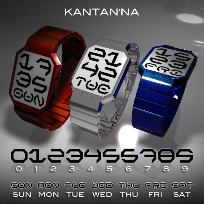
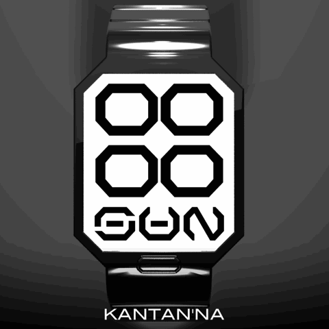
A clever watch design from Laszlo here which uses e-ink technology to display the time and date. This watch design is very simple to read as you can see from the images below. The time is shown digitally using shapes that are very close to real numbers. It would certainly be easy to get the hang of quite quickly.
The watch has been designed with e-ink technology in mind. E-ink is a kind of electronic paper and is commonly used in e-readers such as the Amazon Kindle. It offers a clear, crisp and detailed effect.
For the watch case and strap, Laszlo feels anodised aluminium would be a perfect material. Aluminium is Extremely lightweight design and an anodised finish would increases corrosion resistance and wear resistance. Anodised aluminium surfaces can in some cases be dyed allowing for the color variations shown in the images below.
What do you think about Laszlo’s latest concept watch idea? If you’d like to see this concept become reality, vote and share with your friends. Feel free to offer your feedback in the comments section below.


This watch will be perfect for me, because easy to read. My favourite is the silver one. Can I see a moving version?
LikeLike
Animation: http://www.insideshirt.hu/kantanna.swf
LikeLike
Very Striking Lazlo!!!
LikeLike
Apologies for mis-spelling your name.
LikeLike
Thank you Pete, no problem.
LikeLike
Love this watch, the abstract font reminds me of the computer game Wipeout 🙂
LikeLike
I really like this watch, a clear 5star concept. The silver one is my favourit! But I would prefer a leatherstrap in the same coulor as the digits (same black as the “numbers”)
LikeLike
Thanks Tzu.
LikeLike
Flat, 45° angles, cryptic at first, easy finally, E-paper – all good elements I like. I think, I would have used 3×2 symbols with a two digit day (su, mo, tu, we, th, fr, sa). But it’s cool. The font reminded me of the one used in Star Wars 🙂 Besides of E-paper, I can see this watch in the style of the newly released 3D Unlimited – using color LCD. For all who like to know what kantanna means, it’s japanese for simple, easy, brief. True 😀 Like it.
LikeLike
Special thanks for translation! 🙂
LikeLike
Yo , I see the moving version, sorry. That’ great!
LikeLike
Hi Laszlo
Sorry for not posting very much, as you probably already know we are very busy and understaffed. Lots on the go and trying to make sense of all the data on the blog and choose wisely as the time involved to make the designs is quite some. E-paper has 2 problems. One is big MOQ and the other is the outlook is not that clean. Kind of newspaper like. We are looking into various suppliers to see what they have come up with as improvements have made it better. The battery is perhaps the biggest obstacle for more options. Always when you try to fit it into a watch it becomes a big issue, and the engineers say “can’t do” then we ask why, then try to find solutions. Anything can be done if you through enough money at it but we are still a small humble company. 😉 And want to keep it that way.
Regarding the design I really like the outlook of this. Has a very clean and unique look to it. My only concern is the numbers can be a bit confusing. Many people complain if there is any difficulty understanding the time, so we are focussing on keeping it clean and easy to read. Perhaps connecting the lines may make it easier. The 1,5,6,7 look the hardest. For me personally It’s fine as it is but after considering all the feedback from our customers I would say this would be an issue for many. As many people vote a low rating but do not comment this would be one of the reasons, but on the other side the outlook is awesome!
LikeLike
Thank you for your comment.
The battery is the biggest obstacle…
I don’t know how to solve it, but it works: http://www.phosphorwatches.com/E-Ink-Digital-Hour-Clock-Watch-Black-Leather-p/70510565270.htm
LikeLike
I dont know why TF havent done an e-paper watch yet. They must have a good reason because i think they are never afraid to try new things. Ive seen phosphor watch before too. It looks very clear, but some people say e-paper is quite grey looking. I have never seen it myself for real. Still, I think they should try one. Your design would be a good one because the display is very bold with big numbers.
LikeLike
Thank you very much for your comment Onisan! I believe in Tokyoflash’s engineers.
LikeLike
I love this watch, maybe a backlight I would prefer more than white, but the way the time is told is super cool, its like a sci fi language writing, I would definately buy this if the numbers are easier t oread like tokyoflash said! 😀
LikeLike
Thank you. The new numbers is here: http://www.insideshirt.hu/kantanna.swf
LikeLike
Wow, this is epic!! I love this idea, I would definatly buy it!!
LikeLike
Awesome!
The numbers system you have is very cool.
1 & 7 are a little bit confusing to see, but the rest are easy. Maybe you could just tweak those numbers just a bit like you did with R in FRI.
LikeLike
Thank you Onisan. Did you check this link? (http://www.insideshirt.hu/kantanna.swf)
LikeLike
Thats the ticket! Perfect. Now its really easy but still very stylish numbers.
LikeLike
🙂
LikeLike
Want it !
LikeLike