A new concept from the Tokyoflash Design Studio.
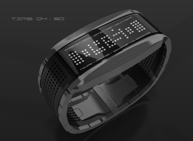
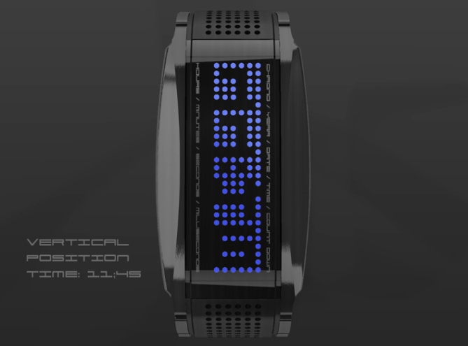
This LCD concept watch design presents the time in negative space. The unlit spaces on the screen show digital numbers which are highlighted by the bright dots around them. On first glance it looks like a mysterious array of dots but once you see the numbers, it can be read instantly.
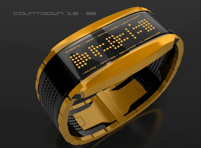
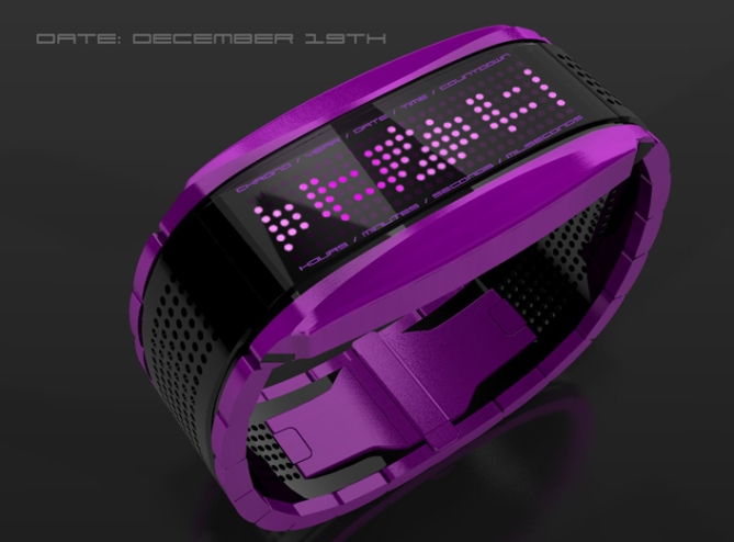
With a sports theme and appearance, the design has a dual material look expressed further through the color variations. The inner part of the strap has a perforated appearance to match the display.
The design has functionality and includes time, date, year, chronograph as well as a countdown timer; ideal for keeping track of race times. In order to switch between the different displays, just sweep your finger across the touch sensitive screen and it will move and lock onto the next display. See the video below for more details.
Dual color combinations are shown so you can choose the finish you like. If you would like to see this concept become reality, vote below.


Nice geometry, nice material, nice continuation of the LED holes, nice variants, very cool touch feature, wonderful display (I like the negative mode and the indicators) This is not brand new (not a big “I’ve never seen such before” feeling), but I think the audience this watch would be big enough. And it still looks cool. Conclusion: 5*/y!
ps.: it’s milli- not miliseconds 😉
LikeLike
Oh, I like the tactile side panel to see the time and the chronograph.
5 * / Yes!
LikeLike
Sweet one! 😀
LikeLike
very nice! i buy (black and yellow one is my favorite), what is the black part of the band made of ? spring steel?
LikeLike
Hot design. Period. 5 & Y!
LikeLike
I love it. It’s reminiscent of the Negative watch you made a while back. I loved that watch but never got the chance to buy one. I certainly wouldn’t miss out on this one if it was created!! 5 stars and a yes
LikeLike
5 / y IF it becomes so the dots go all the way around the number. As of now i think its abit to hard to see the time.
LikeLike
You guys at the design studio have taken a liking to touch screen watches recently…
Maybe provide power to random LEDs set into the dots around the strap and animate them every now and then? But anyways, this is a nice one. 4*/y
LikeLike
One thong is that you’d have to look down your arm to read it because of the orientation…
LikeLike
One thing**
Gotta hate the tiny onscreen iPad keyboards…
LikeLike
With a silver band and green lights, I’d buy this in a heartbeat.
LikeLike
I love the idea of a tokyoflash sports watch, and I think you’ve made the design abstract enough to be cool & original but also easy enough to read at a glance and easily interfaced with whilst participating in sport, yet the stylishness means that it wouldnt look out of place with a suit, or more formal attire. I also like the shape of the watch – very uniform, adding to the comfort, would this watch be made from aluminium or another lightweight material? (carbon fibre please) because I think weight is important. Touch screen and tilt sensor are great features, but i’m surprised that there isn’t more technology? heartbeat sensor or something? Overall great watch, very versatile yet beautiful.
LikeLike
I would’ve buy this, but really afraid of the size. I have relatively small wrist, and most watches look really big
LikeLike
WOW!!!!!!!!!!!!!!!!!!!!!
it really surprised me!!!! GREAT DESIGN TOKYOFLASH!!!!
LikeLike
Looks amazing and as always I hope you can adjust the light colors, but still great idea. Hope you guys decide to make it. It’s like the in between watch for those who want something eye catching but also not so complicated to read you need to keep instructions on you HAHA.
LikeLike
Bought. Can’t say much more. It convinced me at first sight.
LikeLike
I want it.
The look & design of this watch is awesome. The yellow one looks cool too, although I’d probably go for the black.
This really should be made, its very VERY good indeed!
My only comment to change something is the display dots are just a little too far apart to see the numbers clearly & because its a sports watch I need to really see the display quickly & not make a mistake or think about it.
The negative display is good because once you know how to look at it, its very obvious. But, with the dots too far apart it makes me struggle a bit, even though I know how to read it.
LikeLike
I can’t stop looking at this.
LikeLike
I’d buy it 5*
LikeLike
It is a very good concept but I find it a little hard to read
LikeLike
I’m suprised this concept hasn’t had more comments and a better ratings. I really like this one, it looks very contempory and you don’t need a maths degree to read the time. Please make!!
LikeLike
Modern chic all i expected from a watch PLEASE PRODUCE I want to get one ASAP.
LikeLike