Design submitted by Sam from Germany.
An analog concept watch which works with a traditional mechanism but does not look like a traditional analog watch at all.
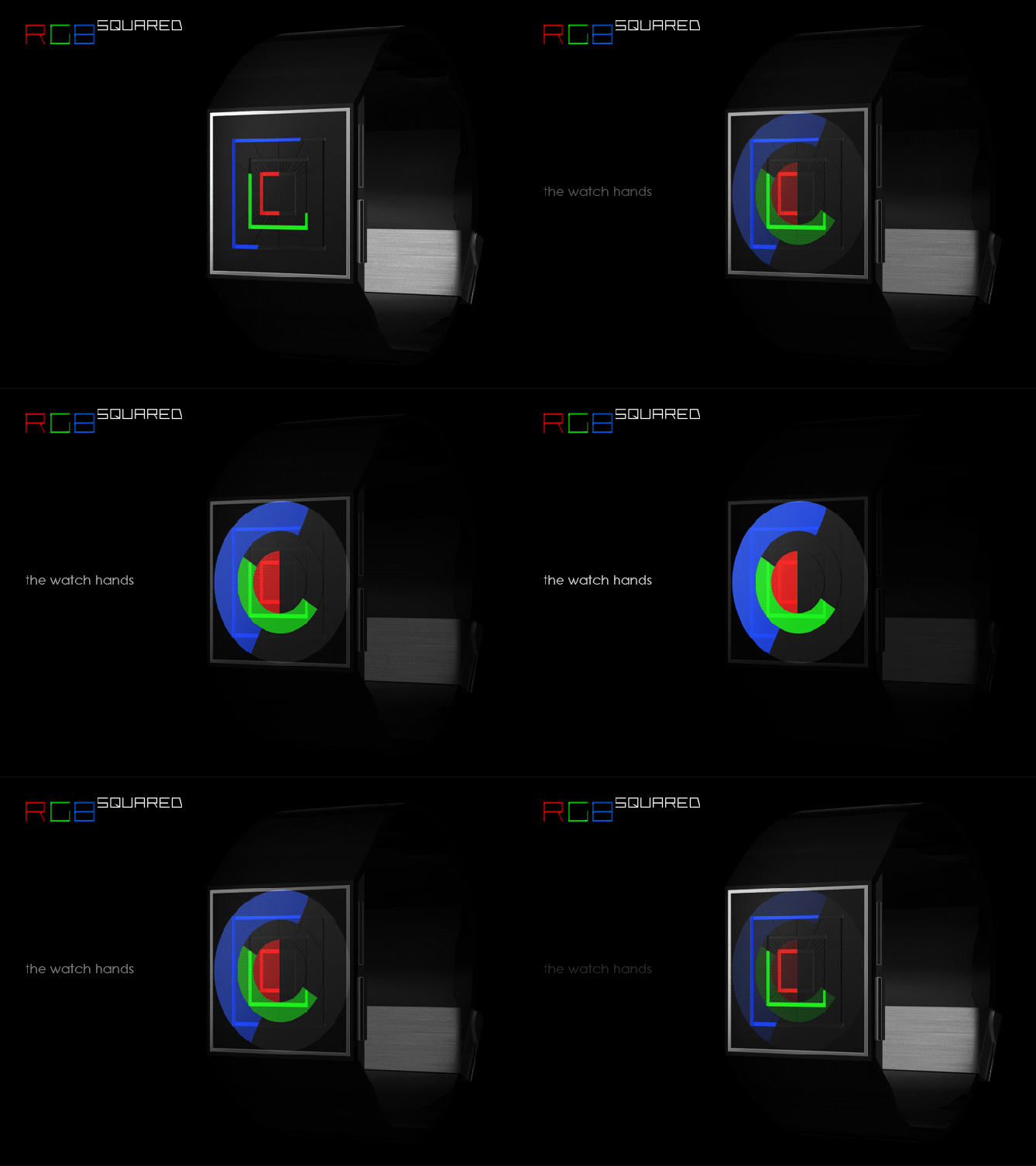
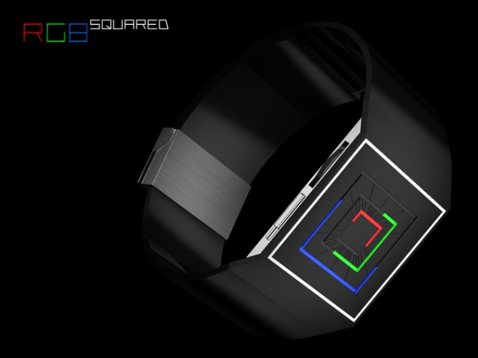
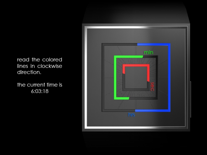
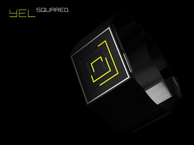
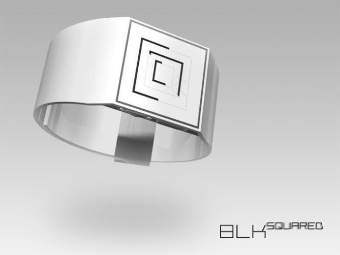
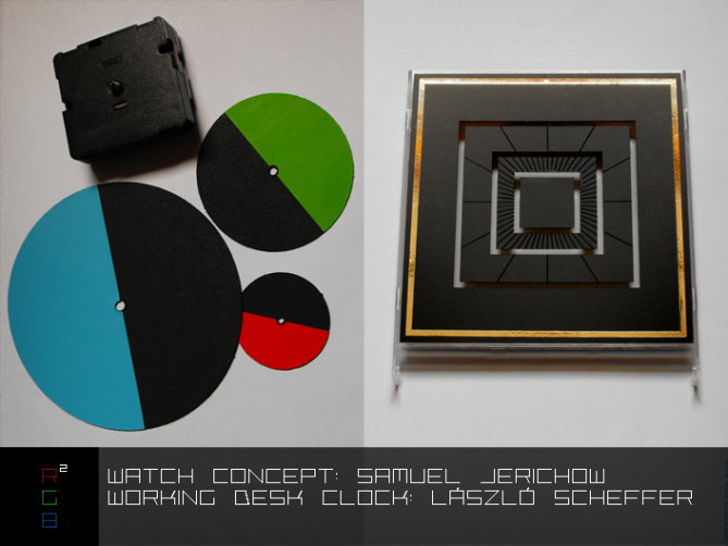
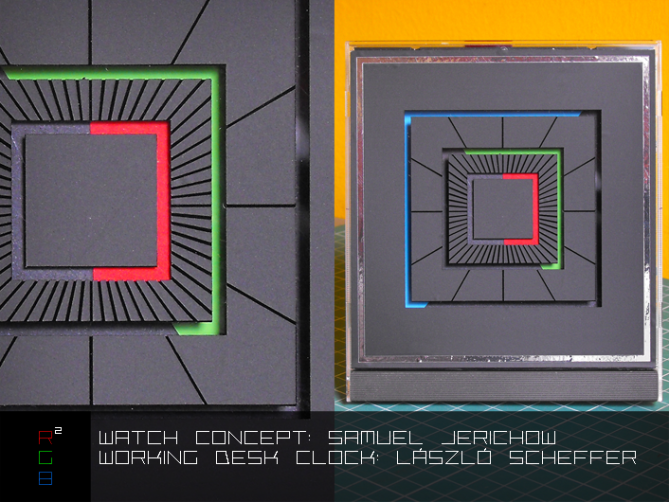
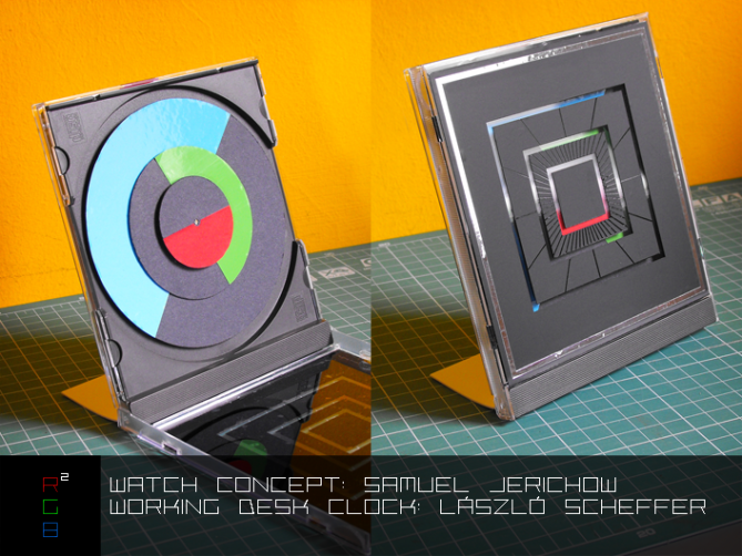
To achieve this concept, Sam got rid of the circles and chose a square case and three squares to show the time. These are actually square holes above three rotating circles. The smallest square is the one which moves the fastest, it is in red and shows the seconds. The middle square is green and shows the minutes. The slowest square is blue and shows the hours. Each square is half black, half colored. The clockwise facing edges of each color work like the watch hands of a traditional analog watch. To ease up precise reading, indicators are placed on the two inter-squares between the hour and the minute squares.
A unisex watch design that is both fun and rational and could appeal to many people.



how the design look now is very interesting compare to what ive seen from the preview. I respect how you managed to disguise the analog watch to make it completely doesnt look round. I also like the minimal implementation so this watch can be made affortable to the masses. My buy. Congratulation for the innovation. 5*.
LikeLike
You exactly pointed out my intentions – minimalistic, interesting, affordable. I’m glad the very first commenter also sees it like me. Thank you Firfir!
I would like to take the chance to pull your mose arrows to my facebook page. I just started it and well, let’s put it simple, I need you, all who like my style. If I reach 25 likes, I can get an get a username for my page. I’d really appreciate you being one of the first 25 people to like my page – it would really help me and only takes a few seconds. Here’s the link: futurewatches Kind regards, Sam
LikeLike
loL true, but its impossible for me to like it twice since I already liked it from the day or next day you created the page. Do you mean I need to dislike and like it again, when it reached 25? I am sorry if you were talking to the rest of all… I’ve rated this design 5* x 3 times if I’m not mistaken. Looking forward for one of your design to be chosen.
LikeLike
No no Firdaus, I meant ALL you 🙂 Double likes aren’t possible. Unliking decreases the number. Just the plain good old “the more, the better”.
Man, thanks alot for your support! I also look forward and cross fingers. Until then, I have fun letting those ideas become images.
LikeLike
Very interesting indeed. This design jumped out at me immediately. I really like the simplicity and the three colors, reminds me of our TV when I was a kid.
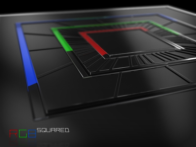
I wonder about the three discs being on the same level though, surely if they are on top of each other on a dial they would show at different levels. In the penultimate image they look to be on the same level, maybe this is a lighting effect? In fact does this design have lighting included or is it simply analog?
LikeLike
Oh yes, red-green-blue is a classic!
The discs are on top of each other, there is a small gap between them. I looked at my old analog watches and the distance of the watch hands is so small. On the prenultimate image, it is an optical illusion. Since the real edges of the discs are hidden, you loose the sence of spatiality (no more “on top of each other” visible”). The glass gaps cause some refraction, which distracts the impression you have. I chose a material, which reflects light pretty good. I thought about a material similar to these reflective stripes of a safety jacket. I left light out of the watch by now. I know it’s a tough point, and if this watch gets really considered to be made, Tokyoflash will check the actual need of light. For now, I tried to keep it as simple as possible.
Ava, thanks alot for your comment. I like how close you look to the designs.
LikeLike
A very good concept, Sam. Again…=) Simple and stylish, I really like it! I especially appreciate the technical solution, using (relatively) simple means to great effect. The only downside is that it makes me worry a bit about my own ideas…=)
LikeLike
Same here 😉
LikeLike
Don’t worry Anders… and Firdaus 😛 You have unique designs I often wish they are real NOW! And, you two, I know this feeling too. It’s exciting.
Thanks for your review Anders!
ps.: Anders, you have facebook? It would be cool to connect over there… ask Firdaus, hehehe.
LikeLike
I suppose I’ll have to up my game a bit, and have better ideas…=)
At least I can blame my software trouble for not having submitted anything for a while… But there are things coming. Eventually…=)
No, I don’t actually… More on principle than anything else…=)
LikeLike
Hehe no problem 🙂
If I really make you work harder, that could only result in a win for the blog. But “working hard” is maybe the wrong term. Best ideas don’t take struggle. The execution is another matter. If the technics you prefer using don’t work, it’s a pity. Hope to see more from you soon!
LikeLike
Yes, what’s the expression; “10% inspiration, 90% perspiration”…=)
Thanks Sam, I’ll get it done one way or the other, some time between working and sleeping…=)
LikeLike
You did it again! I like analog watches. I want the black one now!
5*/Y
LikeLike
Thanks alot Laszlo! Always nice to have your “blessing” 😉
LikeLike
The Watches of Sam, are always beautiful!
Small questions: why not cut the squares of colors on the level of the moment, the reading would be simpler?
For the drawing and idea, 5*/Y!
LikeLike
Quel dommage! Je ne comprens pas la question… Petits niches dans les carrés?
But I understand the rest! Merci beaucoup Patrick!
LikeLike
A Picture is clearer, than an explanation.

LikeLike
Oh I see 😀 Looks cool and it’s less confusing that’s true. But the graphical intensity is lower. I like to use more space for the sake of the image 🙂 Merci pour faire cette proposition Patrick!
LikeLike
I agree with you Sam, your proposal is more graphic, I tried reading easier, but less well, sorry?
LikeLike
In the immortal words of Huey Lewis… It’s hip to be square!
Like like. 5/y like a BOSS.
I think this may be my favorite of your designs, Sam.
LikeLike
Wow this sounds great! Thanks so much Cory!
ps.: In the immortal words of a robot: My hips are square!
LikeLike
Kudos for the Huey Lewis reference! Made me smile…=)
LikeLike
It would be a good advertising phrase…
LikeLike
The black RGB looks great. It reminds me of the classic game called Snake. Are the indicators necessary? I’m curious whether people want them…it’s a common question for unusual analog designs.
LikeLike
Thank you for commenting 😀
Yeah, I’m always 50/50 on indicators. Actually 33,3/33,3/33,3 -> no indicators, only hour (respectively 5 minute) indicators or no indicators at all. My upcoming Zaga watch has no indicators and I expect, some people might miss them. My upcoming Han-En watch has hour indicators only. I think, if Tokyoflash takes care of the watch (in an utopic future), they will decide what’s best. I think, the squareness and the hand layout (they are across the normal pointing direction of a watch hand) irritates the trained analog watch display knowledge. I would agree if they are gone, in favour of a puristic display, but I also see the need to tell the time precisely. So I chose a middle way: case colored indicators.
Your snake analogy is cool, I had Tron lightcycles in my mind when I produced my first rendering. Poor red one, hahaha.
LikeLike
Instant buy! Two purchases, black for me, white for my girl. I wonder why there are no color suggestions yet, normally that’s the first, the people want to change. I love the rgb. But I’d like to see all three hands in yellow for an awesome wasp like display. If there are different options, I would buy more watches sam, think about it. *****YES!!!
LikeLike
You shall have your color variant Apho 🙂 Stay tuned! Thanks for your comment and vote!
LikeLike
Great looking watch Sam! 🙂 its amazing how complex the mechanism looks only to find it is just 3 simple circles! very nice minimal surround and strap (similar to canvas) suits it perfectly and the RGB and CMY is a good name and colour sheme which will appeal to graphics geeks such as myself. 5* yes plz
LikeLike
Thanks alot for stopping by and leaving your love 😉 I hoped it would create a bit more awe then I proove, its really that simple – success! And it seems, the saying “less is more” is also prooven again.
LikeLike
Sam, you know that these days I only have the time to comment on here when something absolutely needs to be said. Well the following really needs to be said: this concept is awesome! In my mind, this watch is absolutely perfect and I don’t even have to bug you for a red-green-blue colour variation this time!
5*/Yes/Liked your Facebook page
LikeLike
Thank you so much for your support! I really appreciate your comment. I must re-read it now… 😀
LikeLike
You’ve earned it, Sam. I just can’t wait until TF finally produces one of your designs so I can buy it!
LikeLike
There is no like button here so I thank you the traditional way. It’s nice when others are excited too!
LikeLike
4*, but yes i would still buy it. I love the bracelet-like appearance. 4 only because I like other ideas better, however I still really like this idea. I like that it might not need lights, and that it’s analog. I love the indicators and how easy it would be to read.
LikeLike
Hello hermit! Thank you for your honest comment and for telling what exactly you like 🙂
LikeLike
Hello again Sam just wondering what each of the buttons do? looks like a wheel on one side? and some other buttons/slots on the other?
LikeLike
Oh yeah, cool that you ask. On the left side, its a time setting wheel (its rotating axis is vertical, not horizontal like on traditional analog watches, looks better on this flat edgy case). Next to it is a locking switch, so you dont change the time accidently. The botton on the right side is for resetting the seconds when being in setting mode. It could be used for light too, it that is really needed, and if the second reset works automatically in setting mode. And finally I left some space for a USB recharge cap.
I didn’t mention these details because that’s quite an essay and I wanted to concentrate on the striking concept (this time, hehehe). I built them in 3D to have a certain degree of realism but if they look different in the final watch (crossing fingers) then it’s ok for me.
LikeLike
i bow to your brilliance 5*
LikeLike
hum i like the black and yellow…
LikeLike
6* my good sir. Quick question, how did you add the BLK and YEL images after submission?
LikeLike
I hope, TF adds the extra star you liked to give me 😉 Thank you.
Oh I didn’t add them personally… You can submit extra images like you submit your actual design, and write, that you like to add them to an existing presentation. There are kind people behind the computers, so they will understand.
LikeLike
Useful is it?
LikeLike
I gave you all my points to the original concept!
LikeLike
Thanks so much master Laszlo!
LikeLike
@ Gordon: Come up again, I blush 😀 Thanks for coming by!
@ rachid: Great! It just appeared today after Aphosno asked for it!
LikeLike
Really great concept! Makes me wish batteries were good enough to have this running 24/7.
Hmm…
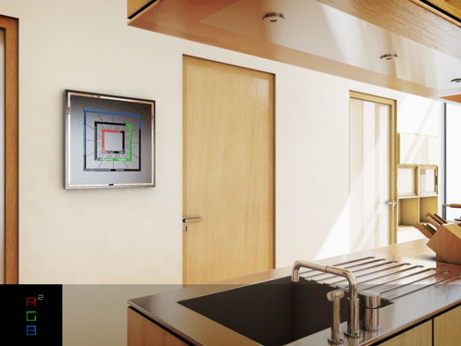
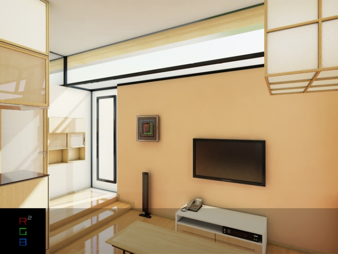
Might make an interesting wall clock, no? Since it’s just a different version of an analog, I think it could work pretty well. It’d make an absolutely gorgeous addition to a modern home, since the flat design being flush against the wall would go great with a flat screen TV. I would without doubt buy one of those!
LikeLike
This is a simple analog watch, it runs loooooooooong 🙂 Probably longer than an RPM with 10 times checking a day.
Wall clock is a cool idea. I think I will make one or two images for this and let TF add them. Stay tuned!
Marshal, tanks alot for your comment!
LikeLike
Awesome! Your renders are always fabulously done. Can’t wait to see how this design would look scaled up…especially the RGB! It reminds me of the lights on a PS3. I could see both the RGB and BLK fitting quite a number of more modern-styled homes.
I’m hoping this design gets approved…it’s really very elegant!
LikeLike
Thank you Marshall! Look, I made a wall clock version. Before TF added it to this presentation, you can see it here.
LikeLike
Oh! I really like that! It’s like functional art. Very nice work.
LikeLike
Sam, thank you so much for making the version with yellow lines only! Looks so awesome! And there is a wall clock too? What a great idea! I wonder what other watches could be wall clocks.
LikeLike
You’re welcome, thanks for the hint 😉
LikeLike
Hi Samukun,
I’m a newbie to all this but your design stood out for me due to its simplicity and bold look. Keep up the good work. 5*
LikeLike
Hello Peter! Yeah I saw your magneto watch – very nice first entry. Welcome to the blog! I also submitted a magnetic watch so let’s see if they take it 😉 I will keep it up. I hope you will too. Thank you for your comment!
LikeLike
Thanks for the welcome. I didn’t realise you did a magentic watch too, I hope I didn’t make it too similar?
I’ve got a few more entries submitted, will wait to see if TF think they’re good enough to get on the blog.
There is a high level of quality ideas and everyone seems uber friendly.
Cheers for the support.
LikeLike
Oh don’t worry about the similarity – it’s totally different, magnetic but different.
Oh yes, mostly the people are friendly. But I wish the ones who give low ratings would talk more 🙂 The people at Tokyoflash are always friendly, they could be a bit more around here. They are busy, making watches of course.
LikeLike
I agree with what you say a about the ones who give low ratings, If I don’t like something I just don’t vote rather than drag their score down. Still all part of the game I suppose.
LikeLike
Now that’s team work.
LikeLike
Yeah you could say that.
Actually Laszlo asked me, if he can build a desk version of my design for his own use. He did it great! So simple and stylish 🙂
LikeLike
Nice work Sam/Lazlo, where can I buy one?!
LikeLike
Thank you Pete! Do you mean the desk version? That is a hand-made prototype by now. I hope this working clock is encouraging for manufacturers and this design finds it’s way into reality.
LikeLike
🙂
LikeLike
Not long to go now Sam, best of luck!
LikeLike
Yeah a quarter day! Thanks Peter!
LikeLike
It was a pleasure again! Meeting new people, getting good critiques, a really good rating and also a working prototype! Thank you all for your support! This is not the last time you hear from RGB².
My best regards,
Sam from Germany
LikeLike