Design submitted by Sam from Germany.
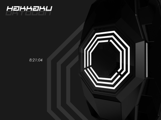
This watch design is inspired by the Dharma Initiative logo from the mystery series LOST. That logo is actually a derivation of an I-Ching symbol. The part of the symbol, which interested Sam was the interruption of lines.
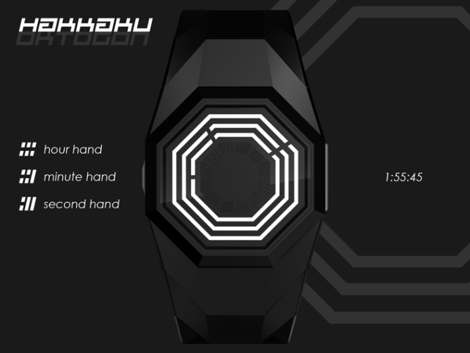
The watch works like a traditional analog watch. There are three white octagons which are more or less interrupted by the black watch hands. The second hand is the shortest, the hour hand the longest, the minute hand is between them. There is a center octagon which has indicators to ease up reading.
This is a watch for Dharma Initiative members and fashionable people.


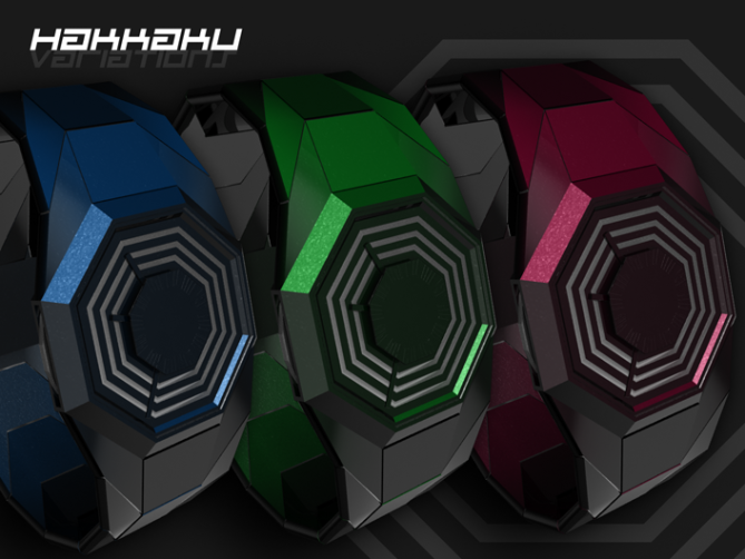
Very cool design that flows well from the face to the strap. I would like to see this in colors other than white and maybe even a silver strap.
LikeLike
Very tokyoflashy!
LikeLike
rekaan yang ringkas, menarik dan senang dibuat. saya lebih menggemari versi heksagon, dan mengerti rekaan ini sesuai untuk heksagon juga. semoga rekaan ini menjadi kenyataan, tapi dalam versi heksagon. lalala
LikeLike
Very nice design! Only thing I would change is the order of the hands. The layout here is the inverse of convention in which the hour hand is the shortest, and the second hand the longest. That may be deliberate, of course, but it would confuse the heck out of me!
I’m holding out for serial number #4815162342.
LikeLike
I like this concept. The case and the strap goes excellent togheter. Also it is simple, and very attractive. Very Tokyoflashy 🙂
LikeLike
Hi Sam, beautiful design as usual.
One suggestion, needle-free with only the ruptures of different octagons to indicate the time?
LikeLike
Hello everybody 🙂 Thanks for your comments!
@ Greg: I will take care about alternatives soon.
@ Jordan: 😀
@ Firdaus: I see, you like hexagons more. That was never an option here, so I cannot say much. Still glad you see it’s potential ^^
@ Pat: Hm… I wanted the fastest hand to be the shortest, so the display keeps it’s solidity. With a continuously moving second hand (and knowing the minute hand is in the middle) you automatically see the remaining hand as the hour hand… no confusion I think. But if the voices get louder, it would be easy to change it. Nice big serial number. 5 digits are great enough 😉
@ Gabriel: 😀
@ Patrick: Thank you. I don’t fully understand… can you send me a sketch? Would be cool 😀
LikeLike
LikeLike
Oh yes interesting. Since my inspiration comes from the I-Ching symbols, I have interruptions of different lengths here. But I must say, your version looks good!
LikeLike
It’s just another version.
LikeLike
“With a continuously moving second hand (and knowing the minute hand is in the middle) you automatically see the remaining hand as the hour hand… no confusion I think.”
You may well be right! I’m sure you’d get used to it after a while anyway.
LikeLike
Making a lot of angular designs lately, Sam. Not a bad thing at all. I like the shape of the display and the case. It’s a good combination. I never got into Lost, but I see where you’re going with the concept and it’s a cool design. Nice!
LikeLike
Oh yeah you’re right. Maybe it’s a phase… There are some really edgy ones coming soon, but also smooth and round ones 🙂
This design had it’s starting point in Lost, but I didn’t want Lost to be its end, so I took a step back to where Lost had its inspiration from – the graphically interesting and systematic I-Ching symbols.
Cory, thanks for your words!
LikeLike
An octagon is difficult for a watch, but you’ve pulled it off well. You’ve made it just easy enough to read. The strap definitely enhances the overall look. Greg might want more colors, but, for me, black and white is perfect for this design.
LikeLike
Yeah octagon was tough. Especially the connection of case and straps. Had a smooth strap before but it had to be segmented and edgy after looking at it after a night of sleep.
Thanks for your review 🙂
LikeLike
Sam, you know I absolutely love your designs and I like this one, too, but I think it´s too simple this time, common, I know you could do much better.
4*/y, though, cause I really hope one of your designs will become reality one day, you really deserve it. (I know, there are a few others who do, too, but hey, I have to stick with my compatriot^^.
LikeLike
Oh thanks for your honest words, especially the ones about becoming reality 🙂 4* reflect the current state so I’m fine with it. I wish the1* peeps would give a detailed description. Yeah it’s simpler in a certain way. But on the other hand it’s so full of edges o.o I am trying to try out different things and cover a wide range. It’s tricky to find a spot between “boring” and “too much” with the own taste as ruler. That makes this blog so cool – feedback ^^
LikeLike
Very cool, I like its simplicity yet so cool to look at. I second the more variety of color, especially if the line color can be changed/adjusted. Totally cool as is though. I would buy it 100%
LikeLike
Omni Consumer Products anyone?
ie. the OCP logo in Robocop!
LikeLike
@ Travess: Hey cool, thanks for your input. Mh, a controlled changeable color for the lines? That’s only possible with LEDs and that means they are off the whole day except you press a button – totally different from the “always on” analog watch 😛 But I will try out some (static) color variants.
@ Shannon: Haha yeah, I see the similarities 😀
LikeLike
Although it uses an aged concept, it is remixed through the way the “hands” are designed. Nice.
LikeLike
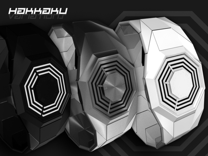
No matter what says Ferox :-), it’s oofbeat and flossy. Have you tried a negative item (stainless with black octagons) ? Or whole bright colored ?
LikeLike
the idea of the design is fantastic and the color too. it should be not too heavy or big in dimensions in order to become an unisex watch. there is only a (big) problem: apart from certain hours it’s very complicated to read time because now the ratio is 8:12. with an exagon (6:12) should be far more easier (but bye bye dharma of course). i have other watches “difficult” to read: to avoid confusion in reading time it should be better that hour hand SPRING (not run) from hour to hour, while minute and second hands can move running constantly in the traditional way. this should avoid the problem of reading by mistake a wrong hour especially when you are close to the next one (e.g. from 50 to around 59 minute)
LikeLike
😀
@ Ferox: Oh yeah, it’s analog watch remixed. Thanks 🙂
@ Yves: Thanks for your comment. I will try some mentioned color/material version today. Steel too 😀
@ uncle: No Dharma stay! 😛 The octogon is a matter of style apart from readability. So I took this risk, inspired by TF’s tradition. The SPRING of the hour hand sounds interesting. I have a smooth movement and added the center indicators, so it should kill confusion in the first days. But I actually played with the thought of letting all hands hop to go better with the edgy display – would be more consquent. But I see, there could be more confusion since 9:59 looks like 9:00 if looking too unconcentrated respectively if looking with an anlog watch trained mind. Anyway, it’s a good hint and worth thinking about. Thanks alot for pointing out the (more or less) issues 🙂
LikeLike
The black (the original) is beautiful! I like the octogon, easy to read! 5*/Y!
LikeLike
Thank you very much Laszlo 😀
LikeLike
I would get the blue one or the “dark” silver one, good job on the variations.
LikeLike
Thanks for checking back and for the request in the first place 🙂
LikeLike
Very nice watch. Would love to buy the black and white one. You guys should make a really nice $300 watch thoe. I would buy that
LikeLike
I think it says a lot when the strap of the watch get as much attention as the face. Great design. Has to be the white one for me!
LikeLike
Woohoo 😀
@ Alex: Thank you for your comment! Ill keep that 300 watch in mind 😉
@ Scott: Cool, then I’m really glad I’ve shown that variant. Yeah, sometimes I feel like “the watch must be one whole thing” and sometimes it’s all about the case and the straps are secondary. Thanks alot for your comment Scott!
LikeLike
I like! I take the first version if it’s not too expensive. You should get an own shop sam. Your watches are so different and diversified!
LikeLike
Thank you for all your support! Thanks to the hardcore bloggers and thanks to all those who quickly came by to share their thoughts. Check out my facebook page if you’re interested in my works. Just click my yellow name here 🙂
My best regards,
Sam from Germany
LikeLike