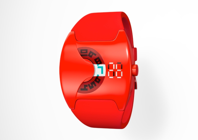
Design submitted by Devindh from the UK.
Devindh says: “I looked at the watches featured in the Tokyoflash Watch Museum and the ‘Nekura Tumbler’ style of watch with it’s rotating, semi obscured face appealed to me. I did some more research online and decided to combine some of these design elements into my own hybrid version.
Telling the time is very simple. The hour markers are read through a small window that is integrated into the case in such a way as to draw focus. The minutes are read from a linear arrangement of LEDs that are ‘flush’ with the surface of the watch.
This watch design is aimed at ‘sporty’ people who also enjoy casual styling. This watch does not represent any particular ‘innovation’ in time telling, but I think the combination of design elements and styling will be enough to help it stand out from the others.”


the most exciting concept design for a long time !!!!
LikeLike
Hi cygnus. Thanks:) I think there are many exiting concepts on this blog.
LikeLike
Rated 5.
However, I would like to see more colors variations.
I think the straps being a different color would do a great combination.
LikeLike
Hi Beto. Thankyou. I can certainly render out a few different colour variations to see what it might look. I’m not entirely sure that having different colours for the strap and the case would be as strong visually a single colour, but i can make some tests.
LikeLike
Hi Devindh, nice design, well done. the shape reminds me of R75. Is it actually an analog watch for the hours section? And LED for the minutes? It’s interesting to have the combination. Not sure about red myself, that is quite a statement.
LikeLike
Avatara. Thanks. The hour disc is analog. I chose red because there are not many red watches on this blog, so I thought it would help to make the watch stand out. My first instinct was to try White, but i find it difficult to render white objects convincingly.
LikeLike
Wow, great design! Very very nice shapes you have there. I like the mix of analog and LED. Can you please try a version with your special devindh gold? Please! But this version already looks like it belongs in a shopping window (and then out to the people) 😀
LikeLike
Hey Sam. Once again thanks for your comment. I think it’s great that you always have something positive to say about everybody’s submitted ideas. It’s that kind of generosity that makes this blog a pleasure to visit:).
Hmmm…Gold. If I rendered a gold version I think i would need to redesign a matching bracelet. But I might give it a try:)
LikeLike
Well I also see little things which aren’t 100% perfect. But I can say that about the Tokyoflash watches, I already have – so not worth mentioning. I would buy it, that counts 😀 I try to see it with a bit more neutral eyes, because too specific tastes take a while to discuss. Oh yes, I liked your gold pretty much (some other people didn’t…). It’s a warmer alternative to chrome. If you have time, try it. I like to try a gold [1440] now.
LikeLike
Red is not my most liked color, but I’m sure this can be changed. 😛 Rated 5 and would buy 😀
LikeLike
Thanks MisterD. I get the message about the colour……perhaps I’ll render out a few more variations:)
LikeLike
The Case is awesome, the way the strap comes together with it is really neat and interesting, and the time telling method is too slick! The ONLY thing I don’t completely dig about this design is the color. Me gusta! 5/y!
LikeLike
Hey Cory. Thanks. Check out my replies above for the reason behind my choice of colour. I look forward to seeing more ideas from u:)
LikeLike
The font that I used for the watch dimensions is called ‘Micro N55’ and is available at Dafont.com
LikeLike
This is absolutely terrific! One or two different colors would be nice, but besides that it’s a 5 star watch to me!
LikeLike
???. Thanks, I’m glad you like it:)
LikeLike
Beautiful watch, I love it. Would definitely buy it. Perhaps the led can be negative, for a black band.
LikeLike
Hey TomRoll. Thanks.
LikeLike
I start with the only thing i dont like: the green hours. Why green out of the sudden? The rest is great! I could tell you what I like, but it would be telling you things, you already know, hahaha. It looks so good!
LikeLike
Thanks Aphosno. Maybe i need to recalibrate my eyes:) I can’t seem to get the colours right….:)
LikeLike
Hahaha! If colours are the only problem, then you can smile. Colored circle is a good name!
LikeLike
professional presentation. the idea is not new, but the arrangement is great and looks appealing. I am a guy and the color is not my favorite. 5* and yes for sure!
LikeLike
Hey Firdaus, thanks for the feedback. You know in some cultures red is considered to be good luck:)…..(well thats my excuse)….
LikeLike
Ridiculous!
LikeLike