Design submitted by Kecskemeti from Hungary.
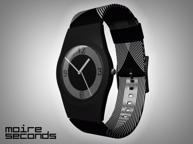
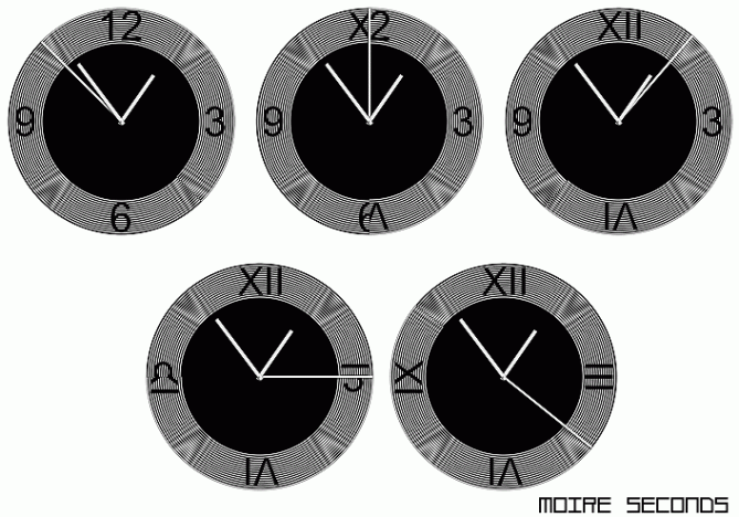
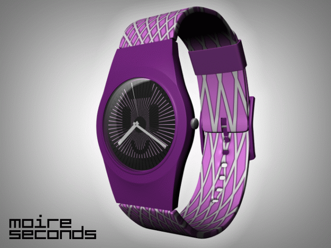
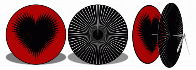
Kecskemeti says: “I wanted to modify a conventional watch to be more exciting to look at and to have a bit more movement than a regular watch, while using the same amount of energy as used by normal watches. You can check out the structural setup on the construction images below.
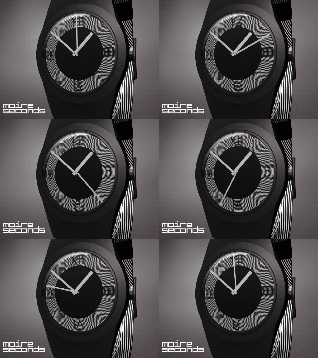
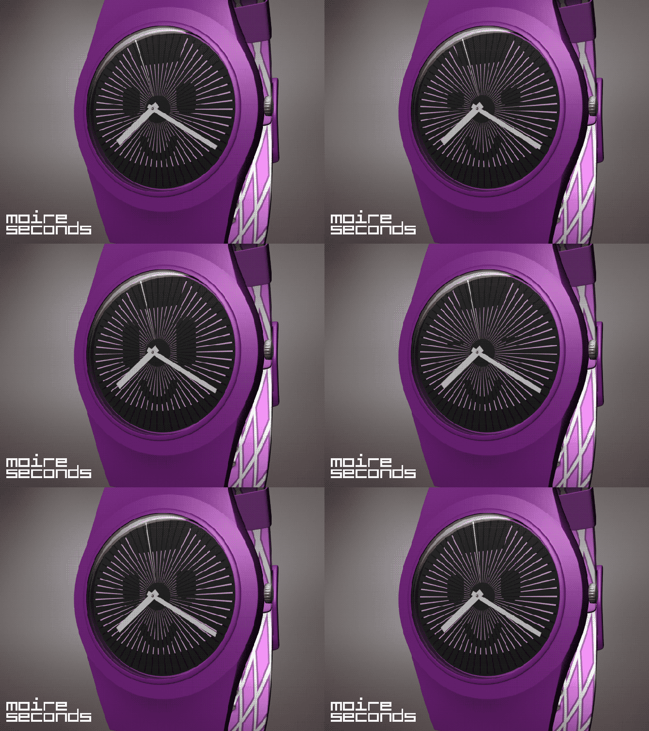
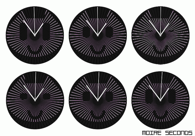
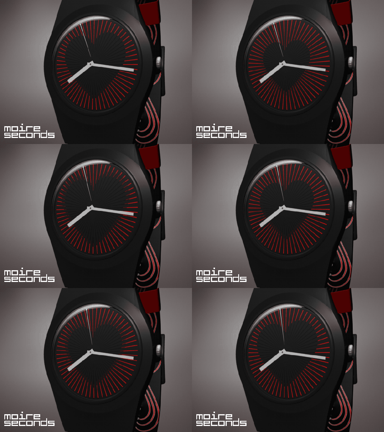
The time is indicated in the usual way a watch shows the time. But the second hand of the watch is replaced with (or connected to) a mask which rotates. Due to the rotation of the mask, it gradually reveals different parts of the watch face as time passes. This creates the illusion that the image on the face of the watch is changing.
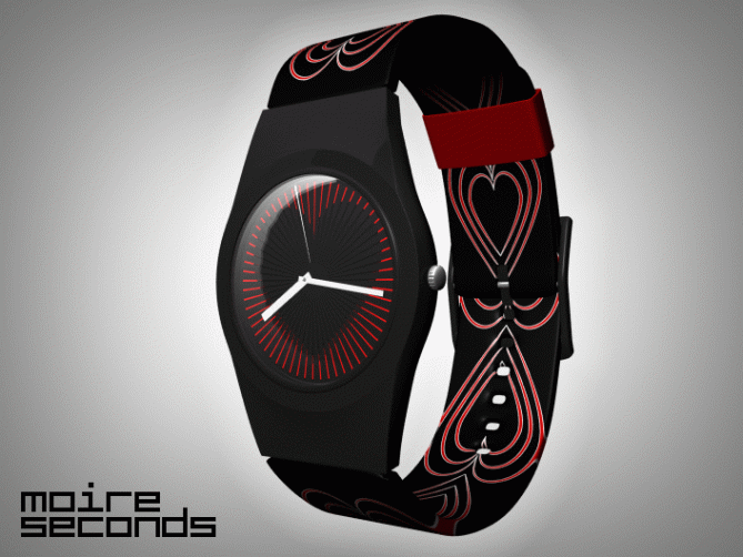
The illusion is based on so-called moiré-effect, more precisely moiré-animation. All three watches are based on this principle. The only difference between them is in the rear image and the shape of the mask.
This watch design would be ideal for young people and young adults as well. People who like pop-cultulre, happy and fun clothing, and accessories. The blinking kitty variation is more for girls, the number-changing model is for young men, and the heart-shaped one is for everyone.
Because by applying a simple modification to an already existing concept, the result is visually captivating. The clock face is always in motion, while showing time in the conventional way, so anyone can use it.”



I like it I like it I like it…. it gives me heart beat…. very cute + clever + simple concept that looks amazing. Guys let vote this up 🙂
And hello to Kecskemeti-kun 😀 or chan?
LikeLike
Great idea! I also had a similar idea, but I stopped him … (http://kepfeltoltes.hu/view/110322/MOIRE_SCREEN_ANIM_www.kepfeltoltes.hu_.gif) I see only a technical problem: the second pointer is at the top in the watches.
If this can be overcome: 5 stars! Good luck!
LikeLike
Clever! =) I really like the effect, especially since it’s achieved so simply. I have a soft spot for mechanical solutions… If there’s one thing I think could be improved it’s that I think there’s a lot more potential to the idea, beyond having an animated background. Perhaps the analog hands could be replaced by the animation, making it more integral to the design? As it is now the animation could be removed and it would still work perfectly as a watch. Nothing wrong with that, but I think you could give the concept much more zing, not to mention making it more ‘Tokyoflashy’…=) Still, top job!
LikeLike
blast! this is much more elegant than the moire idea i had cooking. love all of them, especially the matching bands.
well done.
LikeLike
wow! definitely want the numeral one.
LikeLike
I would deff buy this.
LikeLike
Why it dropped so fast? It’s a good concept indeed…..
LikeLike
I like the artistic idea pretty much. I prefer the black/white watch, but it is good, you also showed alternatives. So you reach more people 😀 I am not a fan of the case, it seems too traditional. I’d like this http://www.tokyoflash.com/blog/2011/03/a-stylish-simple-lcd-watch-design/ (maybe colaboration… I like to dream, nevermind) The color motives are cool though. Good luck!
@ Firdaus: In the first days, it can change pretty quick. The rating should stabilize within a week or two (if no mean forces influence it).
LikeLike
a very interestimg idea, but I never would wear it, sorry
LikeLike
I want the kitty watch!
LikeLike