Design submitted by Benegizer.
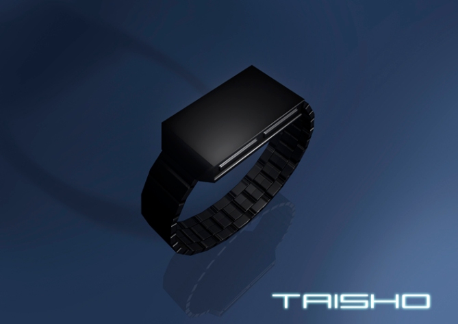
“My theme for this watch was “Simple Complexity.” I liked the idea of a very simple, rectangular shaped body. I wanted the watch to have a smooth, featureless face when off. I also wanted the body, face, and the light patterns to be as symmetrical as possible. Creating a very uniform, futuristic, but aesthetically pleasing watch design.From the beginning I wanted the watch face to be completely black, and featureless when not displaying time. No indentions, marking, or numbers. Nothing. Just a smooth, reflective, shiny, black surface. Much like the Monolith from 2001 A Space Odyssey.
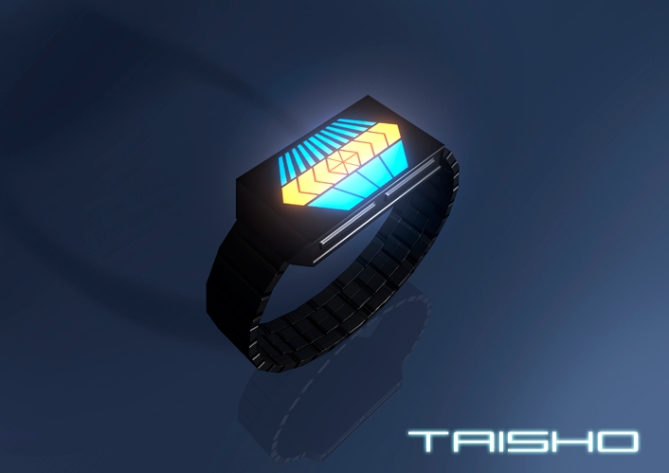
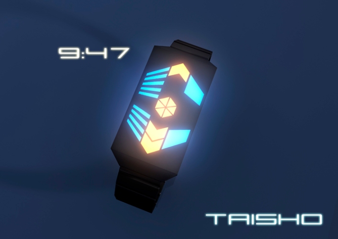
When the button is pressed the time is shown, glowing from under the surface of the watch. The thick middle bars represent hours, with the center hexagon representing +6 hours. The thin bars on the left show groups of 5 minutes, and the bars on the right show single minutes.
Personally I envision all types of people wearing this wrist watch design. Especially people who have a flare for the unique. I also think it will be very popular among sci-fi fans and gamers. Eventually I would love to see electronica artists like Daft Punk sporting watches like this.
I think the thing that stands out the most about my design is the lack of any details or marking on the face of the watch. When looking directly at the watch face you shouldn’t be able to see anything but your reflection. I also haven’t see many other watches with a strong symmetrical light pattern layout.”


This is simply amazing.
LikeLike
Mhhh I like it simple. The just flat display area is nice. And the small details around the watch which differ from that are also cool. I’m not sure about the proportions (case and strap width, that’s up to the manufacturers) and the empty corners of the display. A rectangular display would be a bit boring and a differently shaped case would be more controversial… so I think you found a good balance between angled & detailed and rectangular & simple. Not screaming new, but the design is still 5*/y
“Design submitted by Anonymous” Now I’m thrilled to know! Nice advertising strategy, tehehe 😉
LikeLike
LOL anonymous, if we don’t know the name we can’t criticise xD , i bet is firdaus or maybe is a new intriguing designer, either way, very very nice
LikeLike
‘Anonymous’ is those hackers. they must be diversifying
LikeLike
Geohot & company, they have fu***d all the normal gadgets and are coming for the cool ones LOOOOOOL
LikeLike
Toys-kun, it’s not me la….. and lol too for the anonymous. What a great design from mysterios artist…. I like it so much, n so my type of watch.
LikeLike
Sorry. I’m not sure why it says Anonymous. I’m positive I put my name up.
Anyways, you can direct all criticism to me.
As for the strap, it was something I based on the “Pimp’n aint easy series.” I wanted the strap to be simple as not to distract from the featureless face.
LikeLike
E-mailed support, so hopefully they can straighten it out.
LikeLike
It looks great! I like my watch simple. The black flat panel is also very appealing.
Good job Benegizer!
LikeLike
Very nice and actually quite simple. The only thing that I don’t like about this design is the way the 5 minute lights are laid out. The way they build from top and bottom is a nice idea, but when the time is (for example) 10:49, the minutes will be more weighted towards the lower face making the watch appear a tad lopsided. 5* nonetheless. I would definitely buy this watch.
LikeLike
I’m not sure I understand what you mean. If the time were 10:49, it would look very similar to the 9:47 picture except with one more orange block in top center, and all four blue single minute blocks on the right side.
I know that with certain times, like **:15, **:25, etc, the 5 minute lights will be slightly lopsided, but only by one space.
Thanks for your input though. I really appreciate it.
LikeLike
Glad to see they corrected the ‘Anonymous’ mistake!
I really dig this design. It makes very good use of the rectangular case design. I like the empty space in the corners when the LEDs are on, it makes for a good silhouette. The pattern that the LEDs are arranged in is also very neat and orderly, almost like an isometric view of an abstract building.
Bravo!
LikeLike
This is an interesting design. I think Taisho is Japanese for symmetry. Which is what the designer was going for. I don’t wear watches, but I like this one’s balance. It’s uniquely simple, yet techy. So I’d definitely consider hanging this one at my desk, with two others from a different maker.
LikeLike
Really cool! It is so spacy! It remind me of Enterprise. Important is, that the display is absolutely black. I hope it is not necessary to press a button (LCD instead LED)? If yes, it is a “strong buy” for me. A button could be for an animation or to brighten the display.
LikeLike
For me as well the most important thing was having a completely black surface when the watch is not showing time. But since it will be LED, you will have to press a button to check the time. The buttons are hidden on the sides.
But it will have automatic light animations that will animate on the hour, and every 10 minutes, between certain hours, like form 6:00pm to 12:00pm.
I imagine the watch being USB rechargeable, and programable, so you would be able to set the kind of animations you want.
LikeLike
変にデザインにこりすぎて読みにくかったり、時計には思えないものも多くある中で、時計という基準の中でデザインされていてよいと思う。シンプルだけど宇宙的なデザインが格好いい! また反射をなくしたフェイスというアイデアも斬新。 普段あまり気にしたことがなかったけど、漆黒の表面はとてもいいアイデアだと思う。 いきすぎず、ありきたりすぎず、洗練されたデザインが未来的でとても格好いい。 ぜひ商品化してほしいし購入したいです!
LikeLike
I really love the light display design. What I’m not so happy about is the shape of the watch at the top. Should have been a bit more like the design or less square or something around there. I voted 5 though 😉 good design.
LikeLike
Strong deja vue!!!!
LikeLike