Design submitted by Sam from Germany.
Sam says: “This is an adaptation of the idea I had for my San Sen watch. This time, I use an imaginary center line to divide the watch into two parts: One always black, the other one whatever is possible. I planned to let “the other side” be also transparent even. So all the necessary technology needs to be hidden in the black part.
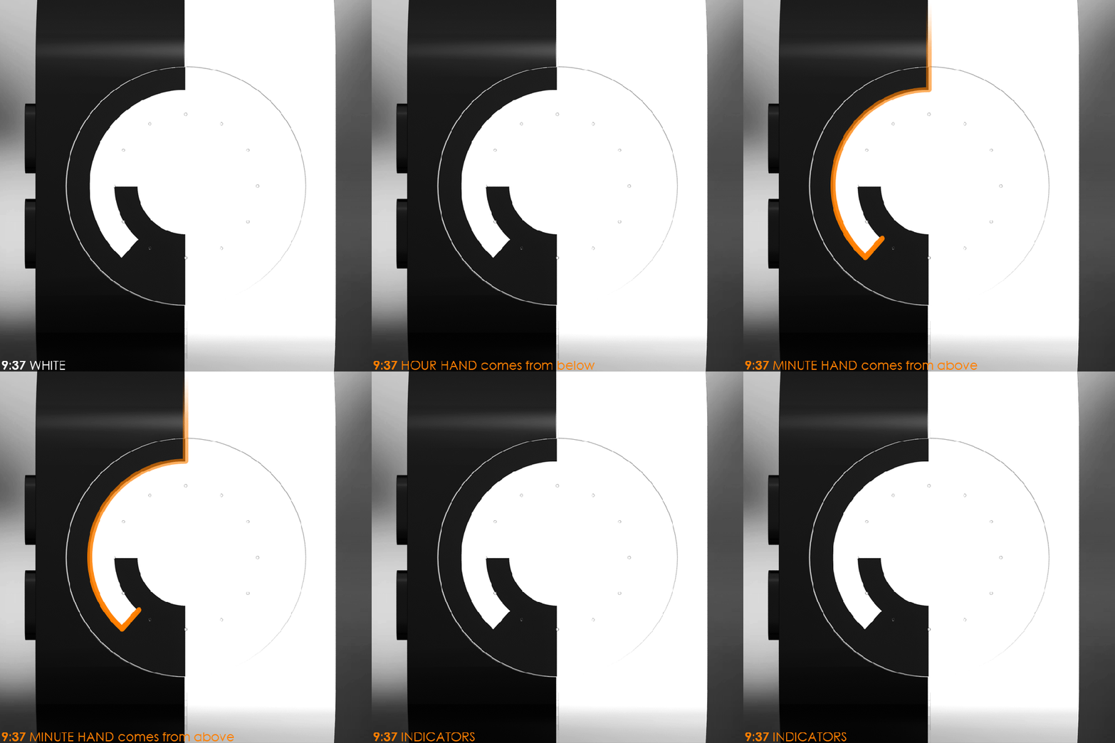
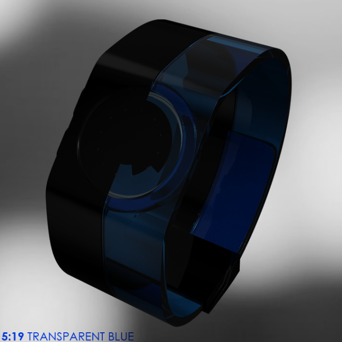
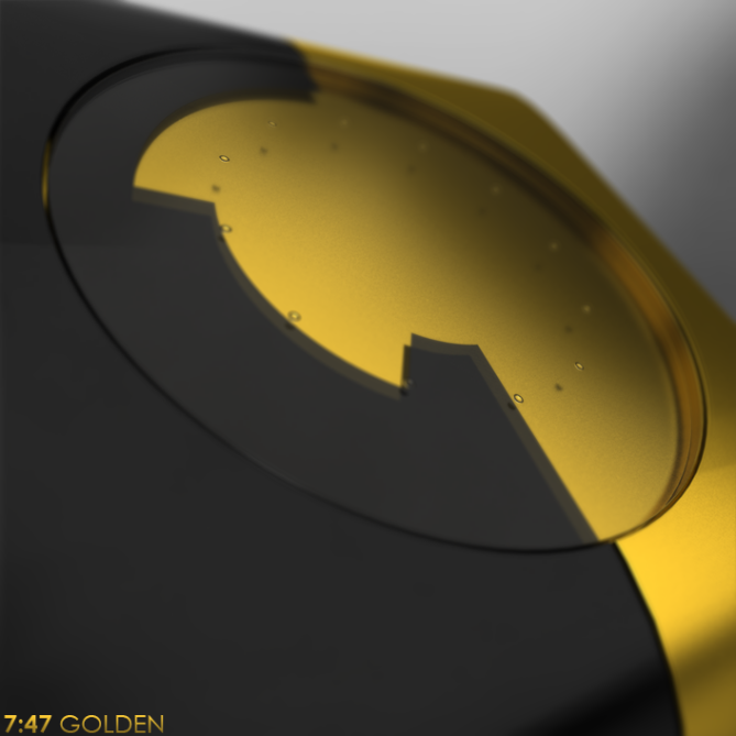
I made a simple bracelet which is hard in the case region and soft where the straps are. This bracelet is 50% black plastic and 50% differently colored plastic. These two sides partially interlock. This is where a layer of LCD defines the black part of the case. The watch is read like an analog watch. The two straight lines pointing away from the center of the display are the hour hand and the minute hand. There are small in-glass indicators in the watch glass to ease up reading.
Arts lovers and purists might like this the simple but graphic design and the strong duality. This is an LCD analog watch like no other.”
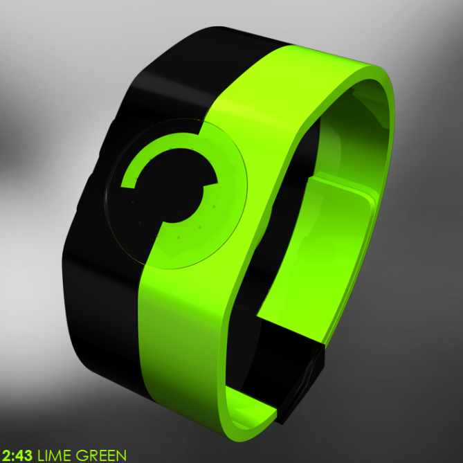
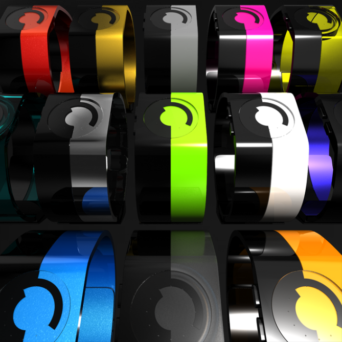


I love the green version, and I would still buy watch (even though I cannot wipe image of human anatomy from my mind, when I see the time at 9:37/10:36)….. Hope TF proceed to the next stage with your idea……
LikeLike
Tehehe, biology ftw. Now that image is even stronger, tehehe. Thanks for the comment Steve!
Here I show, how this watch could look on a wrist 🙂
LikeLike
😀 😀
LikeLike
Does the girl go with the watch? LOL ,it’s a very nice watch but with the san sen you arrived to perfection, maybe this one is more feasible, compared to the san sen but either way it’s an instant buy.
LikeLike
Thank you Toys. “An instant buy” is always a comment that makes me smile. 😀 See? Ah the girl, her green/black outfit was hard to ignore and it fits so well to the watch.
LikeLike
Sam, you just made my day with that image (of how the watch looks on the wrist). Lol….. looking good 🙂
LikeLike
Stunning. I hope they make San Sen and this. If I had enough money, I’d buy both 🙂
LikeLike
I cross my fingers too. Thanks for your words MD!
LikeLike
Beautiful images. Personally I wouldn’t wear this design but I like the way the time is displayed, it’s simple and creates quite intriguing shapes.
LikeLike
Hey thanks for your honest words. It’s cool you judge it even if not seeing yourself having it. Thats cool, the graphical effect gets through to you 😀
LikeLike
Sam, I like your “san sen” most……I cannot delete that watch from my mind….and after a distance the black/tr.blew.
With Duality/LCD you enlarged the possibility to love your concept by large numbers. I am your victim again. Buy!
LikeLike
Woohoo yeah 😀 Seems, the San Sen is hard to beat… at least for me 😉 It’s cool you also like this one.
LikeLike
Sam, very nice original watch, the black version I like that.
LikeLike
Oh Patrick, they are all 50% black 😉 Thanks for pointing out the originality – that’s what I always try with my designs.
LikeLike
Ah ah ah, yes it’s true, but my taste is towards the colors dark blue or metallic, which is why I was talking about the black model.
LikeLike
Sam, I like the previous version better n more than this. But thats my taste.
LikeLike
It’s alright Firdaus. Interesting to be my own competitor, tehehe. Well, thanks for telling 🙂
LikeLike
Wonderful design! I love that babe you showed in your first message. But you don’t need a sexy girl, although she is a good advertising help, hahaha! The 50/50 idea is damn smart. For myself the metal, the gold and the white versions are the best. My girlfriend likes the blue transparent and the lime green. You know, you cover a huge range of customer’s ages with your dozens of variations. If tokyoflash decides to make it, they should make many different versions too. As far as I understood, the electrics are all inside the black part. So producing the other part in different colors should be the easiest thing on earth. 5*/y
LikeLike
Tehehe, the girl is a little help. When I saw the green/black outfit, I couldn’t resist to give her the lime green version of my watch. I hoped to reach a wider range of people by offering many variations. Seems I do… at least to a certain amount 🙂 Thanks for your comment!
LikeLike
does make me think about the ZIIIRO watch (zerowatch.com)
LikeLike
Hmm I like that one. Smooth shapes… Same philosophy of offering many many colors 😉
LikeLike
Hey Sam. I really like this design, it’s clean and ‘simple’ (but in a positive way). This is definitely a watch I would buy. Transparent blue is my favourite colour here.
You have had a few designs that I really want to buy. I really hope that I get to own one of them one day. My old Accurist has a date with a hammer 😉
LikeLike
Hey yeah simple in a positive way, that’s great 😀 I would be so glad if one of my watches lands in the shop. The transparent blue would look so good there, tehehe. Nice to read, that my work appeals that way. Thanks Duke!
You had an Accurist LED watch?
LikeLike
I like the San Sen but I do not like this design; it is too contrasty. I read an article about corporate logo design several years ago on Suck.com that basically said, “the unimaginative create a black & white, split in the middle, contrasty image and think it’s stylish. We call it, The Logo of Death.” Then they went on to illustrate several silly corporate logos that were cut-down-the-middle contrast designs. Sorry, checkers have been done before. Anything too contrasty is just modern checkers.
LikeLike
I agree about the strength of the contrast. That you already think about logos, is the crucial effect this watch has, and no other watch on here (I tend to exaggerate 🙂 ). But beware, watch design is not logo design, you cannot necessarily apply the same rules. I don’t agree with the term checkers. There are no squares, and no points in which four areas meet, because that effect would really scratch your eye. I just have two things, a left half and a right one which partially interlock. The word “contrast” was made for this watch, tehehe. Well I cannot change the taste and I don’t try to convince you. Actually it is good, that you wrote your concerns. We need more such critiques here, so we know better, why concepts are not liked. Thanks Tim!
LikeLike