
Design submitted by Sam from Germany.
Sam came up with the idea of a 12-5-9 watch with all the time telling LEDs placed on one single circle. If it is 1:00 there is only one light that fills the whole circle. If it is 1:23, there are six lights (one for the hours, 2 for the minutes x10, and three for the minutes x1).
The circle would be divided into six equal segments. There are a maximum of twenty-six divisions. In the center of the display are round digital numbers showing the seconds. The have a random color each second. The date mode in 12-3-9 has practically the same way of reading. The center numbers mean years. An E-ink display would have the resolution and brightness to make such a display.
Counting should start from the top position of the display to a clockwise direction. The cyan colored lights stand for hours, 10 minutes group in magenta, and single minutes in yellow. The lights are bracketed to ease up reading.


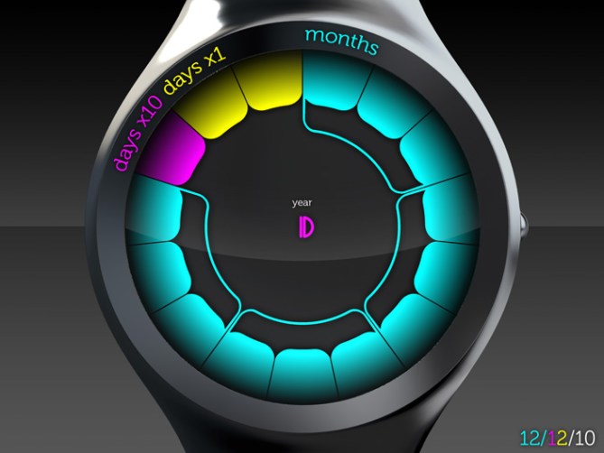
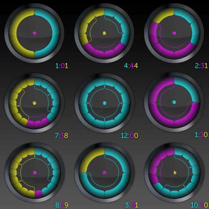


Hello 🙂 I made this watch. I wanna let you know, that each triple of segments gets combined by a bracket to ease up reading. It maybe wasn’t clear in the despcription. The bracketing helps you to count quicker when there is a larger amount of segments on the display and it also makes the display look cool 🙂
LikeLike
Sam has a factory of ideas in his head?
Very nice!
LikeLike
Thats brilliant! Coloured e-ink would be a great way of making it energy efficient, and easy to read! The brackets would def help! Its a brilliant idea, i just found on first look it took me a few seconds to count the time! but its actually very intuative!
Good job!
LikeLike
Woohoo, yeah idea factory 😀 Every little thing inspires me and my head works and works 😉 Merci Patrick.
My colleagues also firgured it out pretty quick. It was first confusing. But even when the 12-5-9 concept is unknown until now, it works. They asked me about the colors. I’m pretty flexible concerning the colors, I just took three colors with the biggest difference among them. Red blue green… not this time 🙂 Yeah it takes just a few seconds but looks so interesting everyTIME. Thank you Rascle!
LikeLike
Sam, very nice animations! Of your submissions so far, I think this benefits the most from animation.
LikeLike
I´m sorry. I don´t like this watch. The whole design looks like something a 2nd grade girl would wear. Just doesnt look appealing to me. So sorry if I offended
LikeLike
I like the design. Is really a brilliant idea. It easy to read the time and interesting.
LikeLike
I love it. It’s ingenious, looks cool (except I don’t like the colour scheme) and is a lot easier to read than some of the other watches.
LikeLike
@ logan: Yeah, I liked to show the way it works and the variety of the display. Thank you Logan!
@ daniel: Well that’s a legitimate position – tastes are different. A reason would’ve been nice since normally people seem to justify their critical statements.
@ coolte: Cool thanks for that. That’s the reaction I liked to provoke.
@ Xenobio: You can tell me an alternate color scheme and I could try that out. But think about it 🙂 I’m glad the time reading is rather easy for you. I hoped for that by putting all the digits on one single circle.
LikeLike
I think this one of your best displays yet, Sam – brilliant! The design of the display is really well thought out, I really like how the bracketing adds a little extra variety and detail while also making the time quicker to read (without ruining the mystery of the watch by giving away the method to those who don’t know how to read it!), and I think it has this great stylized, almost-organic feel that really makes it unique.
As far as suggestions go, I’m not all that fond of the colour scheme on this one (maybe give the classic RGB a try?) and I’d like to see the case fleshed out a bit more (as-is, it seems a bit bland and almost too feminine for my tastes). Also, given that e-ink displays only use power when the display needs to be updated, you may want to reconsider displaying the seconds so that the battery will last for an exceptionally long time.
Keep up the great work!
LikeLike
Wow thanks for the detailed review! You really see what I intended.
As for the colors, check out these combinations. I like the “black-white & one color” version right now.
As for the case. Yeah I believe it could be more characteristic. I tried to make a neutral, not too talkative carrier for the display. I could live with a more detailed display as well with a more simpler one.
Oh, If that is really like you say, then good bye seconds. Maybe am/ap indicator then.
Thanks again!
LikeLike
I have to agree with Squirrelking here as well. The design is exceptional for sure color and case not quite working. Your variations on your page there look better. small details for sure. Most important is the base concept and that Sam you hit. 🙂 I am also a fan of your designs.
LikeLike
😀
When the base concept was through the sketch phase, then I had many many things to consider and this is only one way to interpete it. I’m glad the concept itself is strong enough so people quickly like to see changes in the things wich aren’t that strong.
I tried a less smooth case with a traditional strap attachement. I like this more actually. More imaginable. Maybe for others too 🙂 Here is the link:
Thank you for your words!
LikeLike
You’ve got some nice combinations on your variations image, but I must say that I really like the look of the RGB one!
Actually, as I think about it more, couldn’t the colours potentially be user-customizable? I imagine it could add a degree of extra complexity and cost, but that would be one watch that you could really personalize!
Also, the AM/PM indicator would be a really good compromise and would still allow you to display the year there in Date mode while maintaining the consistency of the design.
Great ideas Sam — don’t stop!
LikeLike
RGB for you then 😀 Cool that I made these variations.
Oh yessss! You really have a good idea with the user customizable colors. First: that’s a reasonable reaction to the difficulty to please everyone with a color triple. Second: The “flexible” display already screams for E-ink or E-paper – but this technology allows even more and optional colors aren’t a big jump in energy usage / feasability / costs. If RGB (or CMY) works, then all colors are already covered. Brilliant idea! Somtimes I feel more green, sometimes I like to see the german flag, sometimes I’m depressed and prefer grey shades… So many possibilites!
You’re right about the year in date mode. Since it is not changing so often, it can stay.
Thanks alot for the clever input!
LikeLike
Nice design again Sam. I really like this one because of the display, it’s simple, intuitive and is a good balance between easy to read at the same time as looking interesting, different & fun.
I have to agree with some of the comments above about the color scheme. It’s not for me, but, it may be ideally suited to girls. I did have a look at your additional combinations and couldn’t see anything there that caught my eye either. It’s difficult to find a triple color combination.
I would like to see this display idea with a more masculine case, maybe even a square case and possibly with light blocks that are a slightly different shape, squarer maybe?
LikeLike
I finally see the issue with the color scheme. I like this color triple and when I saw it again and again, I get used to it and didn’t question it. I cannot imagine the first impression, other people have because I’m too deep in the project. I’m glad, this blog works like that. Other points of view and constructive critiques are always welcome. Finding a good color triple is quite worth a research 🙂 Check my link in the previous message for a different case/strap solution. Square case? I never would have had this idea. Maybe I’m to narrow in my way of thinking, tehehe. But more edgy segments are a possibility. I like the round corners pretty much though. Actually, they are there to make the segments better countable. Edgy shapes and thicker gaps would do that too. But I always liked the lcars diplays from Star Trek ( http://www.utopiaplanitia.info/blueprints/1701d/original/display3.jpg ) and let them influence me. Oh, maybe such colors are good 😉
Avatara, thanks alot for your kind words and critical statements.
LikeLike
I don’t need to complain about the colors. When you do the user-custimizable color option, then all is fine. I would really try a lcars display color scheme since I’m a trekkie. Case and straps are simple and okay. The base idea is just awesome. I never saw a display wich changes like that. All other displays are kinda static and only add shapes. This one deforms according to the number of shapes. The brackets for each triple of segments is just brilliant. This one needs to be made.
Btw, very interesting that people provide so much support here. I hope this is a good sign. I think I would buy 4 or 5 watches from you. I already save up money 😀 Maybe next year we see one of your watches in the store.
LikeLike
wow
Very original and interesting!
I m maybe a bit too focus on the style but there are too many colors for me here. I like one or 2 colors. (including black) 3 only if 2 of the colors are very closed to each other (only luminosity difference)
Beside that, the way to read the time is genius!
LikeLike
Change the yellow to electric blue and we’re set.Great concept!
LikeLike
@ Aphosno, said and Cherubim: I’m kinda glad, that the colors are the biggest issue, because it could be solved with a watch with adjustable colors. That would be an awesome timepiece! Thanks alot for your messages!
LikeLike
Very nice design. I would buy this watch for myself and give it for gifts.
LikeLike
Definitely a great design. Solid watch concept. I’d buy it.
LikeLike