Design submitted by Sam from Germany.
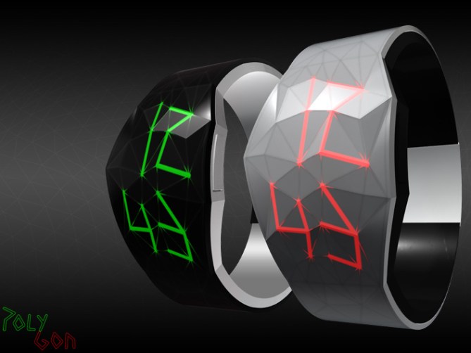
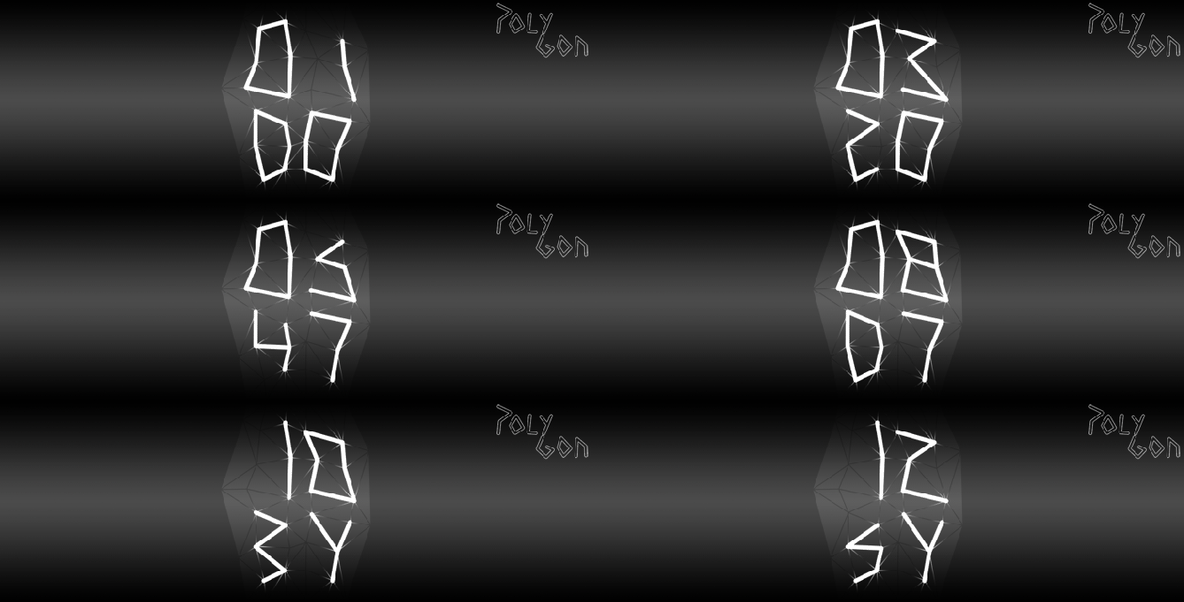
This watch design is made in one solid piece. The case area is wider and has a crystalline shape and surface. The strap is made of flexible plastic and the casing of rigid plastic. There is a wide frame drawn all over the watch. The polygon edges define the shape of the numbers which is displayed in easy- to- read digits but with a little distortion.
The overall appearance of this watch makes it both a fashion accessory and a geeky gadget.


Hello Sam, yet beautiful design.
My taste is mainly for LED watches, with a particular reading (for the uninitiated), this watch is readable by all, is this the new philosophy Tokyoflash “tell time differently”?
I had this idea on a sketch of facets and it is your design, so my vote is YES!
LikeLike
@ Patrick: Thank you 🙂 The inspiration came from my 3D work. I thought it is a cool new way to make a watch wich could fit the Tokyoflash philosophy of telling time differently 🙂 Here I have another view of the watches in different colors.
LikeLike
Ok Sam, I love the Black Watch base number in Green.
To shape with facets, great!
LikeLike
WOW! Wrist Porn! That thing can get you off! Very nice design Sam.
LikeLike
Nice one Sam! Love the concept. This design could be made without too much difficulty.
LikeLike
Thank you! That sounds good.
LikeLike
This is another lovely design Samu-kun~ 🙂 the design (somewhat) connects my mind to astrology 🙂 wondering what your 3D work is – the one that inspired you to come up with this design~ and im not sure you intended to show what im feeling right now —–> because if you intended to link the stars concept with the watch, and THEN upbrings the concept of jewellery through the LED lighting – I would think that you are damn SMART 😀 hahaha~~
Jewellery concept can be very feminine, but clearly you put thoughts into the design of the watch strap, so the watch is neither too soft for a guy or too strong for a woman. Very clever~! I also like the triangular facets on the watch surface – not sure if the numbers can be made to show directly on surface 😮 but it certainly looks great! Overall I can see your aim in expressing glamour and individuality 🙂 and you’ve reached it 😀 Congrats~ It’s a very likeable product~
p.s as a girl i favor the pink one more haha (the one shown in your later post~) 😀
LikeLike
@ Patrick: 😀
@ Bill: Hahaha, wrist porn. Never heard that before 😀 Thanks for your input!
@ GN: When I the first computer image with the illuminated numbers, ithey also looked like zodiac signs to me. I didn’t defend against that impression, tehehe. It wasn’t my initial intention to show astrological images, but it is very cool if everyone has his/her own interpretation. But I knew that I might have this duality: technical wireframe look and blingbling diamond appeal… depending on the one who looks at it. Kinda controversial 🙂 Oh I wasn’t inspired by a certain 3D work, it was the way complex shapes are displayed in the 3D programs. Always divisions and lines. I chose the irregular polygon mesh (not an easy to understand isoline display) because thats… cool. I wanted to get that into the real world. I believe that could be done to any object… I think the world is more than ready for this style 😉
LikeLike
Really nice one Sam! I was trying to design something like this (with edges and facets), but you have made it and pretty well !! The white and red looks very nice 😉
LikeLike
I don’t know about polygon meshes. I like the mineral look and the accentuated edges. The time reading is as easy as can be and looks nice. I can imagine wearing one. I would like to have black-blue. Maybe you need to make a table with the cases and number colors, then people can check their favorite combinations.
LikeLike
Black & Green. My favourite combination. Love the image and the funky way the numbers are displayed.
I echo Patrick when he says “this watch is readable by all”. I want something that is less easy to read instantly; something that has something more than just digits.
I would be interested to hear what other people think about this.
LikeLike
@ Genghis: Thank you! Nice to read that from another designer 🙂
@ Aphosno: Thanks to you too! Good to have different points of view here.
@ Avatara: Funky and readable, that’s quite a résumé 🙂 Thanks alot. I also like to hear the opinions. I was prepared for a controversial mini war, tehehe.
LikeLike
This watch would’ve been so cool in white casing and blue LEDs. I live in Norway and right now it snow outside, and made me think of this watch. “What if it looked like a glacier?” It would also look amazing in black casing and warm-white LEDs, to look like the night sky with stars. The style of the numbers look like starsigns to me…
LikeLike
So you checked the link I gave on my first posting here. Yeah I like the associations about star signs. The glacier image is cool too (in the real meaning of cool, tehehe) I really should make a table and check, what color combinations are liked most 😀 Thanks again GEEK!
LikeLike
Very cool Sam!
Not for my wrist, but I m sure there is people for wearing this one. And the idea is definetly good!
LikeLike
Thanks again for you honest words!
LikeLike
Trop belle!!! I want,I want,I want!!!!
LikeLike
Merci, merci, merciii!
LikeLike