
Design submitted by Sam from Germany.
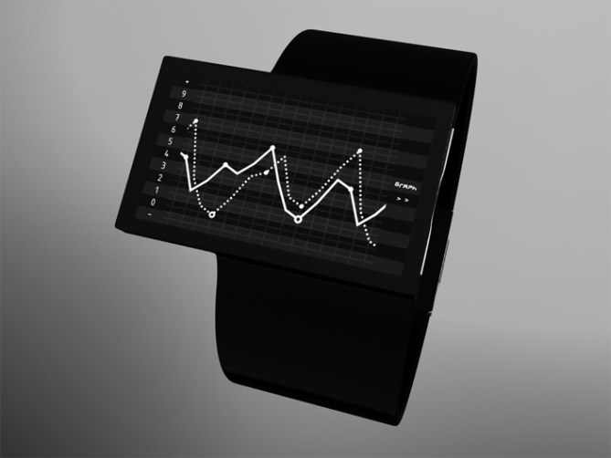
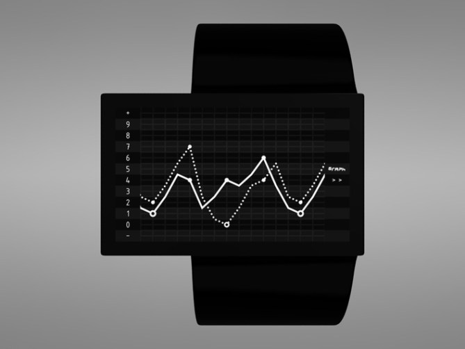
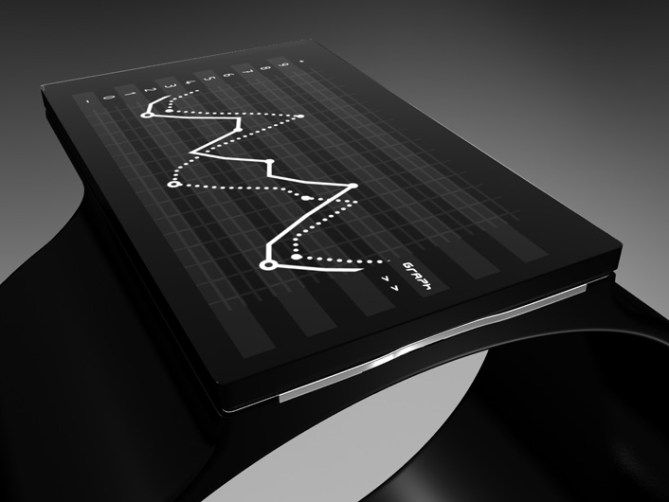
Sam came up with the idea of stock market graph as a cool contemporary watch design representing the end of the financial crisis. There are two graphs which continuously move from right to left.
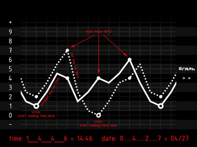
The time graph is a normal line which goes up and down, just like in the stock market. The date graph is a dotted line. On each line are circles and thick dots. Their position represents a number that is on a column of numbers on the left side of the display. Time/date is read from the circle indicator. The three following dot indicators complete the four digits to tell the complete time/date. The graph is constantly moving so date/time information is always displayed.
Sam is thinking of e-paper or LCD for the display. Just a black and white display that does not need much energy.


Clever design! But not sure about the date bit.. actually makes it a tad confusing!
LikeLike
Thank you! I’m open for suggestions 🙂
LikeLike
Hello everybody. The second image is meant to be animated so you can better understand my idea. Maybe it is too big for this blog, so there is a link here.
LikeLike
After looking at this I better understand the idea but I think it should be a little slower personally and smooth. The picture shows it like a slideshow of the graph jumping spaces instead of say a smooth sliding movement across the screen.
LikeLike
Well done Sam. Maybe have the two graphs could be in different colours as well? Might look good but would make the watch look less minimal. It would be good if there was an info board running along the bottom as well, to give it that full Stock brokers look. Only thing is I think stock brokers would probably rather wear a Rolex.
LikeLike
Yeah those posers might wanna wear a Rolex, that’s true 😀 But Rolex watches… I hope stock brokers have a better skill for money than for aesthetics 😛
I thought about a rolling board but I didn’t want to overload the guys and girls with too much things. But maybe this is the way to display the date, if it turns out to be too confusing as a graph. Or other information. If a radio or bluetooth reciever could be implemented, then any kind of live information could be shown… Very interesting idea.
About the different colored graphs: I hoped this can be done, but LCD cannot do it I believe. If e-paper can do it, I would like one graph blue, the other one green.
Thanks for posting. I hope to see you more around here 😉
LikeLike
I like the minimal colour and I think just black and white would be perfect and help it be more sleek. It took me a while to understand how to read this one but once I figured it out I realized how it was easy in a very new way of telling time. This would definitely be something I would purchase. I would recommend going with a black leather strap but a metal face maybe? I think this could be a great seller for Tokyoflash! Please Make!
LikeLike
I also love the idea of having the graph constantly be moving but I think it should be a slow, crawling movement that is just slightly noticable. Kudos to you Sam.
LikeLike
Yes please make 🙂 Black leather and metal face would fit my intention to keep the outer style silent and rational.
The slow movement is a brilliant idea. I thought about one span in 15 seconds, but since I planned to always see 125% of the display, the slooooow speed wouldn’t harm. And it would fit more to the stock market theme.
Very inspiring, thank you!
LikeLike
I wear a suit sometimes, when we have a meeting or a business travel. I would look so cool with this watch! Takes a little to read, but you get used to it. I prefer tokyo flash watches to rolex watches anytime.
LikeLike
I’m not voting stars on this one, because it’s not something I would wear. It’s just too big for me.
I WOULD buy this design, however as a WALL CLOCK. I think this concept, escpecially with the animation, is better suited for a wall clock, or maybe even a desktop alarm clock. I also like the idea about adding some color. Really a great concept! Good work! 😀
LikeLike
I would definitively wear this watch. It goes where no other watch is and despite it looks familiar (IMO) with is medical graph concept, it propose a new way to read time. I suggest a third wave straight across the others for seconds, aka those heart beat dots with a fading tail. For example:

something like this but… simple and white on black. Its horizontal movement will complete the vertical movement of the actual hour / date.
Great work Sam!
LikeLike
Very original! Would definitely get attention lol The telling of time and date is a bit confusing but sure easier to read if watch was on hand
LikeLike
@ Aphosno: Thank you, nice to hear a business opinion.
@ Heather: Always nice to have your comment! A wall clock… not for this style. I wanted to go away from the wall. But Tokyo Flash wall clocks… oh that would be awesome 🙂 Thanks for your input!
@ niclet: Oh medical. I am working on a watch design wich allows several interpretations. This graph style watch also does. Stock market, medical themed, seismology (earthquake)… That would be a cool trio. Nice, thank you!
@ IamGo: Thanks to you too! That is the impression I liked to provoke.
LikeLike
nice concept if it comes out at the right price i will buy it
p.s. is there any way of like sending a pm
LikeLike
Yeah the price must be right 🙂 If you like to pm, then you can write to samukun(at)gmx.de
LikeLike
Good job again Sam!
I like the way this design fit business men!
It gives them a chance to look at an increasing graphic even on an economic crisis periode!
LikeLike
Hahaha, that’s true 😀 Thank you!
LikeLike
Such a great idea !!
Let me know when it comes i’ll definitely buy it !
I put an option on it 😉
LikeLike
Tehehe 😀 Thank you!
LikeLike