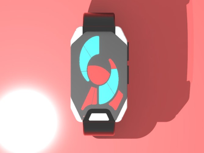
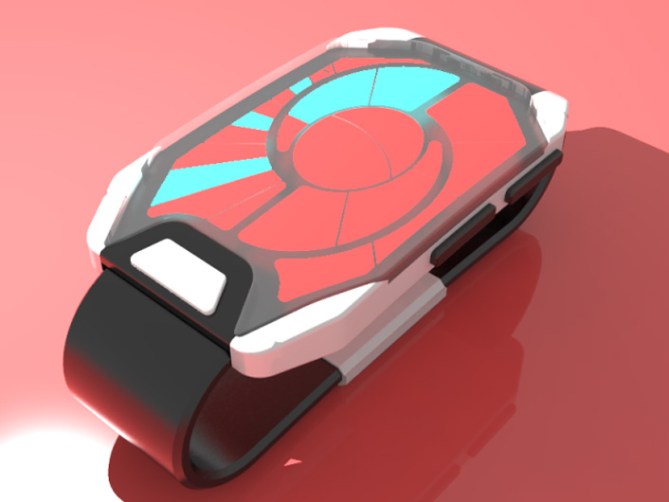
Design submitted by Jorge Zermeño from México
Jorge says “I was playing the videogame of “Portal”, then i had the vision for my watch design. I designed it casually, in black and white. The time is displayed in three zones; single minutes, 5 minutes, hours, as well as AM and PM. I feel this watch design would be great for all kinds of people, it is a beautiful and casual design that would fit with the fashion of many people.” “It is simple, but very striking and carries with it the essence of a game.”
A fascinating and quite cryptic layout in this design and a very simple case and strap shape. The two color display with blue and red LEDs is an interesting element of this design. How do you feel about this concept? Could you think of ways to improve it or develop it? Do you like it as it is? We’re looking forward to your feedback.


Looks pretty good, but it would be even better if it had the all 12 hours instead of just 6, and the segment that indicates the hour could be the only one not red. Anyway 4*
LikeLike
Originally designed the watch to show the twelve hours, but I change the design to have it easier. And it also served to display the colors of the portal.
LikeLike
I love it!!! I will buy it for my boyfriend…. The design is really amassing!. 5/5
LikeLike
Hmmmm quite unusual design. Nice artistic/alien display. Takes a bit to understand the display, but it is not so hard to read than I thought. I hope the top image shows 7:11am, and the third shows 10:59pm 🙂 Good work!
LikeLike
thanks!
LikeLike
Great watch, great design, i love it.
LikeLike
Good job! very original!
LikeLike