Design submitted by Stefano from Italy.
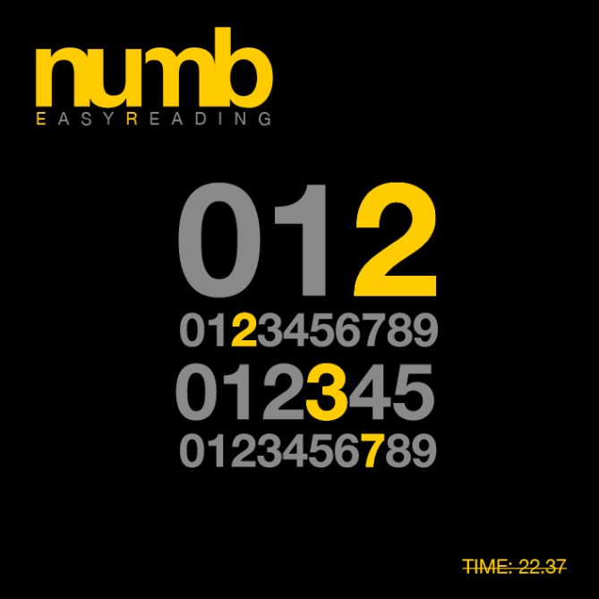
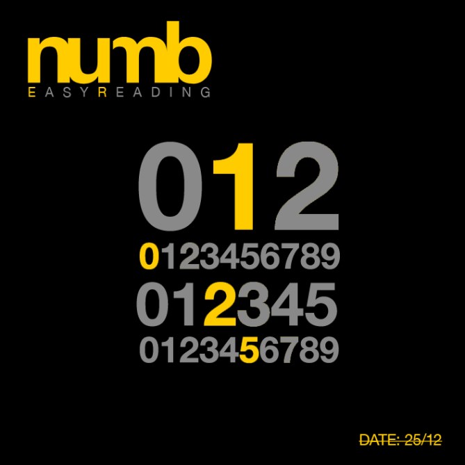
numbER is a digital watch design with a difference. The time can be read instantly and does not have to be calculated in any way. Stefano says “numbER is a simple way to read the time – in the best fashion way”, the point being, simple is best but can be displayed in an interesting format.
The watch case and strap look quite standard but the layout of numbers is not like a typical digital watch. There are four rows, each of which indicate four digits of time. In the example below, the time is 17:28. This design could use LCD or LED with yellow LEDs behind the numbers so that they light up individually. The strap continues the color theme with yellow and black links.


I love this design. Bold color and simple, yet appealing display. Very cool!
LikeLike
Don’t love it, don’t hate it…just a little boring is all. Makes me think of Sesame Street for some reason.
LikeLike
Oh cool. The display graphic design is very stylish. The date is 10/25 🙂 Yellow-Black is indeed a nice combination. The straps are nice too. I like watches you can read, and this is a fashionable example. Good work!
LikeLike
Think it’s nice but definitely more mainstream, which may appeal to various people. Really boils down to what you like. It would catch my eye in a store, but that’s as far as I would go. Maybe others would take the next step and buy.
LikeLike
Going a little mainstream is the key to the much needed growth, because someone that buys this and is happy with it, might want more and might get another Tokyoflash watch, and another one. That’s how fanboys are created, and fanboys bring money and are good for promoting products.
LikeLike
Totally agree. 😉 Just wonder how it would compare with some of the other designs. I guess only the customer would decide. I’m sure it would sell, just wonder better or worse than other designs. It would be a cool watch for sure. Good luck!
LikeLike
This is fun. Not sure about the yellow and black combination. I mean it looks great here but i’m not sure it’s the watch I would choose to wear/buy.
LikeLike
I like the black and yellow combo on the display, but the black and gold bracelet is kinda tacky, a black only bracelet would be great.
LikeLike
I like the black/yellow combo… Kind of has a race car feel. I hope the band wouldn’t be gold, but a bright yellow paint/enamel finish so it truly matches the color of the lights.
LikeLike
Simple and stylish. Yummy work!
LikeLike
I like it! 5*
LikeLike
Yes, I like it. Very slick. Would buy it.
LikeLike
Another thumbs up for the bold, high-design, look. And agree that yellow and black is part of that boldness, but definitely should not be gold. I do think the NumbER naming is a bit odd. I see “numb”, of course, but that confuses me, instead of challenging me. The name doesn’t appear on the watch, so not a big deal. But yeah, I like it.
LikeLike
I like that!
Wonder if it is hard enough to decypher for tokyoflash.
Great job Stephano!
LikeLike