A new concept design from the Tokyoflash Design Studio.
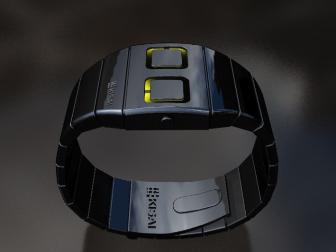
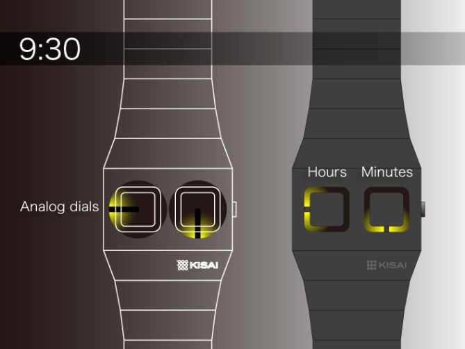
An analog watch concept from the Tokyoflash Design Studio. The metal case of the watch has two analog dials which indicate hours and minutes. Luminous paint behind the hands of the dials help to illuminate the time and add an interesting natural lighting effect.
The case and strap are metal and offer a streamlined curve. As the hands turn, so does the dial, pushing the painted dial round in a clockwise direction to ensure the graduated effect progresses with time. Is this your ideal watch? How do you feel about the color scheme and time display? Let us know how you feel about this concept.


I love the shape and luminosity of the analog dials. I think I’d prefer to see the dial shapes repeated as recessed shapes in the watch strap, so there’s a uniform pattern of those shapes across the entire strap and face, with just the two shapes on the face being functional. Also, I’d make the surface matte or lightly brushed, not glossy, so the dials stand out more. As for color, I like this color, but I guess it’s partly a question of what paint/light combination is the brightest.
LikeLike
Personally, I love the design as it is. I love the idea of incorporating Tokyo Flash’s unique designs with an analogue-style watch as I have a slight preference towards analogue watches. Like Logan said, it will come down to deciding which colour combinations would provide the most luminosity for readability. It would be great to have a few choices for colours – for both the lighting and the watch itself.
I do have to question whether the black rotating ‘hands’ could be made thinner. This is just a thing of personal preference, of course, but overall, this concept is very appealing.
LikeLike
I love this design, straightforward and very simple to figure out 🙂
LikeLike
Personally, I love the design as it is. I love the idea of incorporating Tokyo Flash’s unique designs with an analogue-style watch
LikeLike
Wow very nice! Dividing the analog display into two is cool. Using rounded squares for them looks very stylish. The yellow backlight gradient looks good. It’s simple, easy to read, and pretty rational in its appearance. I want it 😀
LikeLike
I would love to see this design in a flat matte plastic. Nice and light fun to wear, not too over the top, and since it’s analogue should be not too hard to make.
LikeLike
Yes, an analogue watch like this would be cool. A nice medium between a traditional analogue watch and cutting edge futuristic watch design, like those at Tokyoflash. For me, this is definitely for those who like to be more subtle with their fashion.
LikeLike
This is out of this world. It´s not from Star Trek, nor is it from the Star Wars. Or any other science-fiction movie or series for that matter. It´s even beyond our universe. You have done good this time(woops… did I say time). Tokyoflash !! GOOD JOB
LikeLike
Great idea, the old school look of the case resembles the Hanko and the NI, but overall it looks nothing like those too, yellow and black combo looks pretty sweet.
LikeLike
I love it! Make this and you have at least one customer.
LikeLike
Very nice watch like most watches designed by Kisai (besides, I own one), but the current trend in the Blog is a watch that does not give the exact time, it must be interpret. I wish I had 7:34 in this example?
LikeLike
love it. It is simple, very smart, very Tokyoflashy !!!
@Patrick, there are other wathces, classics, with two hands, and no indicators …. so I think is not very important.
LikeLike
The ideea with the 7:34 minutes can be made by ading 4 little squares between the hour and minutes’ indicators, or the black lines who indicates the hour and the minutes can be improved with thw lines for each indicator. Two for hour indicator, and two for minutes indicator.
In this way, you can read 7:34, 9:42, and so on……
By modifing the concept in this way, the concept can have the same similarity.
LikeLike
Gabriel OK, you convinced me.
LikeLike
This is an interesting design and I like the subtle way the yellow seems to change with the time. It also has a slight retro look which will divide people – some will like it and some will not. More variety could be given, by also having a silver case (as well as black) and perhaps other colours, instead of just yellow. Also I do agree with comments above about the difficulty of visualising times such as 7.34 etc (although I know some analogue watches also have this problem). However as is being suggested above, it could be added to the design quite easily. Also a day and date feature would be good.
LikeLike
Love the yellow glow against the black metal. Love the simplicity of the design.
LikeLike
Hey, that s a pretty tokyoflash analog watch! Nice one!
LikeLike
ORGASM ON MY WRIST!
LikeLike