Design submitted by Víctor from Spain.
This design is inspired by the concept of unity. The circle, symbol of the sun, creates rhythm on the watch, it begins from the centre moving out to the edge, the multiplicity of the sun rays interpreted as hours, increase the shape of the watch. This makes relations between the one, symbolizing the perfection of the simplicity, and the eternity.
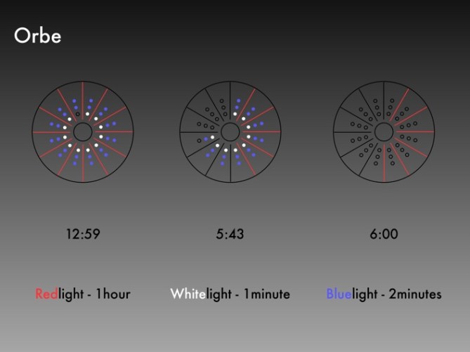
It is simple, after pressing the button in the center, hours and minutes will be shown as lights in the surface of the watch. Every red line is an hour. Every white point is 1 minute and every blue point is 2 minutes. The way to read it is not different as an usual watch, because of the position.
Ideal for people who likes technology and cool fashion, it would also be popular with people who are looking for simplicity and usefulness. Ideal for all ages and both men and women, and for any language.
It is a design that combines atractive colours and shape with the easiness of the reading because there is only one button to be pressed. It has a new exclusive design. It does not require hard production or complex clockworks. In fact it is based on the same technology Tokyoflash uses.
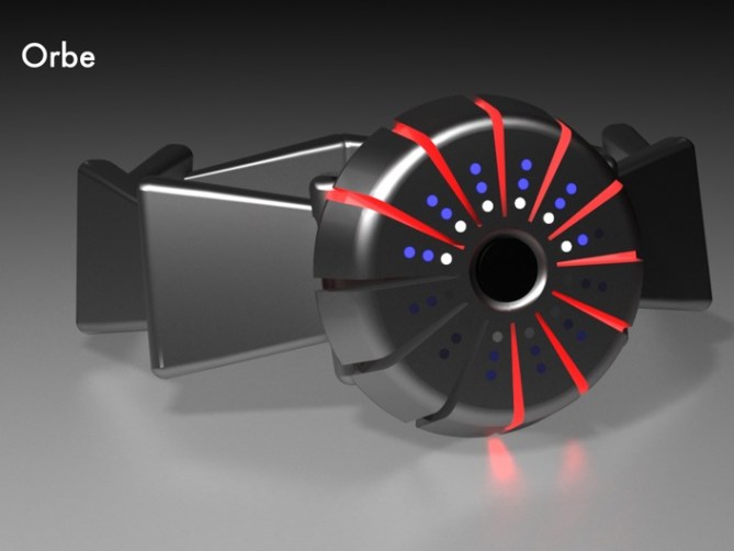


Hmm, interesting. I did not liked it at first look. But after some time i started my imagination (how it would feel on hand & how it would look) and i have to say it has nice touch :). I do not really know what’s happening with strap on second image. I like this red light going all the way down the edge of case. Idea is great, but it require some small redesign. maybe little more flat, and edges less rounded, with good strap & materials it could be buy worthy.
LikeLike
Is a beautiful , modern an original desing. I like it because is a simple design while avant-garde. It is also a breath of fresh air in the world of watches. I think it’s very well thought out, both in performance and in its design. I also like the colors used. In short, I think a great idea.
LikeLike
I liked it a lot. It seems very minimalistic and geek, but also it can be weared by fashion-styled people, not only for geeks. Maybe is a little hard to imagine the final product with an 3d render, but i think that with good materials it would be a really nice clock.
Good job!
LikeLike
I would be too lazy to learn how to read it… and the design is too futuristic for my taste either oldfashioned. But there is sure people enjoying such designs … good luck
LikeLike
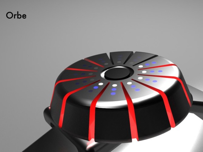
I like the way the light is emanating from the cuts in the side like lava leaking out of a volcano. I also think the time display is pretty easy to understand as it’s progressive in the same direction as a clock.
I’m just not sure that I would wear something this unusual on my wrist. It looks a bit too… decorative, for want of a better word. For that reason I will be giving this one a 3/5.
LikeLike
It looks like a fun luminescent cake! I m not serious here. Maybe a bit more flat for me and a different strap. I m not sure the triangle shape for the bracelet is a good way to go.
Nice job anyway! I don t know how you did this 3D but I really can t do this kind of things myself!
LikeLike
nice clock!!
LikeLike
This is a most modern design and original. Never before seen anything like this, it is also very practical since any person can use it easily. It is very worthwhile innovation in the design of a field such as watches, where so many different designs have already been proposed.
LikeLike
Reminds me of a piece of sliced chocolate or cake. Has dimension and could be fun. Think a softer Rubber strap would suit it though. Could be worn by men or women, relatively easy to read. I could see women going for this as well, maybe some color variations would be good. Nice Submission!
LikeLike
ououououou, I like a lot, man. I’ll buy it without a doubt if this clock is made for sale it! I will like more if it wasn’t necessary pushing the botton, and cit onstantly indicates the time, but it will be my new watch if it’s in shops.
LikeLike
Interesting watch design… I like several things about it; the red lights slicing into the case, The method of telling time is different from other peoples – but fairly straight forward, the colour combination of lights & dark metal.
Something bothers me about the round case though … not sure exactly, looks too small or too many lights close together. The red slices are excellent though, take that idea further.
LikeLike
Interesteting design also the concept that it has behind.
I like the way to read the time, because combines to two worlds, the digital one with the LED technology and the analogue one with the wat to read it.
Also the desing is very futuristic but I am agree with some post and I would prefer without the button to read the time……
LikeLike
It´s an original way to see the concept of time, diferent but sofisticated. I like it
LikeLike
I think it’s a different way to make a clock. It has a trendy design, that includes a futuristic image and shape. The way to read the hours seems a little difficult the 5 first seconds but afterthat it’s more or less like a tradicional clock.
I think it’s a clock that I want to buy if it was made right now.
When can I see thes first prototive??????
LikeLike
I like this concept it is really fashionable and different from others.I find really interesting the way it shows the time and all body made in the same matherial makes it cool.
LikeLike
Not my taste but it is an eye catcher and looks pretty tokyo flashy. Time reading is not too hard. Its a little bit intuitive like an analog watch. If you really need the exact minute, you need to count in the first days, later you just see it. The ufo-ish red lights are very nice. Thast a cool idea how to handle the case.
LikeLike
これって意外と読みやすいですね。ただ、「ウニ」のようにも見えてしまう強烈なデザインがちょっと苦手です。もうちょっとクールなかんじにならないすかね?
LikeLike
I think this can be a very fashionable watch on the market. It introduces a novel way to display the hours and minutes. this is achieved in a user-friendly way, and all based in a nice and evocative concept that makes it perfect for geeks or technology lovers.
And as some of the watches this company has on it’s webpage it shows the message that not everything in the watch design is said or done.
LikeLike
Not really my taste either, but looks that you´ve been deeply analyzing the way that designers from Tokyoflash do watches. Actually it could already be in its catalog. Well done! 😉
LikeLike
nice one, it really defies convention, it’s got a quirky look, an iconic sense of style and a fearless approach to our open reality.
LikeLike