

Design submitted by Salih from Turkey.
One LED dot is all it takes to tell time from this efficiently designed concept. It is a multi-colored LED watch showing 10-minute segments in different colors. The intersecting points between the hours in rows and minutes in columns light up in 6 colors representing each ten minutes. On date mode, all the LEDs light up except the section showing the date.
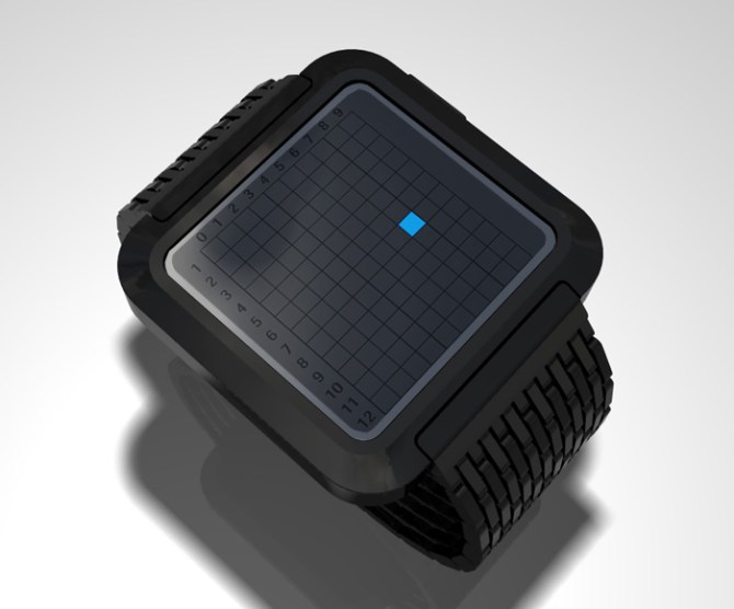
This is a brilliant concept – simple and mind-boggling at the same time. The overall look of the watch with the sleek square face and broad strap gives it a solid and masculine feel. Add a good animation feature and you got yourself another one mysterious-looking watch on your wrist.
Is it good enough or can it still improve?


NICE! This is really clever. I didn’t believe it at first – one unit to indicate the time but the color changing is genius. It does of course mean you’ll need to memorise which color equates to which group of 10 minutes but it’s still cool. I can imagine a Tetris style animation.
LikeLike
great idea!
if you want to stay single color for the indication light, you could try using surrounding blocks to indicate the x10 digit. for instance, for 12:59 the lowest and outer most right field would light up fully, while any surrounding 5 blocks light up at 50% luminosity.
LikeLike
シンプルな感じでイイですね!ただ、色の対応する時間を覚えないといけないところが大変そう。忘れてしまったら完璧読めないすね(笑)。あと、表示がLED1個しかつかないからなんか寂しそう。。。周りの数字とか、枠も光った方がいいかも。
LikeLike
This is so cool! I’d like to see it in silver and in different color variations. I agree with honda, it would be nice if the numbers would light up too. That would make it easier to read.
LikeLike
Remind me a bit of chess master. Could be nice if you can get the game on it as well!
LikeLike
Like the concept. Perhaps alter the color scheme to follow the ROY G BIV mnemonic to help folks remember what set of 10 minutes the colors stand for.
LikeLike
Cool idea with the sinlge led and the coordinates, very original. If you make this watch, make an angled case. Round edges just do not fit with this plain and simple idea. Very tokyo flashy watch!
LikeLike
Hey i started to hear news from turkish side.
nice design but is it possible to make a little bit small according to make design circular instead of square?
wish to see on the shops.
LikeLike