

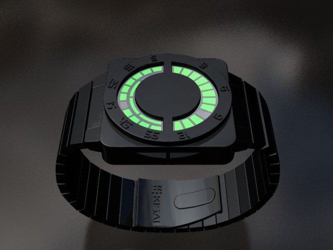
A new wrist watch concept from the Tokyoflash Design Studio. With a square case and circular display, this concept would be ideal for people who like both square and round watches. The face of the watch has what looks like a bezel with embossed digits – reminiscent of a combination lock. Maybe if the bezel worked, it could perform a unique function!
The stainless steel design features green LEDs and the time can be read simply – hours across the upper window, groups of five minutes and four single minutes in the lower window. The spaces showing the current units of time. How do you feel about this concept design? Do you like the color combination and the shape?
Tokyoflash Design Studioから腕時計の新しいコンセプトデザインの提案です。最大の特徴であるケース形状は、正方形と円形を組み合わせた形状なので、四角か丸かで迷う必要はもうありません。ベゼル部分には数字が付いており、時刻を簡単に読めます。また、フェイス部分は金庫のような重厚な存在感を放っています。これであなたの大切な時間を守ってください。
素材はブラックコーティングを施したステンレス。LEDにはフューチャリスティックなグリーンを採用。時刻の読み方は簡単で、上側の窓で時間、下側の窓で分を表示する。分の表示は5分単位と1分単位に分けられて表示される。このコンセプトデザインはいかがでしょうか?色や形状についてなど、みなさまのご意見をお待ちしております。


This is cool. It reminds me a little bit of the Sensai Pure watch you guys sell. Do love the black and green color combination. The buttons look interesting too. They kind of fit with the round display.
LikeLike
Something between Rogue and RPM Concept.
LikeLike
I like the concept, colours, and relative simplicity of this idea, but would suggest replacing the embossed digits with a simple mark (a dot, dash, triangle, etc.) in their place. Because the time is displayed in such a logical and well-defined manner, I think you only need a simple cue as to the relative position of any given LED in order to determine its value. Also, I’d imagine that removing the numbers will help maintain the mystery of the display in classic Tokyoflash style.
LikeLike
Great design. I like it because is simple. Maybe a different shape of the led, triangle, it will be better. I like the combination of colors.
LikeLike
Amazing watch. I like the design of the 2 buttons. I would prefer if the numbers where engraved instead of embossed and, maybe, another color. It would be nice if there was a light in the middle for the AM/PM function, maybe a circle with the letter K inside, like a combination lock. Finally, depending on the size, it could be nice to make a second model who would only be round. I would buy it.
LikeLike
This watch is uber cool, they don’t come much cooler than this! I love how it looks so geeky and sci-fi, blogging this!
LikeLike
I m not a big fan of the way to tell the time. It doesn t seems natural. But the rest of the design i like it.
LikeLike
With the numbers around the face, it makes it very easy to read. Ive seen a few other designs on this blog with a similar look, so im not getting too excited about this one. Perhaps if id seen this first i would like it more.
LikeLike
Eh, the rogue was cooler. If this design ever goes anywhere you have to make those buttons less obtrusive.
LikeLike