
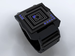
Design submitted by Heather Sable from the USA.
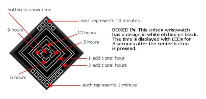
Heather says: “This is a unisex design for a wrist watch. It is called “Boxed In”. When the time is not displayed, the etched design is still pleasing to the eye. The button in the center will activate the time display through LEDs. The center design determines the hour. The boxes at the top and bottom determine the minutes.”
The concept designs we’re receiving are really creative! Heather’s concept is designed for guys and girls and uses simple lines and squares to show the time. The layout of the shapes on the screen are very cool – like a birds eye view of a pyramid perhaps. It looks as difficult to read as hieroglyphs but like most concepts here, when you know how and have had a bit of practice you can read the time instantly. Just take a look at the explanation below.
アメリカのHeather Sableさんの作品です。
以下はHeatherさんのコメントです。これは「Boxed In」という名前のユニセックスで使える腕時計のデザインコンセプトです。特徴的なパターンは、時刻表示をしていない時でも目を楽しませてくれます。時刻表示ボタンがインターフェイスの中心にレイアウトされているのも特徴です。中心付近にレイアウトされたボックスで時間を表示します。また、上部と下部にレイアウトされたボックスで分を表示します。
線と箱だけで構成されたシンプルなインターフェイスは男女問わず使用できます。インターフェイスのレイアウトはバードアイビューでピラミッドを見たようにクールです。それらは一見すると、象形文字のように読みづらそうですが、少し練習して慣れれば、簡単に読み解くことが出来るでしょう。詳しくは下図をご覧ください。
An interesting element is the activation button in the center. This may be difficult to execute but it ‘s a nice touch. So what do you think about this concept? How do you feel about the colors? Maybe a different LED colors for girls? Let us know what you think!

インターフェイスの中心にレイアウトされた時刻表示ボタンは、実現するのは難しいかもしれませんが、このデザインの重要なポイントでもあります。みなさんはこのコンセプトをどう思いますか?また、LEDのカラーはどうでしょうか?女性に好まれる他のLEDカラーがありましたら、ご提案ください。


Nice, I like the idea of having the pattern on the screen when the lights aren’t lit. Would look like a cool bracelet.
LikeLike
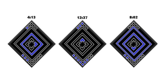
Interesting design. I liike the blue/black color combination. Just out of curiosity, wouldn’t the last sample time shown be “9:02” rather than “8:02”?
LikeLike
varhodes – If one outer box is lit, add 1 hour, and if both are lit, add 2 hours. so the time displayed there is 8:02. To display 9:02, the left arrow would be lit, neither outer box, and just the 2 squares below.
I originally intended the orientation of the face to be different – at a 45 degree angle to the band, but I wasn’t sure how to draw it. I also envisioned a slightly more narrow band, not necessarily metal – maybe similar to the band on the “Eleeno Orbit” – to make it more appropriate for unisex.
-Heather
LikeLike
Am i correct in assuming you’re another fan of the robotic shapes concept watch? It truly was a great watch, and a tough act to follow. Given the choice I think i would still choose the original but this is is a great watch in it’s own right. The way it reads is awesome and really innovative. I especially like it how the two squares light up for the hours in between the main four. I would never had guessed the time without the diagram, and thats what tokyoflash watches have come to be known for. Well done.
LikeLike
Hello, it looks pretty the same as another design proposed by me one week ago or so, an aztec pyramid based concept, but Tokyoflash didn’t post it yet :(( Mine is more complex in shape, and more simple in reading the time. Hope to see some day, Tokyoflash.
It looks very cool with this shapes. I love the symmetry of the concept. It gives a mathematic beauty to the concept. I think is confusing because of the orientation of the case. In 45 degree is easy, but in this form, kinda difficult.
The color combination is great.
Great job, Heather, this is a beauty.
LikeLike
I like the design and colors but I agree with GabrielBB that it’s orientation makes it hard to read.
It might be better if you made it so the head could swivel, rotate 45 degrees and lock position.
This way in the square position, as in the top picture, it looks more masculine and in the 45 degree diamond position it looks more feminine.
Also being able to turn it will make it easier to read because it will be in the position the creator intended it to be in.
LikeLike
interesting
I would like to see it with some lens effect maybe
LikeLike
I like the design and colors but I agree with GabrielBB that it’s orientation makes it hard to read.
It might be better if you made it so the head could swivel, rotate 45 degrees and lock position.
This way in the square position, as in the top picture, it looks more masculine and in the 45 degree diamond position it looks more feminine.
Also being able to turn it will make it easier to read because it will be in the position the creator intended it to be in.
LikeLike
i like the design, but can it be in different colors that light up? for example, if someone doesn’t like the color green, is there a switch to change it, or a button? also does the watch itself come in different colors?
LikeLike
I have a question. why didn’t tokyoflash this amazing watch already?????? Logan you have some serious tallent. make more watches, and sooner or later they’ll make it
LikeLike