

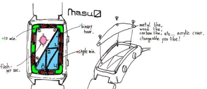
Watch Design Submitted by Akinori Nemoto from Japan.
The display uses various shapes to represent time. Triangles on the right hand side show hours in binary form, for example; 1 + 4 = 5 o’clock. 5 groups of 10 minutes are shown around the edge with green lights and single minutes are shown in red in between. There is also a flashing indicator for seconds in the upper left part of the display. This concept would have changeable covers so that you can customize your watch.
日本のAkinori Nemotoさんの作品。
枡記号をモチーフとした、シンプルで読みやすいけれど、バイナリ表示を用いるなどちょっとひねったデザインとしてみました。また、カスタマイズ要素を加え、遊び心を出してみました。
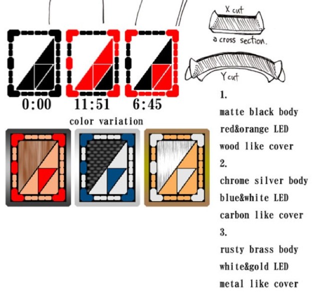


Nice Design Nemoto san, Has a very Japanese feel to it. Many people would enjoy the material aspect of this design. Wood, Metal Carbon, all fun materials than change the look and feel of the is design. The only thing is the screws. Worried if they get damaged taking the covers off on on? If not then good.
LikeLike
Yes indeed, nice design. 🙂 Looks diferent. It is japonese indeed 🙂 I like the combination between different materials.
LikeLike
I like this. Using hours in binary form take up less space. Cool!
LikeLike
First I thought it’s to complicated to read, but it worked very well 🙂 The material aspect is very nice. I do like the combination of warm and cold material. The screws make it look kinda steampunk-ish. Well the whole case looks a little retro, but in a good way 😉
I don’t like triangles so much, but that’s a matter of taste of course. This watch is definitely buyworthy.
LikeLike
Yep, it does seem like its complicated with lots going on, but then when you look at it closer you realise its actually pretty easy to read. He’s done a good job conveying the difference between hours, 10mins, single mins, seconds by having each unit a different shape or colour thats easy to spot.
LikeLike
ohh! clever! First time I see a combination of binary mode for the hours and another way to divide minutes!
LikeLike