
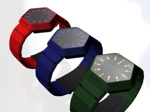
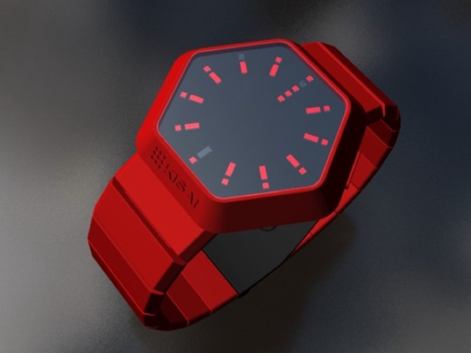
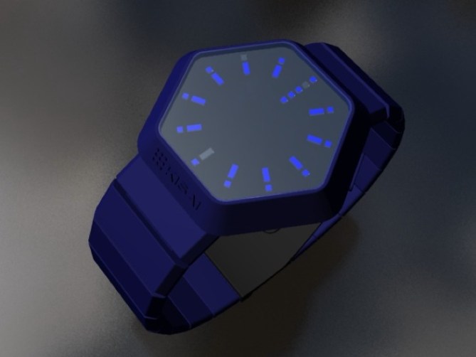
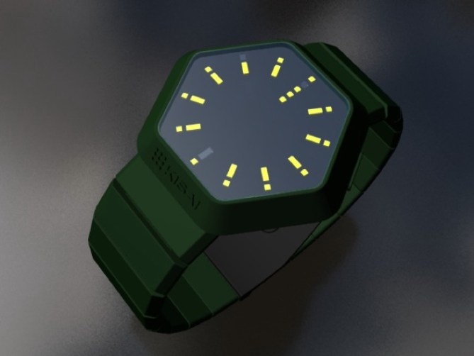
The following images are variations on the Night Vision concept from August 9th. A different interface layout shows hours with the outer ring of dots, in the same position as hours on a clock face. Groups of five minutes are shown in the inner ring with lines in the same position as minutes on a clock face and four single minutes are shown beneath the 12:00 o’clock position. The variations here show different colored cases. Let us know how you feel about these.

このデザインコンセプトは8月9日に掲載されたNight Visionのバリエーションです。新しくデザインされたインターフェイスは、アナログ時計と同様に時刻を読むことができます。円状に配置されたインターフェイスの外周の12個のドットは時間を表示します。5分単位は内側の11本のラインで表示されます。1分単位は12時の位置に配置された4個のドットで表示されます。また、ケースのカラーバリエーションも追加されました。皆様のご意見をお待ちしております。


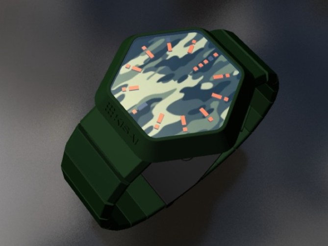


Love the Red and the Blue! Getting tired of just Black. Fun without being to crazy.
Tokyo Pimp
LikeLike
Yeah, I like the red one too. I am a fan of the simple display layout but I do prefer the original Night Vision concept. I’d like to see a white case and strap – anyone else agree?
LikeLike
Cool!
LikeLike
I do prefer the original Night Vision design too. It was really original. Variations seem to be the same idea as many of your concepts (like RPM or Rogue). Shape of LED’s is different but overall idea is not so surprising like in the Night Vision.
LikeLike
I like the different cases, more of this kind of thing would be great. I like the way the time is displayed, but I think the hours should be more prominent than the minutes, i.e. a longer ‘baton’ for the hour and a bit shorter for the minutes. Also I would include a day/date feature as well.
LikeLike
Nice presentation with the different colors. It’s already a trend, even if it doesn’t exist yet 😀 It’s so simple and clear. Some space left in the middle for further information to exploit the case more efficiently. Buyworthy anyway!
LikeLike