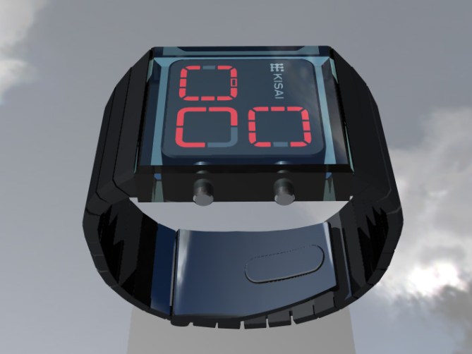
The interface of this design is located beneath a single block of clear acrylic giving the impression of depth. The block is then connected to a strong tapered wrist band. The large control buttons on the side are visible through the acrylic block. Three red zones display the time; hours in the top right, five minute groups in the bottom left and four single minutes in the bottom right.
クリアーアクリルの塊にモジュールを閉じ込めたようなデザイン。まるで腕の上にモジュールが浮いているような美しさ。ジュエリーのように、カドをそぎ落とした形状は、アクリルケースから、ステンレスバンドまで統一されている。3つのゾーンに分けられた時刻表示は、それぞれ、時間、5分単位、1分単位を表している。


Extremely attractive design! I just love the chain, however, when looking at the face the first place my eyes go is where the single minutes are located – and that is where the hours should be.
Just my 2 cents 🙂
LikeLike
Oh yeah, I really like this one, especially the solid shape. It feels kind of architectural with the acrylic case. Readable at a glance and I like the colours too, subtle and clean. Prefer this much more than Speed Track.
Not sure about the position of hours, minutes etc… based on my experience, you’d get used to it however they are positioned.
This is a winner!
LikeLike
Would like it better if the arrangement was…
Hours……5 Min.s
Logo……..Min.s
LikeLike
I love the design. “Strong” is a great way of describing it.
I agree with the above posts, the “zones” should change position. And MicKirGra was on the right track because people usually read hours-5min-min and clockwise.
Also, while I like the fact that the logo stands out, it has different dimensions than the other zones and so the watch feels a little…lopsided. What if the hours zone was twice as big. The logo would fit perfectly inside it. And that would get ride of the zone order problem, since it would lead people to read the bottom left to right.
Oh and, while I love these colors, I’m sure someone will suggest silver band with green lights.
LikeLike
This is a good design and I like a lot the appearance of depth in this one. I think the time blocks could be made more interesting by using different colours for each block. Also I think choice is always good and would make it available in silver colour. I think a day/date feature would add to the appeal and functionality. I think this design strikes a very good balance with being very different and also readable in a straight forward manner. I also agree that the time block ordering should be modified. The hours are fine where they are, but the 5 minute block should be on the right and the single minute block should be on the left. Also, since there is some room near the Kisai name area, i.e. top left quarter, I would put the PM indicator there rather than it being within the 5 minute time block.
LikeLike
Thanks for the thoughtful feedback pm!
LikeLike
I really like it, you just need to switch the places of the 5 minutes groups with the single minutes, also the PM indicator should be placed in the hours area, aside from that, good job.
LikeLike
I’d buy it !
LikeLike
The ideea of time captured in the crystal is great. So the design is perfect, simple and complicated in the same time. I like the philosophy of this watch’s creator.
Maybe could be more interesting if the center of the 3 led indicators, will be empty inside (I mean the same crystal form and colour).
Or the entire surface of the watch is made from the same material, semitransparent, and you can see only led indicators on its surface. (like a semitranparent LCD).
3 different colours for the indicators also could be interesting.
The 3 circle could be arranged like the Biohazard sign ? And the colour could be yellow. Or this could be another project 😉
LikeLike