

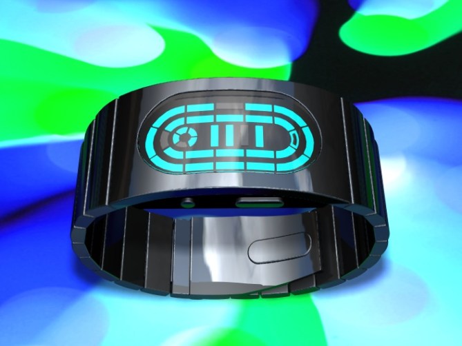
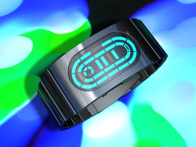
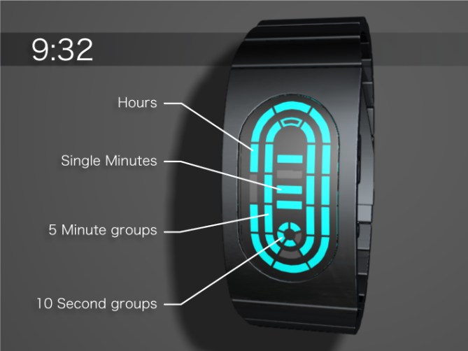
A wrap around wrist watch design with an oval interface that displays the time in rings like a race track. Hours are on the outer track in the same position as hours on a clock face. 5 minute intervals are shown in the inner ring so reading the approximate time is much like reading a standard clock. Four single minutes are presented in the center and this design has a seconds indicator too.
ケースからバンドまで一体感をのあるブレスレットタイプのデザイン。大胆に組み合わされたオーバルシェイプのレンズがひと際目を惹く。インターフェイス部分は競技場のトラックのようなイメージ。時間レーン、分のレーン、それぞれゾーニングされた表示はアナログ時計と同じ要領で時間が読めるので、とても簡単です。


Ok let me start off by saying that I love the “continuous” oval band/inset watch face idea.
That being said, I hate pretty much everything else. The method of time telling is boring. I visit Tokyflash for CRAZY things. Reading the time needs to be AWESOME, not “much like reading a standard clock.”
Not the mention, the color is just dreadful next to the sleek, black strap. A little greener might be nicer (like a teal color).
And the racetrack idea is kinda corny. I don’t want to think “Speed Racer” every time I look at my watch. I want to think “FUTURE!”
What do we get out of this experience? More inset faces, better color choices, and less corny ideas, please!
Also, can we ever expect to see touch sensitive buttons/faces? If not in real life, I would at least like to see them implemented in a concept design.
LikeLike
“Not [to] mention.”
And I’m sorry for being so harsh. I just have really high expectations for a great company such as Tokyoflash.
LikeLike
This is pretty awesome, the cyan color is clean and futuristic but as usual color options are welcomed, the bracelet form is also cool, a fast moving animation when you push the button for the time before showing it, would make this thing bad ass.
LikeLike
great shape, maybe the bracelet a little wider.
LikeLike
I like the design quite a bit. I’d like to see some color options other than cyan though. And I have to make one small point, the only reason I haven’t purchased a watch from you yet is the difficulty of reading the time display. I like the fact that the time is as easy to read as a normal watch.
LikeLike
I guess I’m alone here…ah well…
LikeLike
Perfect! Would change nothing. Just try to keep it around 23 x 45mm or so. 😉
LikeLike
I think this design is quite good, although not the best in this ‘blog’. The best aspect of this is the time feature, it is a good balance between being readable and different/unique. However it could be improved by using various colours in the interface. I think a day/date feature would be good also. Where there is real room for improvement, is in the strap and case. Somehow to my ‘eyes’ the time screen and case do not merge or blend well with each other.
LikeLike