
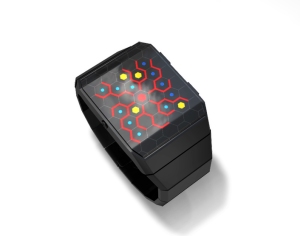
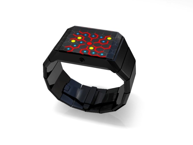
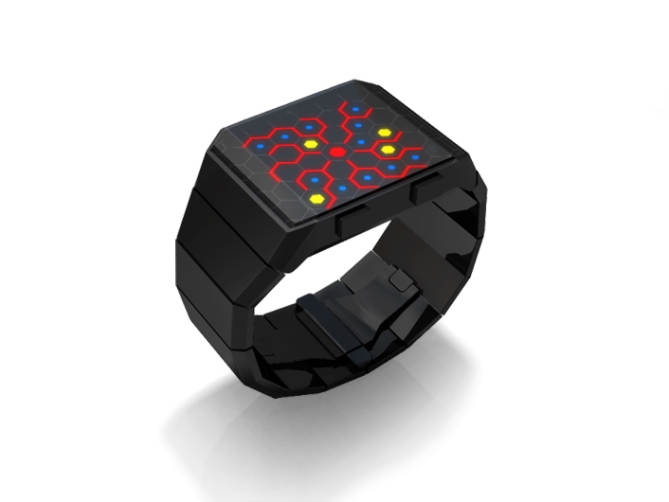
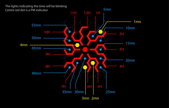
A smart, slimline, stainless steel design that uses LEDs to show the time in a web-like graphic that emanates from the center of the screen to the edges. Each red line from the center to the edge shows an hour in the same position as hours on a regular clock face. Groups of 5 minutes are shown with blue dots, positioned at 5 minute points like on a clock and single minutes 1-4 are shown with four yellow dots.
クモの巣のように張り巡らされた細い線が特徴的なインターフェイス。光源にはLEDを使用。
中心から放射状に延びた赤い光で時間を表示します。青色のドットはそれぞれ5分単位を表示します。黄色のドットは1〜4分を表示します。クモの巣のように張り巡らされた細い線が特徴的なインターフェイス。光源にはLEDを使用。中心から放射状に延びた赤い光で時間を表示します。青色のドットはそれぞれ5分単位を表示します。黄色のドットは1〜4分を表示します。


Cool Reminds me of some virus spreading. Should call it VIRUS!
LikeLike
Well, this thing looks pretty good, kinda odd, but I like it. As for the name, what do you guys think about “Infection 2”?
LikeLike
Very cool. Seems almost like a vortex sucking you in.
Hours and 5 minutes look great. I’d like to see the single minutes farther apart (as in, 2 and 3 not next to each other. Also, I love the look of the PM indicator in the second, but I wish it were a different color than the hours.
In addition, how will the LED’s come on when you press the button. Like, when you press it, will all the lights turn on, but only actual time will blink? Or will only the 3 (or 4 if its PM) lights indicating the time blink? Either way, a cool start up animation would be amazing.
And most importantly: Is it just me, or are the 2nd and 3rd images slightly different than the others? It seems like everything was shifted too close to the edge (The hour LED’s are touching the side?). Either way, it looks much better centered like in the 2nd to last image.
LikeLike
It looks as if the lights are actually a few mm down from the surface of the watch which would produce that effect. Also if you look closely, the layout is back-to-front in the 4th picture, to the first three 😛
However, the watch does looks amazing, the colours are awesome and the layout is pretty neat. I do agree with you that the minute lights (2 and 3) could be a little further away from each other. Maybe move 4 up one hexagon, then move 3 up diagonally to the left 3 hexagons inbetween the 8th and 9th hour arms, above the 40 min light?
LikeLike
I considered that possibility for the lights seeming close to the edge, but if you look at it closely, you can tell that the angles in pics 2 and 3 are not steep enough to produce that drastic of a difference in comparison to pic 4.
Plus, in pics 2 and 3, on the side opposite the place where the LEDs seem to be touching the edge, it looks like there is a space between the half-hexagon non-LED lines and the actual edge. Seems like an error in the digital coloring process. And since 2 and 3 seem to be the same rendering except from a different angle, that would explain why its repeated. I would love if someone from Tokyoflash could clarify this.
LikeLike
Infection, yeah I love that watch. I think this would be quite a subtle design, maybe even good for girls with the slim strap. Fuzzy, maybe Vortex would be a good name! Tokyoflash Vortex!
In fact maybe a concept design could be created around the theme of a vortex, like a twisting spiral that has sections indicating units of time – the animation would be hypnotic! Quite difficult to explain in words, i might draw something and email it in 🙂
LikeLike
Vortex would make a great name. Or a Japanese word for black hole. Something like that.
And I do like the idea of a concept based around vortexes. If the LEDs were placed on different levels and the face was a lens (to exaggerate the different levels), you’d end up with a cool 3D spiral design that really draws you in. Along with an animation (which could start slow on either the inside or outside and speed up as it spirals outwards or inwards, respectively), it would look amazing.
Avatara, if you do a sketch, I would love to see it! You can send it to fuzzygoodelman@gmail.com (but only if its not to much trouble).
LikeLike
I like the design for its appearance, including using different colours for the various time aspects, e.g. minutes/hours. I like the idea of a slimline watch. However, while the yellow and blue is readable, I think the red lines joining each other to form the hours, are not very readable. I know many like the obscure/mysterious look, myself included, but the readability aspect should not be completely sacrificed. Readibility may be helped depending on how the red lines are displayed as indicated above. Also I would include a day/date feature. Further, it may be nice to have the case in s/steel silver colour.
LikeLike
Cool design. I want one!
LikeLike