

Thank you for the feedback on the recent concept E-paper design. There are 4 different interface ideas here to fit the watch and we are looking for your feedback on which you like best.
If you have any additional comments please feel free to share your thoughts.

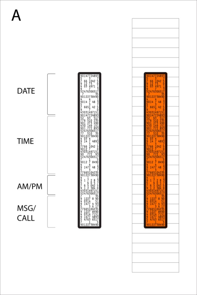


design a could be really hard to read (especially at quick glances) – perhaps if you added some sort of outline (e.g. a soft grey outline) to the spaces that make up the date/time/info numericals?
design b is probably the most efficient of these (not counting the clean cut design d). like it visually. could also work with high contrast color combinations (white on blue, green on black, et. al.)
design c appeals visually the most to me, even though reading it would need some getting used to. also not sure about quick-glance efficiency of this design. definitely the slickest of these 4, though.
design d is a sure-fire: clean, visually well-arranged, might also need some contrast and/or outline for the numericals to be read at a quick glance.
thanks for your great ideas and designs.
LikeLike
Thanks werwolf! very useful feedback.
LikeLike
i love B, it’s simple, organised and not obvious (one of the trademarks of TokyoFlash watches, in my opinion).
C is wickedly cool, but i fear it would be difficult to read such small details quickly.
D is the safest in terms of readability and design, which means there is little chance for people to be confused by it. the only downside is that it’s not as visually exciting as some of the other options.
are the colours indicative of actual, possible e-paper colours for a watch, or just for demonstrative purposes to stand out from each other?
LikeLike
I really like design A, although it can be difficult to read at first it’s less confusing than B or C at a glance, and the numbers that create the outlines of the text on the device have that verbose computing look which is really cool. D is a nice design as well, showing good economy and being easy to read. The forms and colors in B and C are very nice indeed, however I feel that they’re a bit too difficult to read, even after a lengthy time spent looking at them. All of the colors are good choices for any of the designs though, it would be nice to have those options for the final release of any of the designs.
LikeLike
Design A: would be easier to read than the original design because you usually turn your arm to look at your watch. However, it limits each line to 2 numbers/letters (what would MSG look like?). I also like the numbers in the background. Why did you guys choose that series of numbers exactly? Seems kinda random. If it had some purpose it would be cool. “Hey look, my watch has the first (however many numbers there are) digits of pi in the background!”
Design B: Took me awhile to get it, but its actually pretty cool. I feel like it would be better on a more square-ish design, instead of this long, narrow screen one. Maybe if each segment (date, time, ect) was made up of different colors. I don’t know.
Design C: Really cool idea (reminds me of piping or circuitry). But I have the same concerns as I did with B. I don’t think it works on this type of watch.
Design D: After seeing design A, I feel this one would be harder to read (because you would be looking at it sideways). But because everything is in a line, its kinda nice. I say this is the best, but ONLY if you add a scrolling feature (to display texts or caller ID’s).
HA! You could even add in a little Mario-esque side scrolling GAME. THAT would sell. 😛 Just kidding.
LikeLike
Yeah, the numbers in the background of design A are pretty much random. A meaning would be interesting. Thanks for the feedback.
LikeLike
Oh, I couldn’t see the time on design A at first, that’s great, took me a while to click. I think once you get it you’ll be able to read it instantly – I can see it clearly every time now. I like A best.
LikeLike
I really love design A. It took me a minute to get it, but I feel like now that I can see it it will jump out every time. It is similar to reading time on the ‘Negative’, but a little more mysterious because this one has numbers in the background instead of just dots. I think that when people see it for the first time they will try to decode the numbers instead of looking at the negative space, which to me is a good thing, it all adds to the mystery, but makes it easy for the owner to read it at a glance at the same time.
I agree that it would be a cool idea to have the numbers have significance, like the Fibonacci sequence or something. Maybe for the background in the bottom section it could be letters instead of numbers and when you get a call or message the letters could change to say who the call/msg is from.
Being able to change colors through a menu like on the ‘Negative’ would also be a nice touch, but I would probably still buy it even if only one color was standard.
LikeLike
Given that it’s eInk, there’s enough visual coolness that the time doesn’t need to be made hard to read to make it interesting. Instead, I would prefer that the time is displayed as cursive (e.g. “Quarter after Ten in the Evening”). Some of the Seiko eInk watch designs (that they never shipped, darn it) are cool as well.
Given how flexible eInk is, how about if you make it (slightly) programmable? If you let buyers design their own graphics to load into their watch, you would sell _tons_ of them, and you’d have a user community that could last for years.
LikeLike
For me, the D design remains the best. The dot matrix display give a retro look to this very futuristic wristwatch.
And it is easier to read than the others designs
LikeLike
I pic a, it’s gotta be a. I looks ill, and it fairly easy to read. with the other ones buy the time you decode the time, its no longer the time;)
LikeLike
This concept is unique enough that you could use a ‘positive’ display versus a ‘negative’ display and still keep all other watches ‘wrapped around its finger’ so to speak. Option A in its current design is my choice. although, I’d prefer a ‘positive’ display.
LikeLike
Please make this watch. I beg you.
LikeLike
It’s e-paper… you should be able to accommodate all 4 display designs and simply change the style of the display via the buttons.
Needless to say, designs A and D would be the easiest to read at a glance.
Designs B and C are the coolest futuristic looking ones. Design C might be the most difficult to read because there isn’t a good visual element that divides the Date, Time, AM/PM, and CALL/MSG areas, which is not straight across the band either.
If all 4 were available, I might switch to a cool design when I only need to be aware of time casually (evenings out, vacation, etc.), but probably switch to A or D when time is of more importance (during business hours, etc.).
LikeLike
i was confused by the bottom one for a min, trying to work out how the dots corresponded, wasnt until i turned my laptop on the side i saw what i should have been looking at and i like it a lot! in my opinion A and D are the winners but A can be a little hard to read close up
LikeLike
A is the winner!
Then D But not comfy, because you turn your wrist…
B & C takes to long to read time!
LikeLike