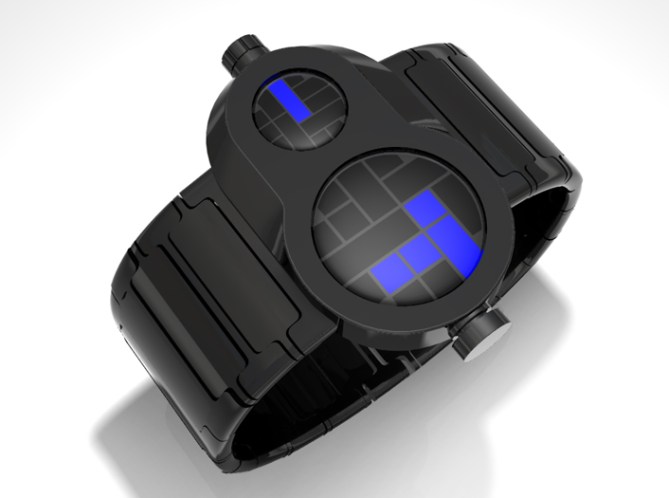
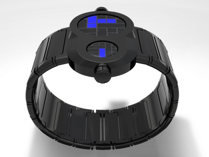
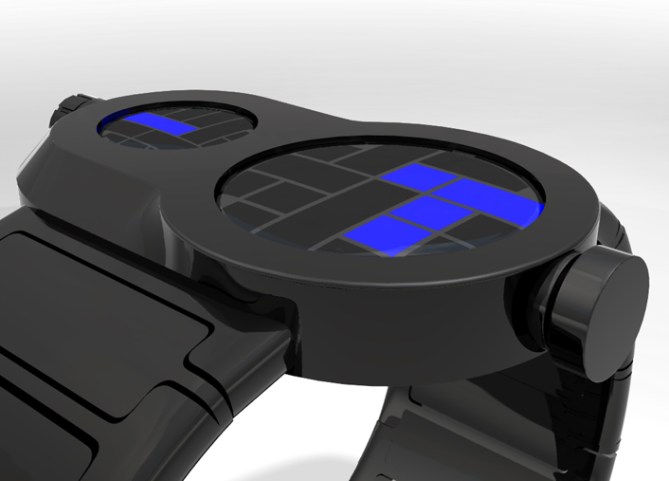
A twin-screen design with blue digital tube LEDs beneath smoked black lenses in a stainless steel case. The wide face displays hours and minutes in two separate windows.
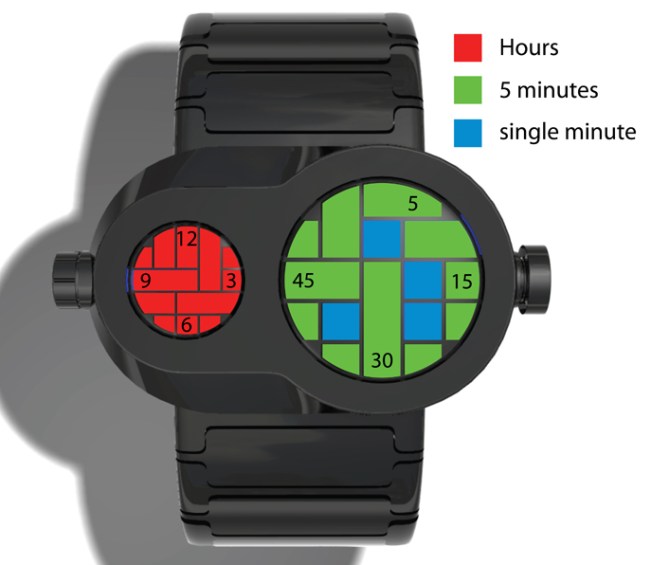
Hour and five minute blocks are located in the same positions as numbers on a clock face so the time can be read easily. The operation button and charging port at the sides of the case add to the robotic character appearance.


Not a bad concept but I don’t think that it works that well.
I do like the way that the hours and minutes are separated but once again I don’t like the fact that the markers for a particular unit of time are different sizes. It seems strange that 30 minutes is larger than 45, but 15 is smaller than any of them. For this kind of design I would recommend either segments that increase in size as the number gets larger or keep them all the same size.
Also, the distribution of the blue single minute markers seems a bit random.
LikeLike
Love the display not a big fan of the case, but overall interesting for sure.
LikeLike
Very industrial, the combined screens remind me of those V8 logos from the classic American cars but in the same time it looks very modern.
LikeLike
I like this one and I think it is very original. I like the case shape a lot (2 screens). I am not so sure about the strap. I think something less plain would go better. I am not sure about the single colour for the time. I think the time would be best displayed in different colours, like in the example above explaining the hours and mins. I would also suggest a day and date feature. From the description it seems that USB charging is included in this model – this is very good. The whole watch may also look good in silver.
LikeLike
sweet! reminds me of the guardian robots in Laputa! 😀
I like the red and blue; not sure about green, but it could still work just fine. overall i really like this one!
LikeLike
Yeah, that’s right, I knew it reminded me of something. I think from the pics above the lights would all be blue. I think all red might work well.
LikeLike
I really don’t care for this one. I actually like the strap, but the face seems plastered on and it doesn’t strike me as an seamless design, though I agree it’s original. I guess I prefer your sleeker, less clunky pieces.
LikeLike
Love this one, especially the display – the blocks remind me of Tetris. I understand what Rumplestiltskin means about the time. Maybe the blocks could increase in size as the units of time increase. Not sure how this would affect the appearance of the display though. I could really picture this on my wrist, it would look cool. Would like to see how a different strap design would look.
LikeLike
I, too, like the idea of separate areas for hours and minutes. It’s all arranged in a very pleasing futuristic design, and I like the black material used.
However, I tend to agree with Rumplestiltskin about the length of the segments used. Having a correlation between the number of minutes and the size of the segment would be very practical… 15 longer than 5, 30 longer than 15, and 45 longer than 30. The same could be said for the hour segments as well.
LikeLike